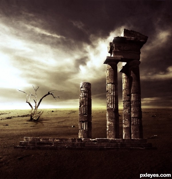
Ruins by IreneIs: http://www.sxc.hu/profile/IreneIs (5 years and 2944 days ago)
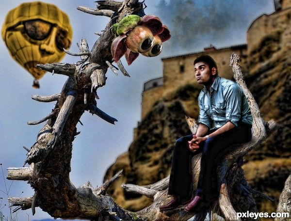
(5 years and 2945 days ago)
I really like your shadows on the guy in the blue shirt. He seems a bit 'bright' to me though. The whole concept is awesome. I love the expressions on all the faces. Nice job, author!
This is just great fun fun chop!..love those big eyes..
the guy in the back looks like my granpa with sunglasses! hahaaa
GL author,high marks and fav!.
Howdie stranger!
If you want to rate this picture or participate in this contest, just:
LOGIN HERE or REGISTER FOR FREE
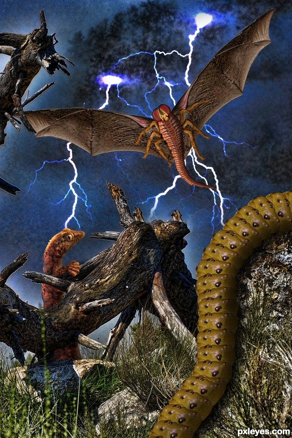
(5 years and 2946 days ago)
Very nice job!
Howdie stranger!
If you want to rate this picture or participate in this contest, just:
LOGIN HERE or REGISTER FOR FREE
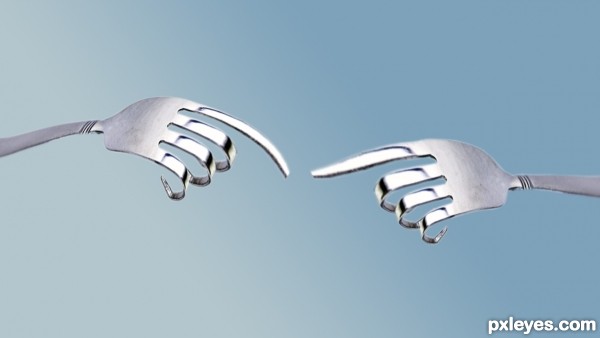
The Creation of Adam is a section of Michelangelo's fresco Sistine Chapel ceiling painted circa 1511. It illustrates the Biblical story from the Book of Genesis in which God breathes life into Adam, the first man. Chronologically the fourth in the series of panels depicting episodes from Genesis on the Sistine ceiling, it was among the last to be completed.
http://en.wikipedia.org/wiki/The_Creation_of_Adam
(5 years and 2947 days ago)
Nicely thought out...very good entry, good luck
Elegant simplicity!  I'd refine some edges, though...GL author.
thanks guys !
great concept
very cool love it
So delicate. Love it!
Howdie stranger!
If you want to rate this picture or participate in this contest, just:
LOGIN HERE or REGISTER FOR FREE
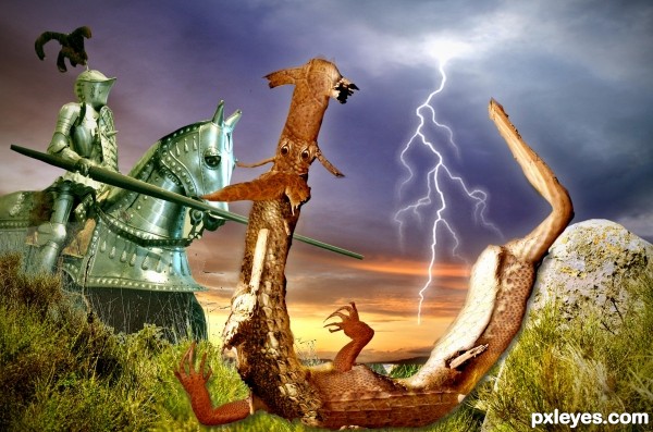
The image of St. George and the dragon has been recreated in many ways, but I believe it is the first time that the dragon was designed from a dead tree ...
GL4U (5 years and 2947 days ago)
It's a nice idea and the execution is pretty well done. Personally I'd skip the PS generated texture though, imo it's a bit distracting from the actual image. If you chose for it to give the image an older look, I'd recommend to use a photo of an old paper/fabric texture. More subtle and perhaps with better "old" result. Good luck!
I took the texture completely, wazowski, what did you think? thanks for your help 
I think this way the image is way better to see, author  . Good luck!
The stark highlight on the knight suggests that maybe the tree 'dragon' might have a more pronounced highlight on it's face and front. Nice job!
let's say that the lighting in the armor of the horse is a reflection of lightning illuminating the belly of the dragon 
Howdie stranger!
If you want to rate this picture or participate in this contest, just:
LOGIN HERE or REGISTER FOR FREE
In your jobs the composition and your choice of colors are always fantastic! in this work, IMHO, the foundation of the building is calling attention to an error of perspective, I disguised the base with fog or something, GL!
Thank you so much for your comment, micoprego!
The "error" on perspective are totally proposital!
I think I understand it, what matters is that the quality of your work makes me have a folder on my pc with your name.
love the mood
Hahaha, thank you so much for your kind words, micoprego! I'm honored!
Thank you too Anoop, you know that I'm your fan!
Howdie stranger!
If you want to rate this picture or participate in this contest, just:
LOGIN HERE or REGISTER FOR FREE