simply cut paste blend (5 years and 3641 days ago)
- 1: source1

The cloud filter can be found
in source link Mura's Meister is the one you want There are different filters and plug in's there. (5 years and 3657 days ago)
Howdie stranger!
If you want to rate this picture or participate in this contest, just:
LOGIN HERE or REGISTER FOR FREE

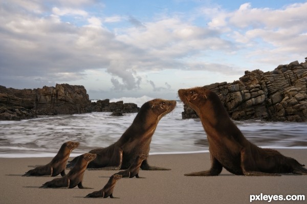
Spec Thanks to mqtrf for use of this picture of ocean found in member stock also in his close to the coast album.He is also a member of PXLEyes.com (5 years and 3704 days ago)
mama gets around..hehehehe
It's a headache and a kick on the a$$!... 
good idea -- check the shadow on the right hand sea lion
alan right, work on the shadows.good luck
nice idea.. but the daddy seal got wrong lighting.. if you can correct it then its perfect.. 
Thanks guys I played with it does it look any better?
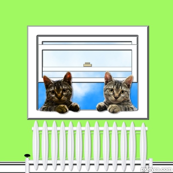
And I thought cats multiplied fast......lol.....GL
cute baby seals............... 
iquraishi made a good point. It's too late now bout your best option would have been to find another seal source. I'm sure there's a dozen or so on flickr alone.
Howdie stranger!
If you want to rate this picture or participate in this contest, just:
LOGIN HERE or REGISTER FOR FREE

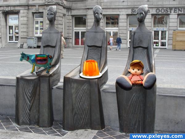
I made their eyes. Then couldn't think of anything else to do with them with their new eyes. So I figured, maybe they could hold something. Looked like they were holding something. So I looked through my own catalogue of images and found my folder of Pxleyes downloads and decided to give them cool stuff from the website.
PLEASE CHECK OUT HIGH RES TO CHECK OUT THE EYES!
All sources are from Pxleyes. (5 years and 3972 days ago)
you forgot to tweak the cow's shadow. i hope.  and why would you flatten the image at the end?
Nice
the shadow from the doll is wrong and the shadow from the cow doesnt match the others, i like how you did the eyes on the statues and the idea is cool...
Merge layers? Flatten layers? Someone want to tell me the difference? I tried different ways to make that cows shadow. I did it and redid it. It was kicking my butt. If anyone has any suggestions they would be greatly appreciated. There's one thing that I know I didn't try, but I'd forgotten how to do it and where I saw it before.
flattening the image IS merging all layers.. you should put the shadow layer below the cow layer, put some blur, play with blending options to see which one fits best. i don't see why you don't use the same technique you used with the other shadows
I didn't use the same technique with the cow as I did with the others because when I used the drop shadow on the cow it affected the others. I know that there's a way to stop that from happening, but I couldn't figure it out. I need to redo the whole cow because I accidently put the cow and the shadow in the same layer. Thanks a lot ELFICHO for the tips. I will try them out. Thanks to Eladine for pointing out the problem with the doll's shadow. I think that I had it right at first. I know what to do. Thanks everyone for the comments. They're appreciated. 
Please take a closer look now! I have fixed my cow shadow and the doll's shadow! Thanks to everyone for your feedback!
Cool  :*)
:*)
he he
Howdie stranger!
If you want to rate this picture or participate in this contest, just:
LOGIN HERE or REGISTER FOR FREE
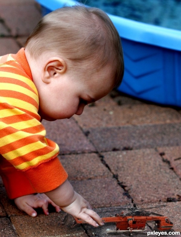
wow, definately cool, just one little suggestion though, maybe a shadow under the copter would be cool you know, just to add a little more realism? also, cool baby choice
cute...
Very cute, it's pretty realistic!...
nice image..but it does need a couple things, including the shadow that Tuckinator suggested..but also a little more contrast and color..right now the copter is a little gray..just use the original toy as a guide and this image will look much more realistic..
Agrees with fatz, and also, you might wanna change the perspective of the ground, at the moment it´s off from the perpective of the chopper. IMO
i stink at shadows....heres an attempt
Cool realistic work
Howdie stranger!
If you want to rate this picture or participate in this contest, just:
LOGIN HERE or REGISTER FOR FREE