source only and Ps
edit: watch the highres or sbs to get the deeper meaning of my image.
Thanks (5 years and 3984 days ago)

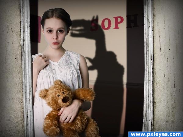
we all had that fear of the dark and what lies beneath our bed... when you stand in the hallway and wait for mommy, does that monster watch you back while your turned around?
for an artistic touch i did a slight anime effect to the eyes, and a twisted deform-ish mouth. makes it more interesting on that level. i like it! please post your comments. (5 years and 3994 days ago)
Great!
great colors 
whoah awesome
Nice job on the girl! Not sure about the shadow, but it's okay. Fix your links...1 and 3 are the same.
haha! oops [about the links] the shadow was hard to work with cause i needed it to represent some sort of monster, but able to cram in into a tight space, had i made it more 'proportionate' it would be way too short, and wouldnt get the message across like i was hoping for. as for it looking kinda cartoony, that wasnt intended, but it works well i think because of her age. what we found terrifying as children could be pure funny entertainment to us adults, so it fits her personality because of it. thanks for that source heads up tho. 
you need to show proof of permission for the images from deviant art as they stated you cant use them outside of deviant art. Good picture, hate to see it removed.
thanks for the heads up, olivia. got permission, view the screenshot in sbs
wicked, in that case loveeee the image lol... favourite 
Howdie stranger!
If you want to rate this picture or participate in this contest, just:
LOGIN HERE or REGISTER FOR FREE

Created while listening to this song
Symmetry by Jane Siberry (Now ISSA)
...or say you're in a room
and there's a beautiful fire
and you're looking out the window
(at the snow and the winter streets below)
but your eyes keep returning to the fire
this is what I'm thinking
the reason your eyes keep returning to the fire
is because it divides your sight
into left and right
and dark and light and dark
like a fine dividing wire
here's another thing
that I noticed last night
when he kissed me over there
he usually kissed me over here, too
I must have known it in my heart
and with my inner sense of art
because when I kiss him over there
I never kiss him over here
it's the way of the world
people do it everywhere
if you're going to do it over here
then usually they do it over there too
symmetry is the way things have to be
symmetry is the way things have to be
or say you're at a table
and you have your forks and knives
do you move them around
'til you get them just right?
(this is while you're talking to someone)
or you work in a nightclub
and you notice that
even though you try to seat everyone on one side of the room
they always spread themselves out evenly from this side to that
like atoms in a model
it's the way of the world...
or say you're in an air show
and you're flying with two other pilots
and you want to do it right
because you like to do it right
and one guy is flying
at the tip of your left wing
and the other guy's off
doing his own thing
would it bother you?
it bothers me
it's the way of the world
(5 years and 4013 days ago)
nice lyric, oops, ah, i mean nice entry, hehe, good job author, very colorful

Edit:Egyptian football

Egyptian football you 
EDIT: Egyptian Petunia you?
Okay I can guess without voting, who the author is 
edit: Bang On Target  Anyways nice picture
Interesting!
Great 

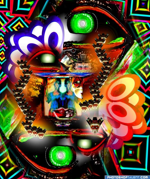
Woah so much is going on here its rather confusing! Totally random and weird, is not a bad thing, I love random! Nice work.
Well Ory, think of it as an entire wall image, it's not so random, I did everything in it in symetry 
things are asymetrical there and make me think of chaos;I imagine one could see this at a disco while being on shrums:P
very nice, good colors, lot of work
very nice 
Very nice entry and colors are too good......G/L Author.
wow
..trippy!! 
great job. like the color 
good.
Howdie stranger!
If you want to rate this picture or participate in this contest, just:
LOGIN HERE or REGISTER FOR FREE
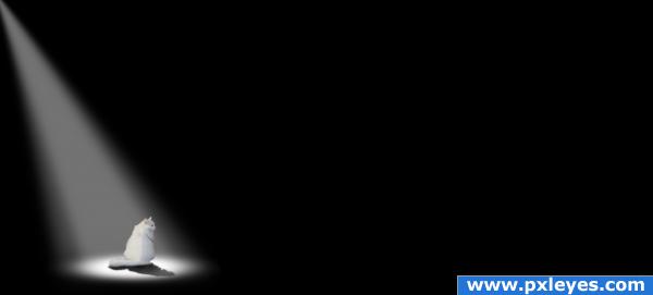
it looks very nice.. a very lonely image. Good luck!
so simple but so powerful
 ... ACK good job Creatfx hehehe.. you got it!!!
since the contest is almost over, I'm going to give it away
PEOPLE LOOK AT THE HIGH RES AND LOOK UNDER WHERE THE PXLEYES.COM BLUE BANNER IS (I was hoping someone else would give it away hehehehehe, but since it's almost done, I HOPE YOU DON"T MIND AUTHOR)
(I hope other's catch it
great mystery and fear effect... i sure expect something to jump out of the darknes at the poor cat... great work with the eyes...
for me this image issnt lonly or feary. I had something diffrent in mind. Interesting to hear other impressions

i like it! sometimes that empty space works well you could though make make the lightened part of the cat become darker more gradually, insted of a straight line
good use thirds....so little in the image yet it says so much... great job
the image looks nice, the cat looks kinda lost in the image though the rest of the image is pitch black but i like it! high marks!
actually the dark area issnt empty at all. There is something in the darkness. (but may only the cat see it) you also can see it in the sbs if you like to get the hidden story insinde. For all others, it´s just a black area.
In High Resolution you can see the mouse. Without your comment, I would have never seen it. Changed my vote completely. Good job author!
Glückwunsch für den 6. Platz!
Howdie stranger!
If you want to rate this picture or participate in this contest, just:
LOGIN HERE or REGISTER FOR FREE