source and CS5 (5 years and 2993 days ago)
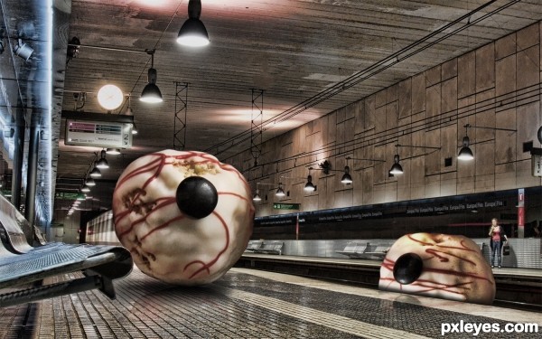
added reflections and shadows and burns (5 years and 3133 days ago)
cool... looks like from a Game 

great image, nice one
Howdie stranger!
If you want to rate this picture or participate in this contest, just:
LOGIN HERE or REGISTER FOR FREE
(5 years and 3175 days ago)
this freaks me out
yaaa really give me the creaps :P but in a nice way........ :P
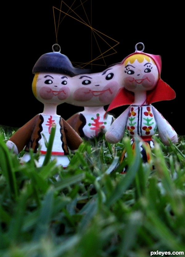
remove the hooks on their heads... may I know what is the purpose of the lines?
the third person should be "ghostly" = fade out more 
We say here '' triangle'' for the 3 lovers situations.
Howdie stranger!
If you want to rate this picture or participate in this contest, just:
LOGIN HERE or REGISTER FOR FREE
Only source used (5 years and 3623 days ago)
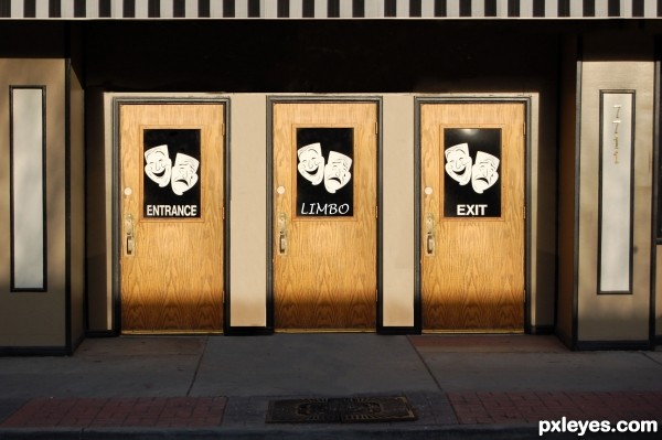
If you could loose the tree shadow on the entrance, it would be nearly perfect.
Agrees with chaplain. Very nice idea and creative work.
looks pretty good but why is there a tree shadow on door number one?
u can copy the middle door, flip it, move it to on the left one and copy the 'entrance' image.. then it'll be perfect.. and you'll loose the shadow as well..
Done 
there is shadow all the way across except the tan strips between the doors, it should have the shadow too. and there is tree (im not sure it matters) shadow on the right and left pieces (the thing that has 7711) good luck author
Thanks for the suggestions guys!
Third option... Through the left door you get in; through the right one you get out; and through the middle one... you stand still! 
I'd been thinking that your middle door needed a label -- and thanks to the inspiration of erikuri, I would suggest perhaps "LIMBO" might be appropriate. The middle door should also have the masks for consistency. (Note that the masks bear no relationship to any of the labels; they are purely decoration.)
Thanks DanLundberg, I did it.
I´d say that you should either put colour on the middledoor letters or try to have as similar letters as possible as the others. Otherwise, still really good.

all the best dear ................ 
Not bad
lol nice!
Howdie stranger!
If you want to rate this picture or participate in this contest, just:
LOGIN HERE or REGISTER FOR FREE
(5 years and 3957 days ago)
gl
Quite a lot happens here, but hard to see the actual connection with the ste, especially when this will be in the final measures. Good luck!
Could not read it scaled down, sorry 
i think your design it's fine put the square attracts the eye more to them than to the anme and the colors are to expresive...you should trry and google some COLOR THEORY see how that can help you good l;uck
Good luck!  Nice!
Nice!
Looks like something from Windows '85 - sorry. I think it's the bright green and bright blue - a no no.
Howdie stranger!
If you want to rate this picture or participate in this contest, just:
LOGIN HERE or REGISTER FOR FREE
Very creative, good luck!
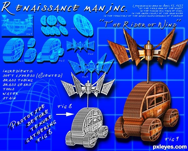
Now this is clever, looks like one of his own 'invention' drawings! LOL @scented cypress. Very nice work, author!
Howdie stranger!
If you want to rate this picture or participate in this contest, just:
LOGIN HERE or REGISTER FOR FREE