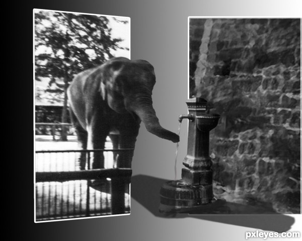
I have used two old photos that I have on the album of the memoirs. (5 years and 2678 days ago)
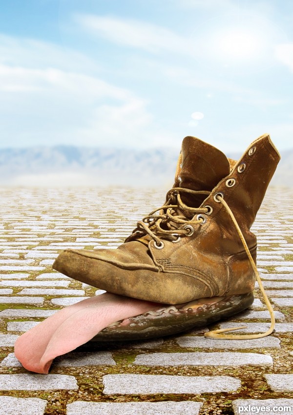
(5 years and 3058 days ago)
Fun image...GL author! 
very cool image high score 
A pair for me, please 
thanks for the feedback
Congratulations! 
Congrats author! 
Congrats, Yoguy. Well blended and very strange. I like it! 
Howdie stranger!
If you want to rate this picture or participate in this contest, just:
LOGIN HERE or REGISTER FOR FREE
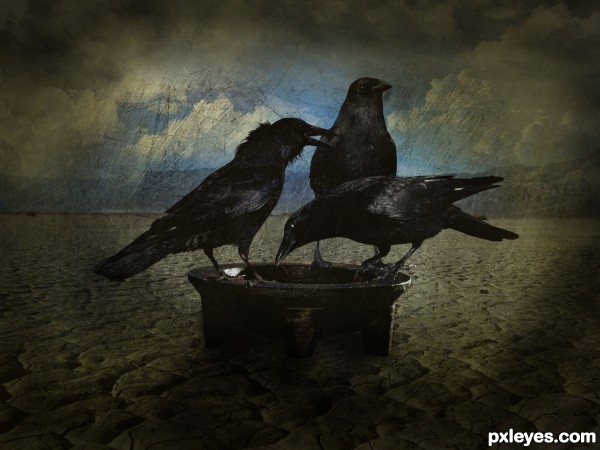
thanks to peroni68, night-fate-stock, javierzhx for images and brushes (5 years and 3216 days ago)
Nicely done 
Just check your sources, cos some don't work
thanks loopyluv.... u saved me  ....
....
god one......
heebie jeebie creepie (GOOD LUCK) great job
welldone....., good effect on the whole image
You did a good job, and I like the bird sources. If I were you, there wouldn't be much thing I want to change, except the bow. If you consider the view angle, the source image was captured from the view angle that was close to the ground, so you just see a small upper part of the bow. But the view angle of the ground in this image is much higher, so two of them are not really fitted. And also there is not much light around, you can reduce the shadow, so the bow will be seen more clearly. Good luck, author 
So dark and sinister.
Howdie stranger!
If you want to rate this picture or participate in this contest, just:
LOGIN HERE or REGISTER FOR FREE
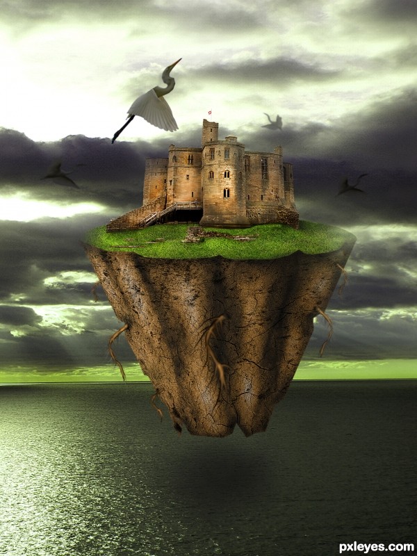
(5 years and 3277 days ago)
Nice painting! I miss a bit more integration with the enviroment, but is a very nice job.
very nice , I think this is from this tutorial http://www.psd-dude.com/tutorials/photoshop.aspx?t=floating-island, for those who want to practice.
Good luck !
Mistica e de lindas cores. Amei sua criação!
Mistica e de lindas cores. Amei sua criação!
The clarity and color of this is awesome. I wish the perspective was a bit more faithful. Normally at this angle we would see more of the top of the castle. If you softly darken the grass around the perimeter of the bottom of the castle it will help a lot. Really nice job though, author!
Howdie stranger!
If you want to rate this picture or participate in this contest, just:
LOGIN HERE or REGISTER FOR FREE
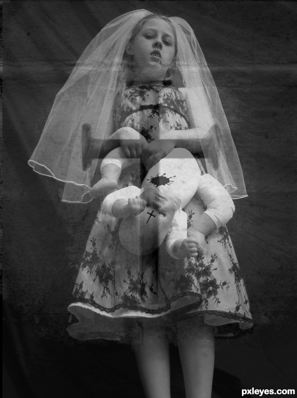
the orig. photo is my own
all i did was copy orig(which i manipulated) over cross picture and lowered the opacity
there is no effect on the cross
picture
through suggestions
i took the color of the blood away thanks to MPMthe1,ba1969 from www.sxc.hu for letting me use thier photos (5 years and 3551 days ago)
There's some potential here. Your SBS doesn't describe the gauzy overlay with the cross [anathema to vampires?], let alone why it's perspective is different from that of the girl. I think the red blood is too bright and thus looks fake. Having her holding a dead baby instead of a doll would be more compelling (disturbing) as would a title that referred to her as a bride.
very cool
i agree with Dan about brightness of the blood,image is scary enough that u don't have to use blood effect at all,its clear that she is vampire.And in this moment something is not OK with the source links...any how i like this image and u how time for some improvements author...good luck
Spooky!
Howdie stranger!
If you want to rate this picture or participate in this contest, just:
LOGIN HERE or REGISTER FOR FREE
I would've liked to see a better source image that was more in focus. Although if you feathered the extraction point to match the blur of the source it would improve the overall image. Good luck!
Thanks for the suggestions but I have not been able to do better because they are old photos that I have cared with the scanner.
Howdie stranger!
If you want to rate this picture or participate in this contest, just:
LOGIN HERE or REGISTER FOR FREE