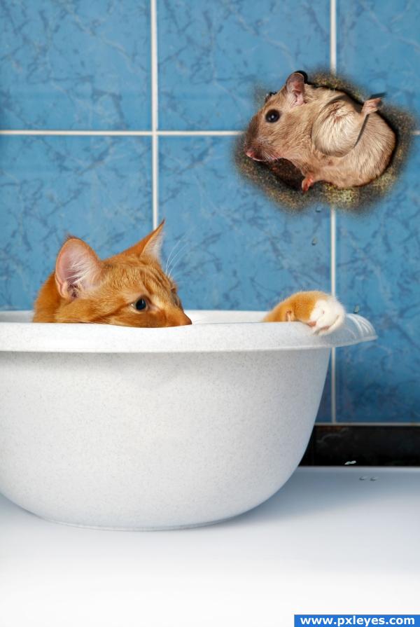
I used one external source of Mouse
Thanks to www.sxc.hu/photo/1097351
Author: lockstockb
(5 years and 3809 days ago)
- 1: Mouse

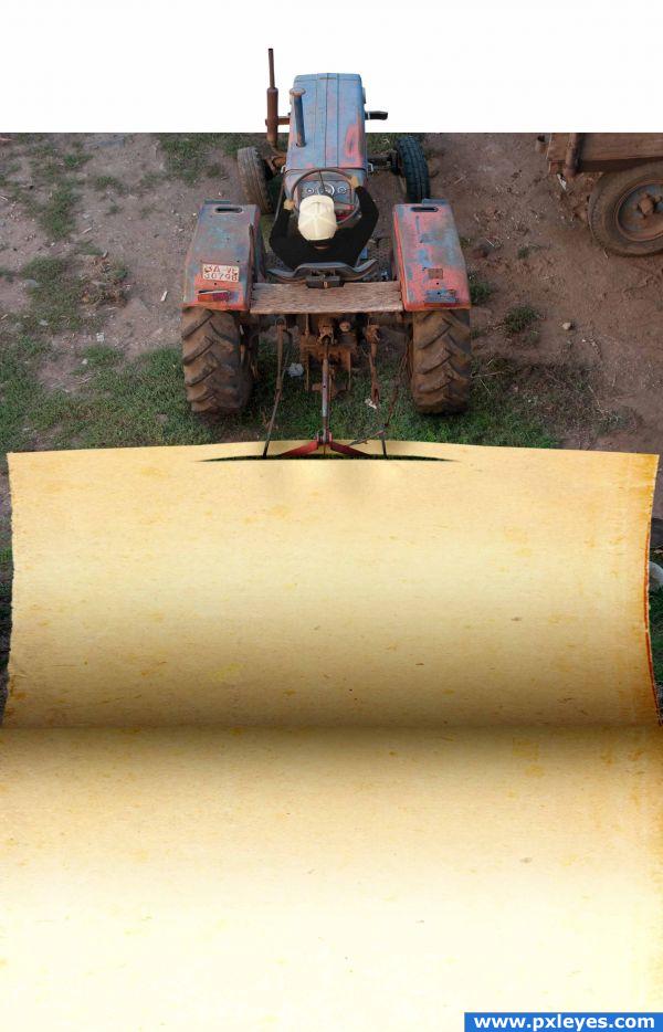
Thank you evobrained for your photo of the old paper.
(5 years and 3829 days ago)
hehehe.. Clever.
very smart , maybe if you didnt cut of the img infront of the trakter it would be better?? anyway its very good GL
Clever take...very effective!
Nice idea...is there a source for the driver?
I love the idea, very clever
Howdie stranger!
If you want to rate this picture or participate in this contest, just:
LOGIN HERE or REGISTER FOR FREE

Read Story to Comment
sorry for my English
There is a girl who work in bar as a dancer because of finanacial problem
whenever she come from the bar she get frustrated by the people so she saw a girl vector on the wall she get a marker nd paint it jus like its rainning on the girl but theres no one to cover her
a boy passing by , he saw tht vector of girl he thought y not making a man standing beside her so shes no alone next day when girl came she draw a cab nd puddle nd water splatter on her next day a boy saw tht painting tht she drew a dirt coming up on her so he drew an umbrella to save her from dirt....
From this Story i got Idea of making this image (5 years and 3848 days ago)
What a nice story... And great job on the picture! GL 
years back a music video was made based on this story.ur peice completely goes wid tht.superb job.i wud like to see the sbs
lolss.. yeah nehayash it waz Leja Leja.... cool u recognized it.... guess m very much near tht picture+
Howdie stranger!
If you want to rate this picture or participate in this contest, just:
LOGIN HERE or REGISTER FOR FREE

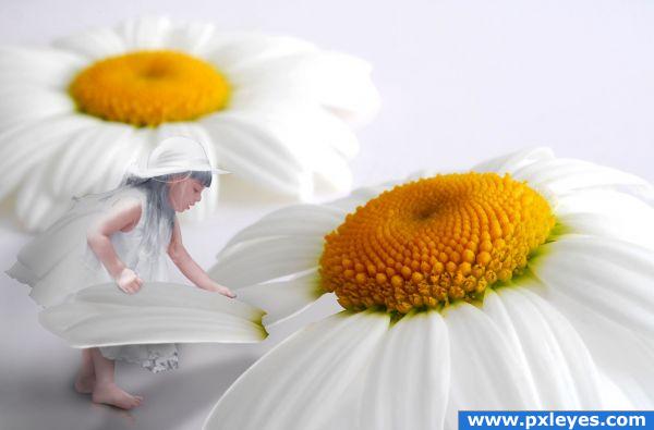
while playing with the flower. Accidentally the petal was broken. She is thinking what to do! (5 years and 3856 days ago)
Nice one
This is too adorable! Great idea!
too cute..i think u should change the contrast and level of the gal a lil .she looks dodged
The girls is looking very bright, but i love the image.. good luck 
I think you need to adjust some things, light come from left so the shadow shoul be different, there's a white edge on the petal ad the girl's lights are totally off.
the light on both pics are too diff.. other then that i really love the idea and composition
great quality work
pretty idea, but... in high resolution the girl looks very grainy, edges could use some work,also the lighting is wrong: light on the flowers is coming from right, light on the girl is coming from left. try to fix these and this will be a very nice image.
OH THIS IS SO CUTE! I am holding off on my vote to see if you take the other's advice.
great idea
Thank you guys for that helpfull comments. I have edited.
I think its a great idea and so cute! the only thing that bugs me is that shes got gray hair... which I now see is a black and white source image. I think if it were me I would give her some blond to go with the middle of the flowers... thats just an opinion though, you did a great job!
what a wonderful idea! The girl could use some more contrast or color and the light on it does not fit the daisy. Love it though, simply wonderful.
Howdie stranger!
If you want to rate this picture or participate in this contest, just:
LOGIN HERE or REGISTER FOR FREE

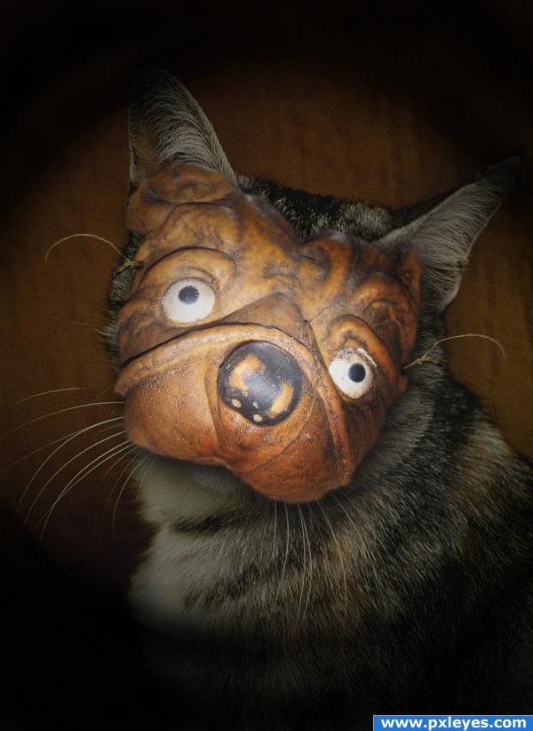
"Someone call Tyra Banks and tell her this is NOT what I signed up for!!!"
Thanks to criscris1 and ba1969 for the great images!! (5 years and 3861 days ago)
Nice image, maybe tone down your vignette a bit?
Really love this idea! Nice job with shadows too.
Howdie stranger!
If you want to rate this picture or participate in this contest, just:
LOGIN HERE or REGISTER FOR FREE
Well Done!
Howdie stranger!
If you want to rate this picture or participate in this contest, just:
LOGIN HERE or REGISTER FOR FREE