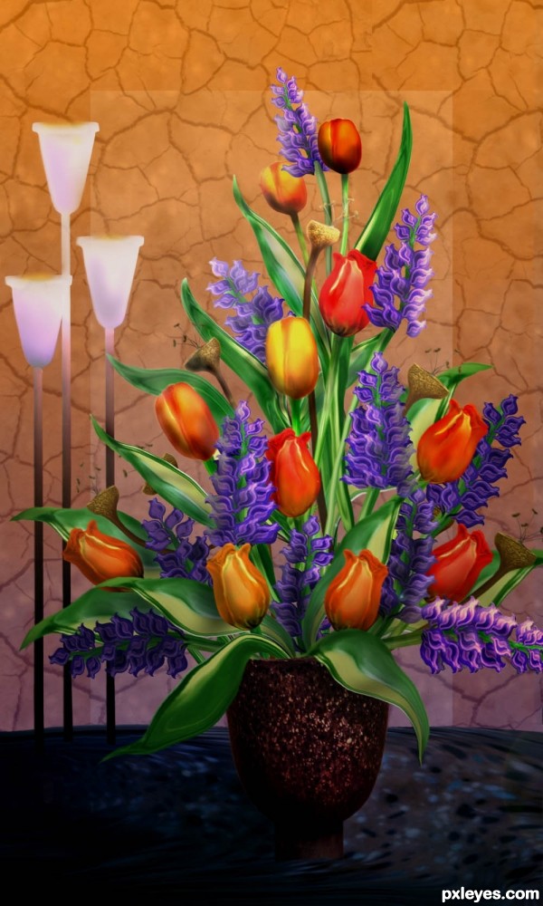
All images are from the source photo except crack pattern. (5 years and 3258 days ago)
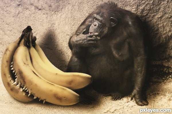
Thanks to g83 and tome213 at SXC.hu The monkey photo is my own. (5 years and 3395 days ago)
hah pretty cool !
You should add some more contrast on the monkey 
GL
Very nice ! Good Luck !
Aside from the scale problem, it's pretty funny. 
Thanks Nickk. Didn't notice that until I viewed it on a different monitor. Thanks Bob, I was going for Giant Bananas, maybe when I fix the contrast it will be more believable.
I made contrast, desaturation, and sharpening adjustments but doesn't it look like he should be smoking a cigar?.....anybody?
Too desaturated.
Must agree with MossyB. I saw previous work and looked much better then this... Bring us some colours!!! 
Thanks MossyB and daredevil. I'm usually bent towards the black and white side but this just might get me into the top 6!!
Yeah, cigare would be cool IMO, you could try it, if you can make it realistic.
Excellent blending and idea well executed! Glad you decided to bump up the contrast on the ape! GL! 
LOVE THE TEETH!!! 
Cool work author...best of luck
HAHA this made me laugh for some reason! Very nicely done. The monkey's expression is like "Oh Sh*t!" lol
i honestly had higher hopes but hey, at least you still get points. It was definitely one of my favs. 
Howdie stranger!
If you want to rate this picture or participate in this contest, just:
LOGIN HERE or REGISTER FOR FREE
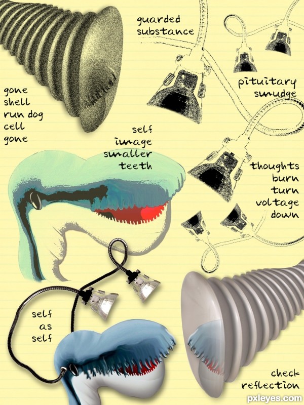
source (5 years and 3483 days ago)
very very nice different approach...good luck author...
ahhaahah wow cool
Howdie stranger!
If you want to rate this picture or participate in this contest, just:
LOGIN HERE or REGISTER FOR FREE
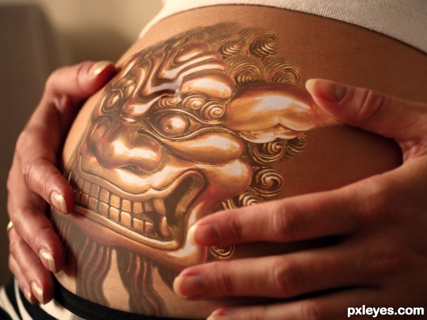
(5 years and 3560 days ago)
Very realistic your blending is terrific and the idea is exceptional. welcome to pxleyes 
Creepy! I'd try to tone down the white highlights a bit.
Overall this has some really nice blending, only nitpick would be the bellybutton. At first I thought it was a tattoo, which would mean the highlights might be to bright. After reading your title, the highlights really do work. Good luck!
Try to make the navel appear. It's a nice creation, author! 
Howdie stranger!
If you want to rate this picture or participate in this contest, just:
LOGIN HERE or REGISTER FOR FREE
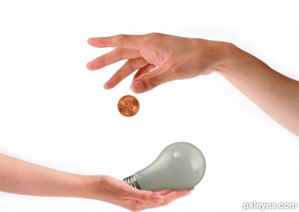
Thanks to demordian (hands Notified by PM)
Nbauer (Penny) and jonra (lightbulb)
(CS3 & Tablet) (5 years and 3592 days ago)
motion blur would be a great idea -- but every time I try to use it my version of CS3 crashes.No fix has worked including a full clean install
THis is a nice clean, cleaver entry. There is room for improvement on the masking. Try using a smaller brush or use the pen tool to cut things out. Good luck!
This is nice! 
Very interesting because you illustrated a literal idiom by incorporating a different figurative idiom, specifically, illustrating the abstract notion of thought as a 'light bulb moment.' I personally think a lit bulb would be a better depiction of a 'light bulb moment,' plus more than one bulb would better conform to the plural thoughts.
great work!
nice
Howdie stranger!
If you want to rate this picture or participate in this contest, just:
LOGIN HERE or REGISTER FOR FREE
amazing!
Beautiful work!
beautiful work...best of luck author
i knew this was you, you do the most amazing flowers..i adore your work! best luck !
I love the pods the most, very nice again, author.
Congrats Lois, lovely as always!!
Congrats Lois a beautiful piece of work
congratulations
Congrats
Howdie stranger!
If you want to rate this picture or participate in this contest, just:
LOGIN HERE or REGISTER FOR FREE