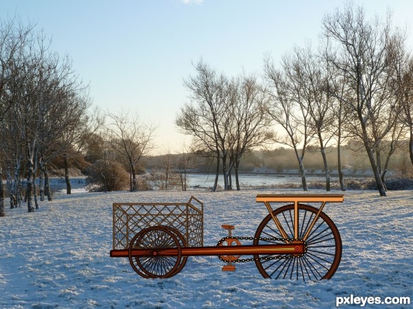
Spec Thanks to CorneliaMladenova for use of this picture found in member stock on PXLEyes.com & in cork& country album (5 years and 3315 days ago)
- 1: source1
(5 years and 3456 days ago)
Howdie stranger!
If you want to rate this picture or participate in this contest, just:
LOGIN HERE or REGISTER FOR FREE
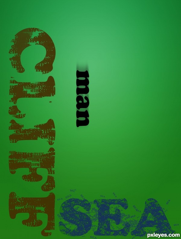
"My time has come, and so I'm gone. To a better place, far beyond. I love you all as you can see. But it's better now, because I'm free." (5 years and 3465 days ago)
NICE IDEA 
Dramatic!
Had to think twice - and it´s very cool!
i love the indirect humour created here 
Lovely simplicity. 
I really like this—u really understand the true meaning of type design.
gosh... that poem sent a damn chill down my spine dude.... words in image were very obvious of first look, well done  and goodluck.
wow..dint get it at first look n now it appears awesome.. great concept!!..
gl author 
hahahahaha...great thinking...well done author
Howdie stranger!
If you want to rate this picture or participate in this contest, just:
LOGIN HERE or REGISTER FOR FREE
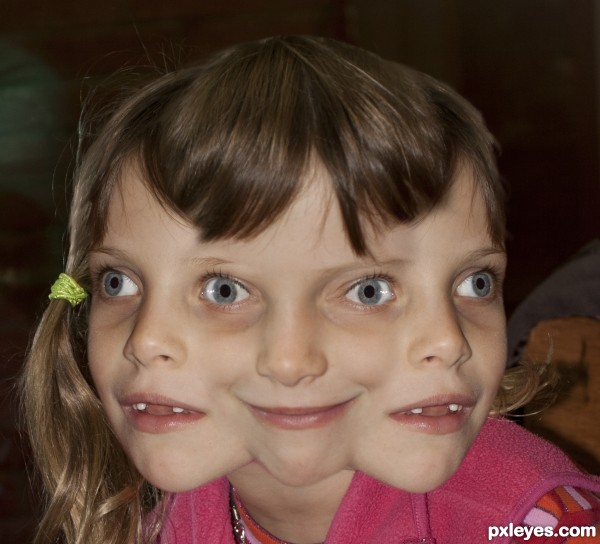
2 images used and blended
1. photo of girl
2. other photo of same girl (5 years and 3486 days ago)
A little strange but well done!
hehehe.. super weird and fun.. (this is great author... consider as a suggestion making ONE chin, (merging the three together will create a very unifying from, make the head into one unit.. at the moment it looks like three heads merged, a single chin might help make it look like ONE head more clearly) THIS IS ALL JUST IMHO!!! of course 
Wonderful work..hehehe.. good luck
awesome!
LOLin hard 
omg...
so funny
Howdie stranger!
If you want to rate this picture or participate in this contest, just:
LOGIN HERE or REGISTER FOR FREE
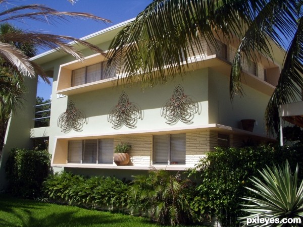
my photo and source (5 years and 3616 days ago)
looks good 
that's realistic.... good luck
It´s a very nice idea, simple and yet sooo good! But you have to smaller the one shape that is most far away so the perspective matches. Not much, just slight.
thanks sunzet.. FIXED
Author, you're so great in realism too... Very nice decoration!  And very beautiful building as well...
Very cool work...and u turned this in something very very realistic and achieve perfect blend...good luck author
author! nice to see something realistic every now and then from you. a few tips though; fix the shadows. the first one doesn't line up right with the original shadow on the wall, but the third one is overlapping it up to a point. add some grain to the lilies and a slight blur to make it look great in high res too! 
realistic work
thanks elficho.. add some grain and blur 
Howdie stranger!
If you want to rate this picture or participate in this contest, just:
LOGIN HERE or REGISTER FOR FREE
Interesting work...IMHO would be better with some other background..maybe a bit more dynamic instead of this one...GL author
Hey Thanks erathion Here's a different backround Any better?

Edit.......... pixelkid Thanks I did a remake couldn't get it in I darken it like you said looked better but I was to late
You did really nice work on the bike...using the source the way that you did...seems that it was very time consuming. However it looks slightly out of place on that background. It kind of looks like an illustration on an actual photo. Perhaps if you darken the entire bike and have the shadow follow the shadows on the trees...this might help. Nice work nonetheless!
Interesting idea and many thanks for choosing my stock
Howdie stranger!
If you want to rate this picture or participate in this contest, just:
LOGIN HERE or REGISTER FOR FREE