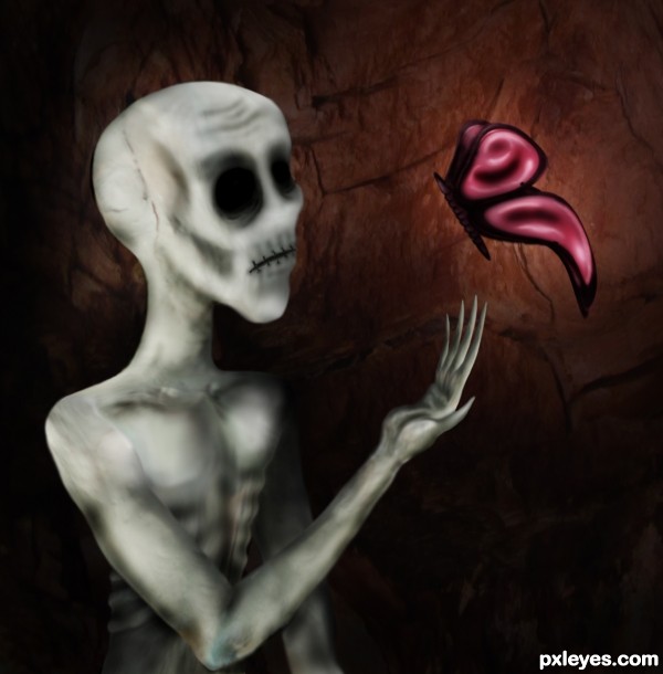
only source image used, along with my own image for texture. (5 years and 3623 days ago)
Photography and photoshop contests
We are a community of people with
a passion for photography, graphics and art in general.
Every day new photoshop
and photography contests are posted to compete in. We also have one weekly drawing contest
and one weekly 3D contest!
Participation is 100% free!
Just
register and get
started!
Good luck!
© 2015 Pxleyes.com. All rights reserved.

very very cool work author...well done
really NIFTY!!!!.. the hands a bit hinky... (could be me) it just looks awkward (I can't get my eyes to move away from it) it feels like the palm is too small or missing components ( don't change it if you are happy with it... ... I'm just emoting

super cool image
nice
You did a nice job but...I just don't really like the kind of work where it's become impossible to recognize the original picture. All this is is a grey texture shaped into a figure...the only real component of the bird or bird-related object here is a small crack along the skull.
notice the butterfly wings. made from the light in the source picture. very easily recognized. as are the fingers... just a warped version of the neck of the bird. i do agree, you loose alot of the texture in my work with the liquify tool on the body... however, if you looked, you'd find plenty of the source being used. or look at the sbs.
you are entitled to an opinion of course, everyone is.
Thank you very much author. I know that the bird IS technically visible in the picture...but, IMHO, the source pic has just been over-liquified and over-burned to the point that it's being forced into a shape it has nothing to do with it to begin with. Once again, you did a good job, so, points for that. It's just the overall style of work that I'm not a fan of. But thank you for listening and making an argument rather than just flaming me as has been done to me in the past. :p
well, of course i defend my work. i work too hard on it for it not to be defended.
and if it weren't "manipulated" well, then ...it wouldn't be "photoshop"
and in art...we are all entitled to our own vision of what we see out of something.
when i started warping the body of the bird and ended up with what looked like a head, i just went with it. i am happy with how the work turned out (minus the hand of course, which i'm still not happy with), it just sort of took shape on its own.
but then again, at 3am...lots of things take shape that you wouldn't normally see. :lol:
very nice work
very good author
cooooolllll i like it . g l
great job! i like the way that butterfly pops out. you could try giving the shoulders more volume.
Funny... I didn't fear him, I feel a kind of terderness in his eyes (oops, eyeholes...)


And I agree with you, author, anatomy is very difficult, specially hands... oh my!
Really nice work. My suggestion (you take it only if you want...) is reducing a little the size of the butterfly's lower wings. Just it. And good luck...
Nice job... but the lighting on the character is looking strange.., still good to see this.. gL
Cool. Nice work on the mouth and the empty eyes
Howdie stranger!
If you want to rate this picture or participate in this contest, just:
LOGIN HERE or REGISTER FOR FREE