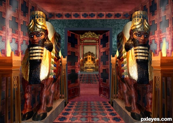
Thanks to Augapfel at flickr.com for the throne image. Statue and lamps are from my own source taken at the Creation Museum. Walls, carpets are from source of doors.
(5 years and 2988 days ago)
- 1: source1

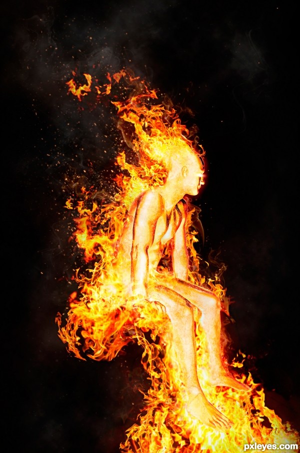
A friend of mine gave me an awesome source image to work from, of a guy sitting on a bed. So I decided to ditch the bed and have him sitting in fire instead! (seeing as this is a "fire people" contest I thought that was a good decision).
:) (5 years and 3391 days ago)
WOW! Nice chop author! My fav so far! GL!
AGREED!! this is phenomenal !! great job author!! best of luck
great entry, gl 
i agree with you all... this is genius...!
Wow thanks so much everyone! 
this is awesome
Really good
Excellent sources. Nice texture and work with the details and the shape of the fire 
Cool! Where's the throne? 
Haha Thanks! Well its not exactly a "throne", I was just going for the fact that he was sitting 
stunning work 
Congrats
Congrats!
Congrats...
Congrats
Congrats!!
Thanks everyone!! 
Howdie stranger!
If you want to rate this picture or participate in this contest, just:
LOGIN HERE or REGISTER FOR FREE

Edit:
- Fixed some masking problems.
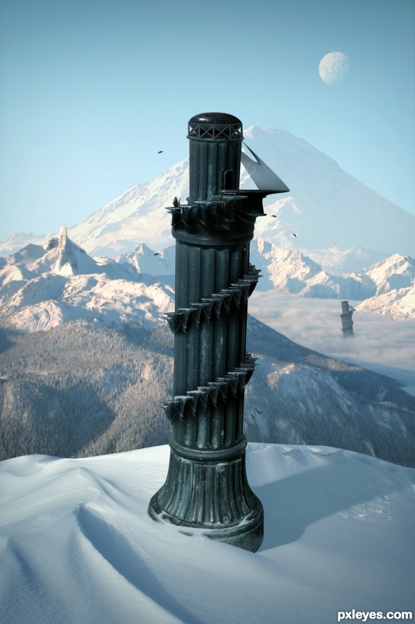
- Decided to go with a colder climate than the last image. (5 years and 3603 days ago)
Beautiful work... 
great great work 
Pretty fast submitted entry! I like the idea, you may want to mask the top of the pawn a bit better (some white edges here and there). Good luck!
Pretty good, but room for improvement!
Im not entirely certain, but wouldn't the shadow be bent outwards over the slope rather than inwards? - the shadow from the furthest tower is too dark in relation to the closest - and - maybe a little addition to some shadows from the terrain would help place everything better - especially from the mound covering the foreground tower as it's casting nothing...
Oh and the glare fom the bottom of the 'tower' it's not true to where you're placing your shadows from, so maybe get rid of it and add some highlights to the relevant side
Thanks for the comments.
Cool over all. I personally don't think the duplicate background towers add anything, however. Also, the palm trees look fake. And the hi-res version highlights the white edge around the tower's top and the fakiness of the tower-bottom and sand-dune edges.
The top of the tower still remains sharp and white spots are there . but this is a good image... you have to make some touches there... good luck...
Great but as above you could just try the matting controls, use the "layer" / "matting" from the top drop down menus and remove white matt or defringe to get rid of them, Then quick select and feather those edages slightly.
nice creation ................ i like it ........ Gl to u ..........
Thanks for the helpful feedback. Image is now complete.
Very nice, like the Pizatower, but in the mountains 
I like it! GL!
yeah a much better image!?!... GL 

i like the colder climate version!! great job!
This is why I don't participate in this contest 
Nice work, and well done, gl
Very nice, good luck 
Fantastic work author...IMHO u don't need other tower...any how this is great,high marks from me...best of luck
nice
Good.
GL
Thank you.
Super! It looks like the tower will fall out of the image at any moment 
Howdie stranger!
If you want to rate this picture or participate in this contest, just:
LOGIN HERE or REGISTER FOR FREE
Good use of the given source. Your photos of the statues are clear...why make them so grainy?
Fabulous room creation!
Howdie stranger!
If you want to rate this picture or participate in this contest, just:
LOGIN HERE or REGISTER FOR FREE