in the Chinese zodiac
2010 year of the tiger (5 years and 3745 days ago)
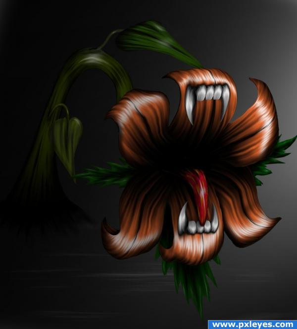
all made in photoshop (5 years and 3799 days ago)
very nice ...good job author
amazing like the colors
Lovely
Great!Very creative!
Beautiful work! 
very cool! gl!
great work,gl author
Like it a lot.......Nice job and Good Luck Author.
This is probably my favorite image on the page, but it doesn't exactly look "realistic" Maybe if there were a wildlife background? Still love it, gl
very nice 
Congrats
I like your "Carnivore Plant" bro. May I have permission to use it. I will give you all credit for promoting your image.
Howdie stranger!
If you want to rate this picture or participate in this contest, just:
LOGIN HERE or REGISTER FOR FREE
Saving the tiger means saving mankind..
Not only is tiger a beautiful animal but it is also the indicator of the forest's health. Saving the tiger means we save the forest since tiger cannot live in places where trees have vanished and in turn secure food and water for all.
If we make sure tigers live, we have to make sure that deer, antelope and all other animals that the tiger eats (its prey base) live. To make sure that these herbivores live, we must make sure that all the trees, grass and other plants that these prey animals need for food are protected. In this way, the whole forest gets saved! Saving the tiger means saving its entire forest kingdom with all the other animals in it.
--------------------------------------
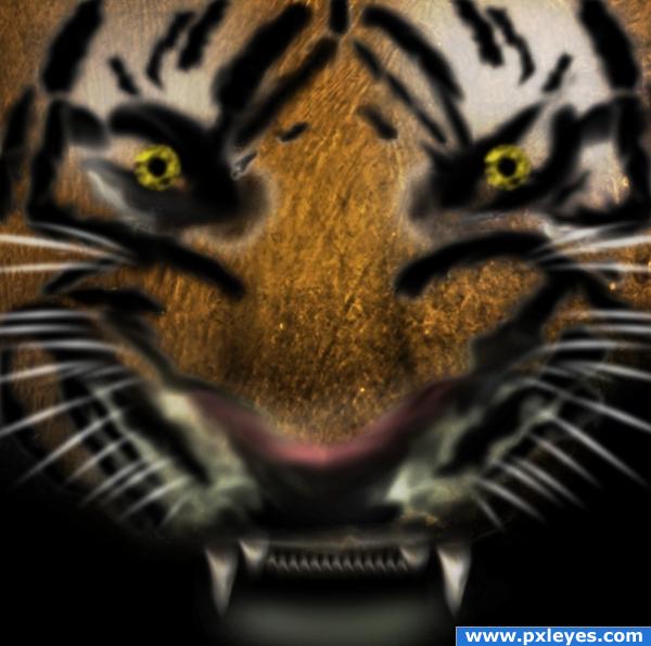
I have used only the source image to work this artwork.
tip - I have used the smudge tool over the cut out and adjusted the curves, hue and saturation, with the brightness / contrast to get the texture. (5 years and 3868 days ago)
Great artistic talent..... good use of source for coloring/shading!
Good use of source, good luck!
You should have used a real tiger as reference.
dear cmyk46, its not bad using references...its not an alien or pshyo character to do it with our imagination and creativity, this is a tiger its has its own attributes....sorry dear try somthing else.... 
Little too dark i think ~~
i really love this! the tiger is a little blurry though
good luck!
nice!!
agree with you, but we must save the entire planet is the only one we have.
I think I took too long to do the voting and it logged me out; now my comment is as a guest.
Howdie stranger!
If you want to rate this picture or participate in this contest, just:
LOGIN HERE or REGISTER FOR FREE
(5 years and 3871 days ago)
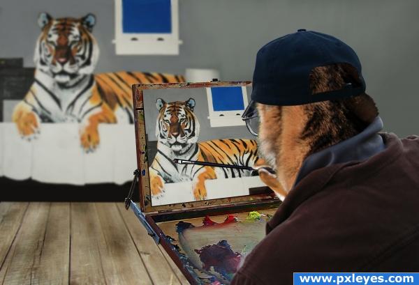
Nice work...maybe the painting could look a bit less like a photo & more like a painting, but it's a good idea. Link 1 doesn't lead to the pic you used.
Reminds me of Norman Rockwell.
ye me 2 downoffthedragon, good luck
Very nice! Love the man's blending with the tiger appeareance.
link 1 does lead to the right pic. I have flipped it around and cut out the head.
neat
I like it, good luck.
Congrats for your second place 
Congratulations for 2nd
Congrats!
Howdie stranger!
If you want to rate this picture or participate in this contest, just:
LOGIN HERE or REGISTER FOR FREE
(5 years and 3874 days ago)
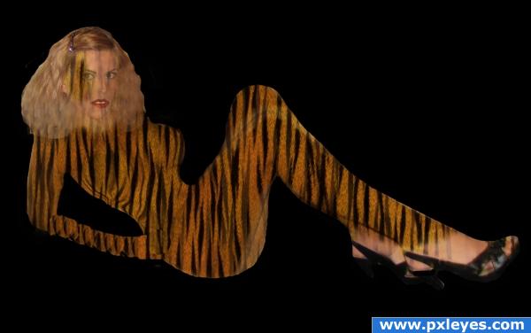
You've got the right Idea but you need to follow the natural shading of the body so the tiger print doesn't look so flat.. I'm sure other's will be along to help... good luck
Instead of using the whole piece of print and slapping it onto the woman's body and erasing around her, I suggest cutting out pieces of the tiger print that fit the different sections of the woman's body. What you have done here is make all of the tigers lines line up no matter what part of the body is showing. For example: the legs are sharing stripes at the knees as if the stripes were a dress. Even if you can't get the stripes to go in the right direction, you'll do better if the body didn't look flat.
Part 2. What you did with her arm isn't going to work, either. Try what I said before by cutting out parts of the print to make it fit the arm. There are much better ways to do this, but as a beginner, you might want to try this.
looks bad; please take into consideration the suggestions you received; you can also look at the comments of the entry before yours; that one has the same issues
thank you to all the people that left constructive criticism instead of insulting words. I will definately try your suggestions out and experiment, now that i have a starting point.
The idea is quite good. The best way to do this would be to use a displacement map after overlaying the texture at a 45 degree angle. Try following Eladine's displacement map tutorial, that should help.
good try! It is great that everyone tried to help too. I'm new and learning a bunch from others because we all start somewhere
Howdie stranger!
If you want to rate this picture or participate in this contest, just:
LOGIN HERE or REGISTER FOR FREE
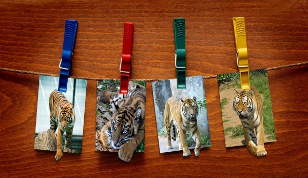
I like it, but I would use layer styles and dropshadows for the notes, looks more realistic,I think.
Tigers are distorted...
It's an idea, but you should apply some shadows where the clothes-pegs fasten the tigers pictures...
Howdie stranger!
If you want to rate this picture or participate in this contest, just:
LOGIN HERE or REGISTER FOR FREE