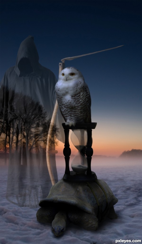
inspired by Salvador Dalis "persistence of time"
thanks to
Mihraystock at deviant art
and zbyszek80 at sxc.hu (5 years and 3031 days ago)

One more source in the SBS (5 years and 3032 days ago)
very nice blend of well chosen images -- great job
Kinda looks like he's stopping off for a pooping.. Not a bad thing if that was your goal... I really like it, but that's what I see... if you placed a Flush Pull coming down from the dead space on the right, it would really up it to hysterical.. sorry.. just what I see in this image.. very hard work here.. but the humor is where my eye goes
(Death kinda looks like he's waiting for his turn at the pot.. a toilet roll floating in space would send it over the top)
(oh lord I'm going to rot in hell)
wow very nice one!
Congrats Rob  love this one
Congratulations Rob...nice eerie image.
I have preceded the time and waiting for it to catch up with me, this is my general theory of relativity, an outstanding work, congratulations on the first place 
Howdie stranger!
If you want to rate this picture or participate in this contest, just:
LOGIN HERE or REGISTER FOR FREE

(5 years and 3041 days ago)
HAHA! TOP of the TOP! vote from me, instant FAV! PERFECT work !


Great work author...should'a put some little ankle biter blocks in there with it. 
Good work, very funny 
Lov it!..
looooov the face expression..hahaha
my fav!!.
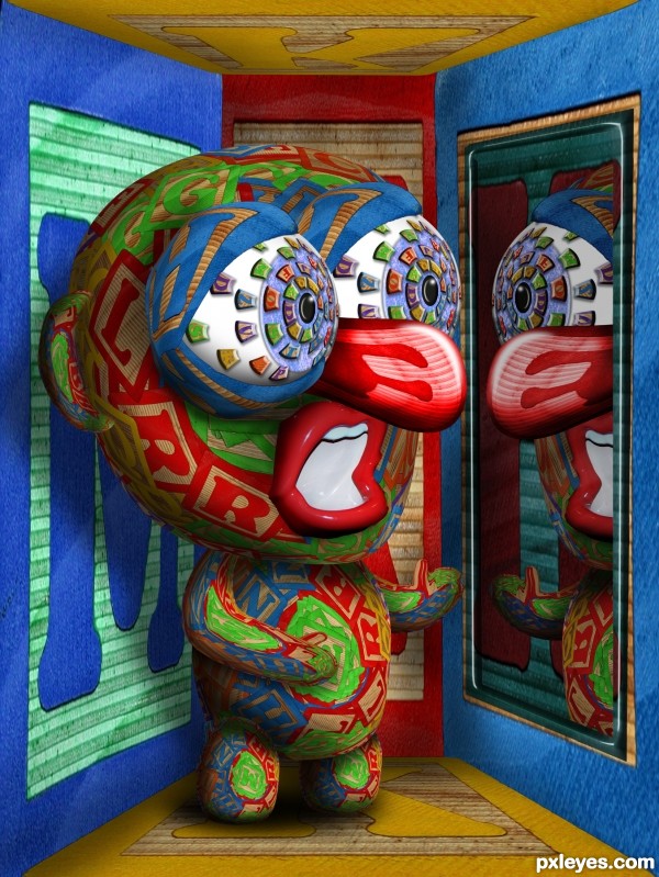
LMAO - well, that potty-mouth NEEDS a time-out! Good source find. Nice work, author. 
Cool red nosed guy 
Howdie stranger!
If you want to rate this picture or participate in this contest, just:
LOGIN HERE or REGISTER FOR FREE

All decorations were made with Photoshop. (5 years and 3047 days ago)
i think the tree is a little too bright but you did a good job on dressing it up!
OK Ela, I toned it down just a RCH  ...I mean a tad. Thanks
Nice work, that RCH worked! LOL 
I like the approach and treatment to the tree decorations. It's a bit confusing with all that light coming from behind the tree...the part of the tree the viewer sees would probably quite a bit darker. Right now, it's very evenly lit from our perspective. It's one of the downfalls to using a pic like this for the background...cuz you don't want to darken the work you've done. Nice job, nonetheless. Cool SBS.
Howdie stranger!
If you want to rate this picture or participate in this contest, just:
LOGIN HERE or REGISTER FOR FREE

Some pics and textures from my personal stock. (see SBS)
Also thanks to:
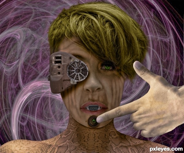
african fi - mouth
cafe-ole - button and jacks
krzysiuc - connector (5 years and 3053 days ago)
i don't know... she is dirty
Howdie stranger!
If you want to rate this picture or participate in this contest, just:
LOGIN HERE or REGISTER FOR FREE
Not bad. Might have more depth if the background values differed from the foreground.
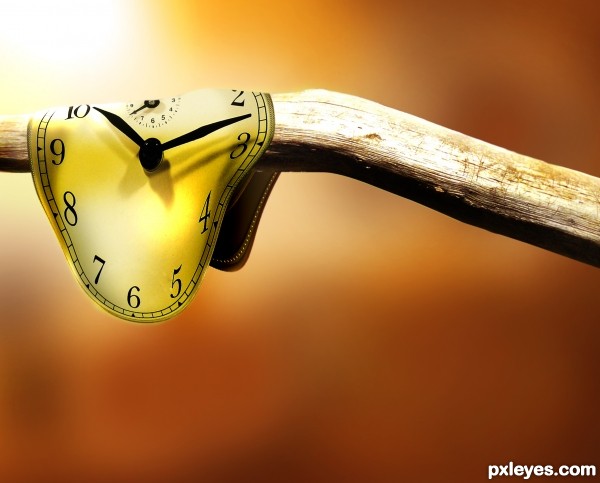
nice idea and well done -- the edge of the watch could use a touch up -- maybe a bit of burr to remove the pixelation
ok, those are good suggestions i will probably edit this entry soon,
what i was most concerned about was context for the branch, any ideas on how to make it seem more natural?
Nice job, author. Notice how bright the wood branch is to the right of the 'clock'...maybe try and brighten the clock right next to that bright spot with a soft edge and follow through that highlight area.
UPDATE: i took most of the suggestions, changed the background color for some depth and added more lighting effects and edge blurs for added realism and consistency,

thanks for the help
Much better image now, IMO...good luck!
Nice work on the clock. It would be nice if the little pointer was not cut off, but extended a little above the rest.
Howdie stranger!
If you want to rate this picture or participate in this contest, just:
LOGIN HERE or REGISTER FOR FREE