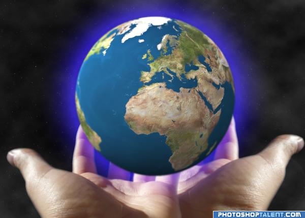
IT´S IN OUR HANDS (5 years and 3942 days ago)
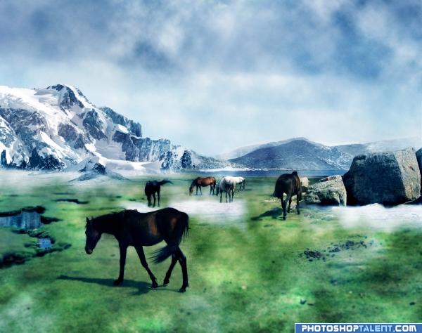
Thanks to marmit and Columbine. (5 years and 3949 days ago)
subtle and sweet..though an SBS would help to see the progression of your work.... good luck
Nice
Pretty Image....Good Luck
nice feel
I like it so much.This reminds me some scenes from narnia....EXCELENT
like the mountains
Howdie stranger!
If you want to rate this picture or participate in this contest, just:
LOGIN HERE or REGISTER FOR FREE
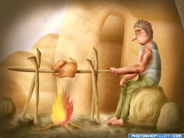
ONLY SOURCE (5 years and 3952 days ago)
good idea
Great idea, you put a lot of work into this one I can tell, perhaps move the man down a little, he seems to be floating over that rock rather than sitting on it 
Picasso Meets Kahlo Meets Tex Avery?!?!?!?!.. HOW THE HELL DID YOU DO THAT?!?!?!?!?! Change the name to Roasting the Road Runner and I would have fainted LOLOLOL.. great job and high marks.. I'm still in a whirl.. I WANT THIS ABOVE MY DINING ROOM TABLE!!!.. what a wondrous work of art .. Congrats Author
A lot of work here and well done!  GL
GL
Nice scene wonderful work on this!
coooool fire looks so real
Org thanks for comments, I have made some color changes and placement of figure.
Very unique use of source!
i like what you done here
pretty cool 
haha, what a party, very big turkey yummy
good job authur
Gotta love these 'source only' entries! Really creative work, author!
Howdie stranger!
If you want to rate this picture or participate in this contest, just:
LOGIN HERE or REGISTER FOR FREE
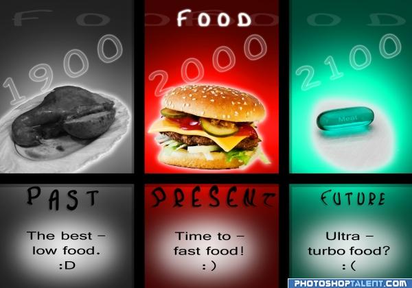
Is the future so awful?...
I don't know...maybe
:|
_______________________________
Check this out! (5 years and 3953 days ago)
Great concept nicely done author!
very unusual use of text, and done very well.. good luck on this.. the work is finished awesome
Great idea! A little heavy on text per my taste. It's not accessible (as I would say in my field of work). Still love it.
i like it
good idea, execution can be improved
Great idea but ditto on the text comments. I'm curious about the white bars at the bottom of each window. That part eludes me.
great idea author!! 

great idea
I totally believe in this; the future is not as bad as it seems though
you did very well
Howdie stranger!
If you want to rate this picture or participate in this contest, just:
LOGIN HERE or REGISTER FOR FREE
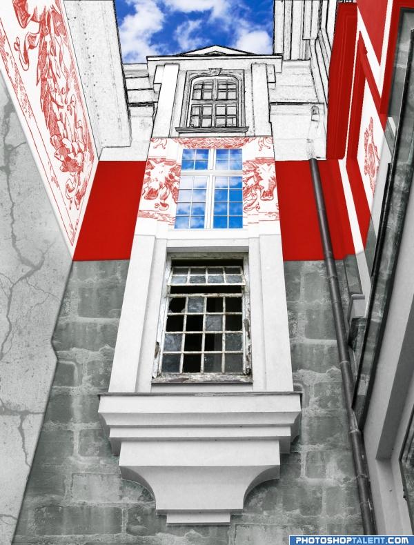
The Past is gone, we like it no more;
The Present shines with all the britest colors;
The Future, it is canvased from us all
Into the shapes and lines, and gathered into figures... (5 years and 3954 days ago)
Nice layering into time.. love the perspective.. GOOD LUCK!!!
GolemAura, thank you for the comment.The image is not perfect but, hopefully, the idea is visible 
The past and future is ok, but present.............need to improve
nice!
good one
Nice description, I like it, Good Luck 
Ory, thank you. Took me a while to create. I hope it will be useful for someone as well.
I like the idea of the future being not painted yet
nice work
Interesting idea, but image is not understandable without the theme and your description. I don't get what about the middle segment conveys the present beyond the reflected sky. The future window seems incredibly classical to me with the side columns and pediment. (A future level that looked like a blueprint might help convey the notion of prospectiveness better.)
interesting perspective;what a great idea would have been to do this building different styles of architecture
DanLundberg, I really liked your idea about the blueprint, and even wanted to try and put it into live in this contest. Unfortunately, for the past couple of days I wasn't able to get back to my work, so don't think it's wise to change anything right now.
akasha, didn't think about that, but like the idea.
you did very well
Howdie stranger!
If you want to rate this picture or participate in this contest, just:
LOGIN HERE or REGISTER FOR FREE
The right hand looks a little bigger than the left hand i think.. maybe its just me. Anyways, nice message, and the image has a very nice 'Act Now' type of feel to it. Well done!
thanks , for comment , in hands they are not in same line, i only flip then and adjust position u can see better in stp by stp.thanks
great idea.....
like the double hand effect
As said above nice message, but I dont get well why you decided to make the edges from the earth and hands so blurry. Unless you want to create a certain Depth of Field effect (but then the inside of the hand needs some blur too), I'd make it all sharp. In case you can make it this way that the light direction comes from one point, would be great (or make it like that that there are 2 light sources, in that case there should be some more higlight on the right side of the earth too). Good luck!
good idea. check light source and lighting
good
nice idea. but have you considered putting the hands one next to another instead of infront of another and rotating both a bit (or even warping) around the planet? also, put some reflection on the hands.
hello elf i try some other ways and to be honest i think this one is the one who works better, thanks
I think this would look better with just one hand
Howdie stranger!
If you want to rate this picture or participate in this contest, just:
LOGIN HERE or REGISTER FOR FREE