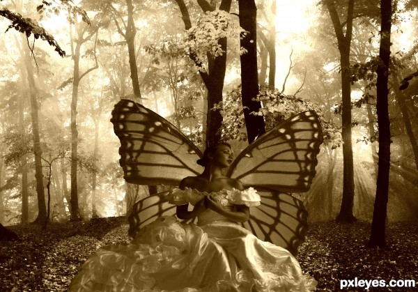
thanks marcus ranum ,davidplex
be kind this is the first one i did with adobe i usually use corel (5 years and 2939 days ago)
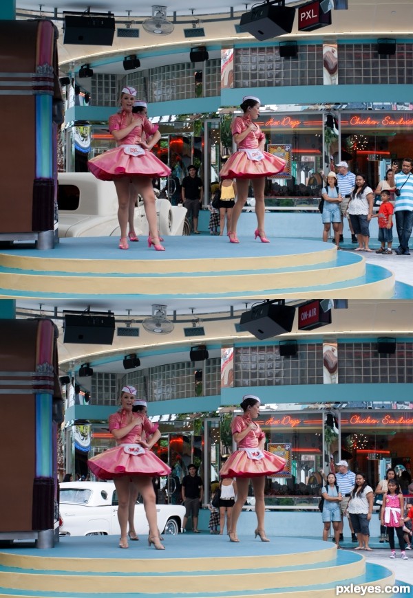
6 differences,
used 4 images of my own.
(5 years and 3044 days ago)
very nice 
got 5
Howdie stranger!
If you want to rate this picture or participate in this contest, just:
LOGIN HERE or REGISTER FOR FREE
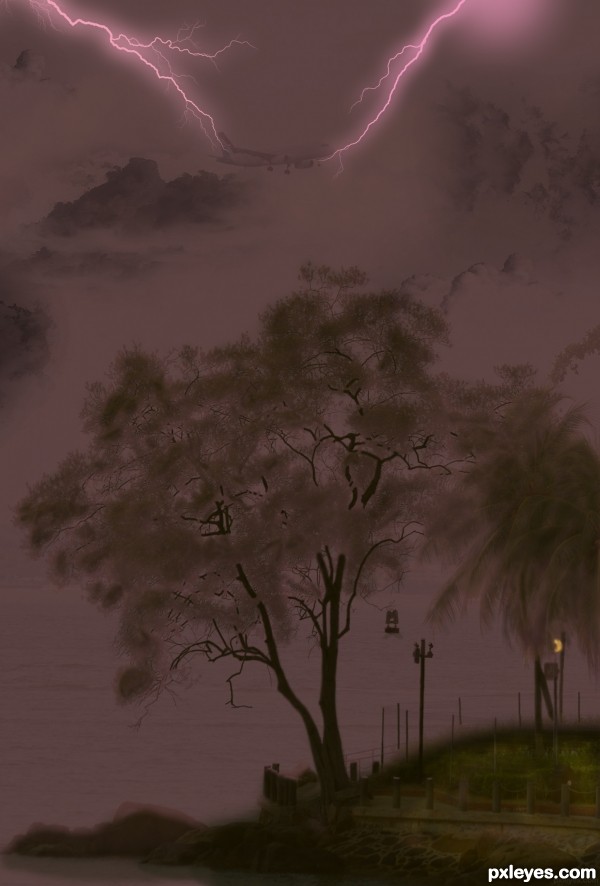
Brushes for the clouds: http://www.obsidiandawn.com/clouds-photoshop-gimp-brushes
Brushes for the lightening:
http://www.obsidiandawn.com/lightning-photoshop-gimp-brushes (5 years and 3137 days ago)
very nicely done author..
Spooky, ghosts and bats are to come soon 
Lovely work author! best of luck!
Howdie stranger!
If you want to rate this picture or participate in this contest, just:
LOGIN HERE or REGISTER FOR FREE
(5 years and 3247 days ago)
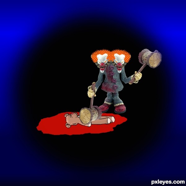
Poor teddy...murdered in cold blood. lol! Nice one.
hehehehehe.. silly author.. LOL.. well done in a very pure aspect.. love the hair you created... hard work.. good luck
Hey Thanks guys for the comments
Howdie stranger!
If you want to rate this picture or participate in this contest, just:
LOGIN HERE or REGISTER FOR FREE
(5 years and 3251 days ago)
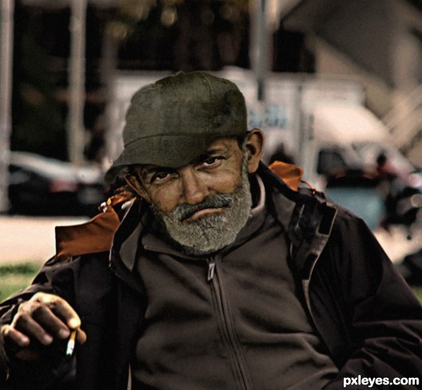
great expression of the guy..I would like to make the hand a little bigger. goodluck
as rakib888 said.. if you placed the hand next to the face you would have a bit of trouble believing the image.. quite and easy fix in my opinion.. but it is your vision author.. do what you feel is right
you are right, I had not noticed I've changed thanks
Howdie stranger!
If you want to rate this picture or participate in this contest, just:
LOGIN HERE or REGISTER FOR FREE
Nice...might be good to remove the black outline around the woman, and make the wings slightly translucent.
Besides the black around the figure there's a lot of white and ragged edges on the butterfly as well.
IMHO as I said, the wings might be better with a bit of transparency, but that's up to you, author. There's some distracting type on the left wing in hi-res. I liked the color version better.
Using just light and dark (not color) is dramatic but also challlenging. I agree totally with the previous commenters. I further suggest employing the Rule of Thirds and moving the fairy to the left so she doesn't blend into the trees while creating a more-compelling and balanced composition.
DanLundberg makes good points about the composition, as it is now you have the classic mistake of having a tree growing out of her head. The type CMYK46 mentions is from the Marcus Ranum image. The mask work has many problems, you should try using layer mask to silhouette an image. This creates a temporary mask that allows you to bring back the edges of the image that may have been too deep or uneven since the image is still complete under the mask.
Howdie stranger!
If you want to rate this picture or participate in this contest, just:
LOGIN HERE or REGISTER FOR FREE