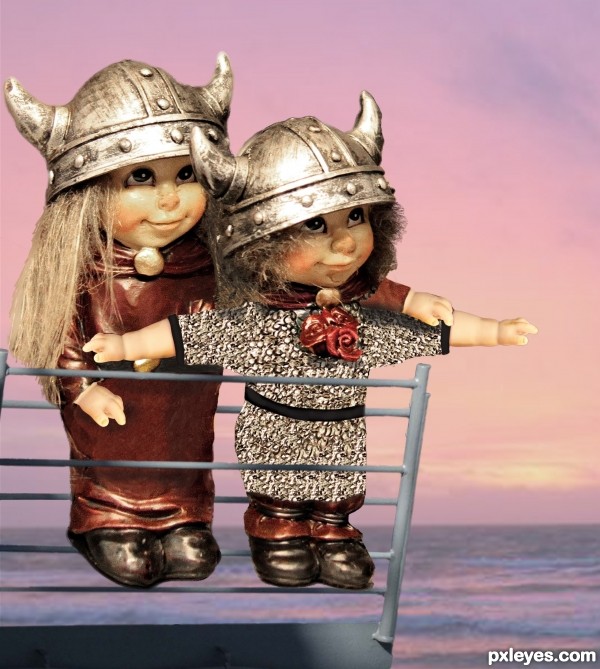
This was titanic fun. See SBS for details. (5 years and 2658 days ago)

(5 years and 3825 days ago)
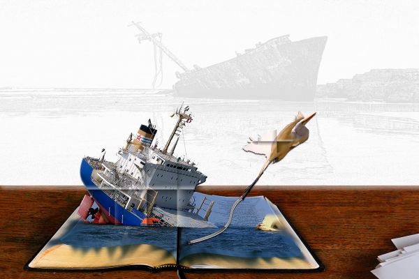
This really doesn't look like a popup book. You can tell it was chopped in and not layered well.
i agree with you but i did my best sorry
I think it would help if you put a crease along the boat where it would be folded when the book closed. Also attaching the bird to the boat will make it look more like a real pop up. Here's a link to a good tut for adding creases if you need help http://www.planetphotoshop.com/folds-and-creases.html
I 've followed your advices and go to the tutoriel that sundevil356 gave to me hope it's look better now ! Thanks
This looked a lot better before your edit.
I think you just added too much folds, there's no need to put folds on your boat or bird, only the water needed folds? and u might want to get rid of the blurred stuff coming over the edges of the page? anyway I hope you make it a bit better, the idea is good, but u can still work on the presentation.
Maybe less folding, if it had that many folds in it, then it wouldnt pop out of the book. Good idea though, goodluck.
good idea but image mixing is not looks... 
dont understand how this would work as a pop up book!...
Howdie stranger!
If you want to rate this picture or participate in this contest, just:
LOGIN HERE or REGISTER FOR FREE

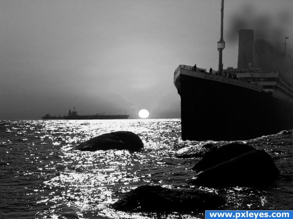
Titanic II.It's going to hit the rocks this time ;D.Used a photo of Titanic and my own captured photo and the main source. (5 years and 3970 days ago)
great ideea, high marks for originality
Is the title of the movie 'Titanic 2: The Small Stone?' Hehe.. it doesn;t look like it'll be doing too much damage, but greate creativity. Good luck!
Of course it will do damage! Are you kidding? That stone isn't sticking of the ocean floor. That ship is about to hit the shallows. It's going to run aground, the rocks are going to tear into its hull and the Captain will NOT make Admiral!!
hmm its good thought keep it up!Very origionality!Shadows are also kept good!KEEP IT UP BUDDY!
good creativity!keep it up!
in that shallow of water.. it would already be kerplunked... hehehe.. great image
those are some huge rocks!
that ship is going to get in trouble...a modern titanic perhaps? 
Howdie stranger!
If you want to rate this picture or participate in this contest, just:
LOGIN HERE or REGISTER FOR FREE
Please fix link 3.
fixed - thanks
Awww, cute!
Howdie stranger!
If you want to rate this picture or participate in this contest, just:
LOGIN HERE or REGISTER FOR FREE