Add a description... (5 years and 2621 days ago)

Would you rather lick a plastic ball or a tiny Elephant? (5 years and 2623 days ago)
The shadow of the elephant on the hand is of a color which doesn't fit (give the shadow a darker color of the hand and not gray! A shadow is lack of light on the reflecting object and not a black light projected on that object  ).
).
Another thing which can be improved is that the elephant is way sharper then the hand which makes it stand out.
I do like the photo you used of your children though the expression on the face of the little one fits perfect. Besides that the elephant in the hand is a good find.
Thanks for the comments. Agree with the shadow, adjusted it. The Elephant is actually not drastically different in noise and blur as the hand, it just stands out more. Note the butterflies on the shirt, they look less blurred as well. Blurring that size element at 1 pixel can make a big difference.
I think the issue isn't sharpness it's the levels of darkness/shadow
No.....!!! Don't eat him! I wonder if elephants taste like peanuts? LOL. This is cute. Great idea.
Lol, they taste like chicken, but she's only sucking on him, no worries!
Howdie stranger!
If you want to rate this picture or participate in this contest, just:
LOGIN HERE or REGISTER FOR FREE

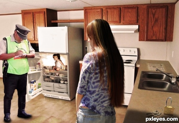
"I am sorry ma'am, but I am going to have to write you up. That child is clearly not old enough to be locked in the fridge!"
Stupid Law: http://www.stupidlaws.com/children-under-the-age-of-5-must-not-be-locked-in-a-refrigerator/ (5 years and 3117 days ago)
lol i think that law falls under the child abuse law, since this is a canada ottawa law it seems very useless indeed 
Hehe I thought it was funny because the law itself that it is perfectly ok to lock children over 5 in the fridge. I'll remind my teenage daughter of this ability when she acts up! :lol:
Nice work! Funny too!
hehe great idea author.. just dont put anything too yummie in the fridge or u might find it empty lol
Howdie stranger!
If you want to rate this picture or participate in this contest, just:
LOGIN HERE or REGISTER FOR FREE
You might want to soften the edges of the camel to match the sharpness of the surrounding image.
 send me a PM so I can illustrate.
Also when adding shadows make the 'connection' of the two surfaces similar in darkness. i.e. the camel looks a bit like it's floating because the darkness of the shadow you made doesn't match the parts of the camel that are meant to be in contact.
The shadows are about right in strength, you just need to add that much darkness to the camel as well, or lighten it up where it's darker. If you don't understand what I mean (which wouldn't surprise me because sometimes I don't express myself very well
PS: Just want to help!
Hee-hee! Sweet!
Thanks!
Howdie stranger!
If you want to rate this picture or participate in this contest, just:
LOGIN HERE or REGISTER FOR FREE