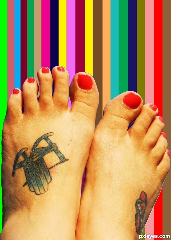
The image tells it all. (5 years and 3314 days ago)
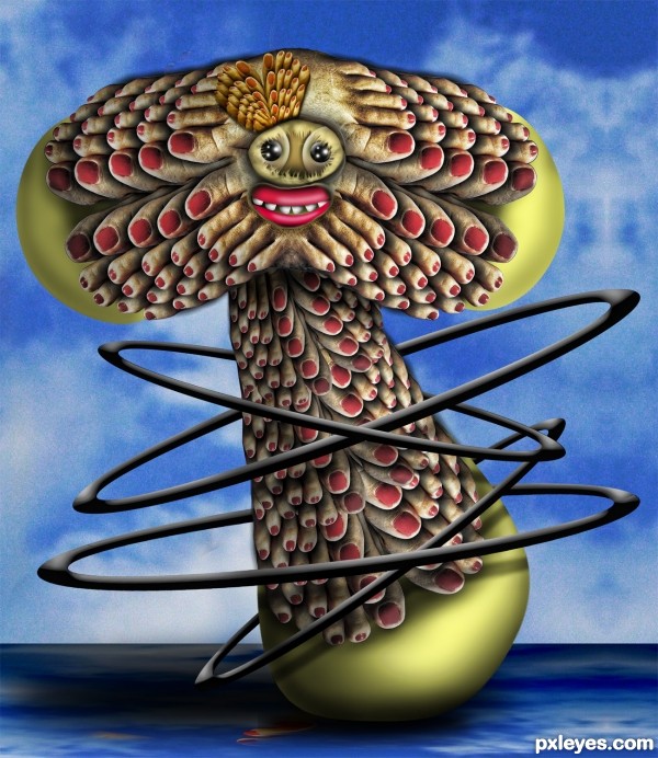
(5 years and 3318 days ago)
Fantastic and very creative!
The toes are cool, but I especially like the hoops, nice overlapping work. 
I just love this........so much your style......best of luck!!
Howdie stranger!
If you want to rate this picture or participate in this contest, just:
LOGIN HERE or REGISTER FOR FREE
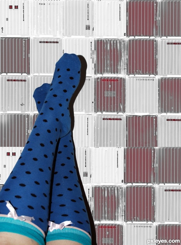
thanks meddygarnet (5 years and 3475 days ago)
This is pretty simple, but a very nice composition.
Bird in Space 
very very cool work author...I love it...shadow is made perfectly...well done
Howdie stranger!
If you want to rate this picture or participate in this contest, just:
LOGIN HERE or REGISTER FOR FREE
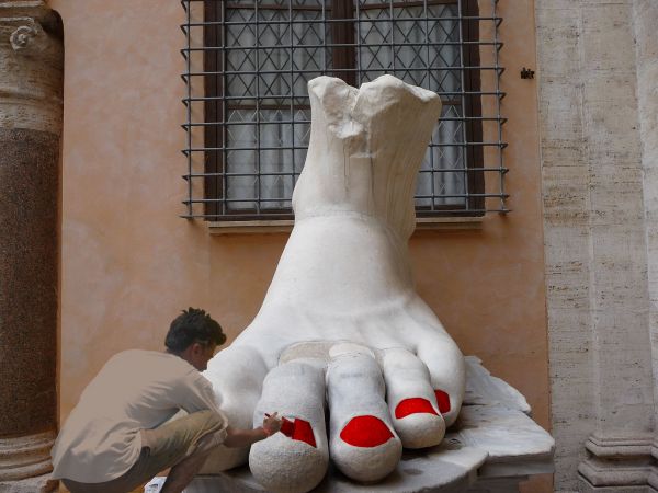
Thanks to Onatosand srpatel at www.sxc.hu for the stock images (5 years and 3824 days ago)
very good
Good idea!!
Love it! GL
cool
LOL!!!!! very nice Ideia......try get more realism in the man!.....hahahahaa very funny
I would suggest upping the contrast a hair on the painter. Other than that it's a clever idea.
Nice idea, but the painter is a bit blurry.
Adjust levels on figure...
good idea! 
masking need work -- edges need to be softened and follow the nail more closely
Mindblowing idea..........I liked it a lot.......
thanks for all your comments andadvice, unfortunately due to a manic week have been uable to adjust my entry on time, but have taken heed and will get back to it to make a more precise pedicure
Howdie stranger!
If you want to rate this picture or participate in this contest, just:
LOGIN HERE or REGISTER FOR FREE
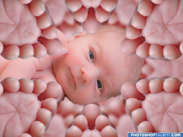
Kaleidoscoped toes. (5 years and 4048 days ago)
the name of the Piece should be kaleidoscoped toes.. hehehe.. great job..
Seems more like "Mutant-Baby Toes" to me when each freaky foot has at least nine toes. I also think it's all too pink. A funky-foot frame in a contrasting color for the baby photo (source?) would be more effective IMO.

 .......I never expected such type of abstract......
Great use of k-scope plugin - would love to see more of these!
good design, but cutout not ok
Honestly I like step 4 toes better then the ones you got up there that's just me ,but nice kliediscope idea. Good luck
Howdie stranger!
If you want to rate this picture or participate in this contest, just:
LOGIN HERE or REGISTER FOR FREE
There's a slight outline where you've cut the feet from the background. The rainbow background you've added also looks very flat, with no shading or depth to match the feet so obviously pasted on top. Perhaps a very slight bit of shadow to correspond with the feet will help.
The thought was to have the background as a color chart from a distance, on a wall to see what color you want the nails done in. With a choice one can see better than looking at the small dot on the lid.
GL
Interesting explanation, author. I'm glad to have it, since my initial answer to your description ("The image tells it all" was "Ummm... no, it doesn't." Maybe it's because I do my own nails.
  Good luck. MossyB makes a good point about the masking. Expanding your selection by 1 or 2 more pixels would remedy that next time.
**CORRECTION: CONTRACTING your selection (make the selection smaller than the outside edge of the object you want to keep) by 1 or 2 pixels. Sorry! Another way to smooth the edge is to feather it by 0.5 pixels before the chop.
Thank you for all the input. Everyone
I try to use all the helpful information that I can.
Being new to PhotoshoP and finding it a fun way to express ones views and imagination by simply looking at something, than trying to apply that to the project, makes for a fun way to learn through trial and error to refine the art.
Howdie stranger!
If you want to rate this picture or participate in this contest, just:
LOGIN HERE or REGISTER FOR FREE