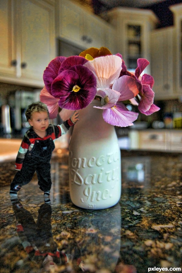
My new nephew, a super bundle of energy :)
SBS photo has blacken out eyes for privacy reasons (5 years and 2985 days ago)

(5 years and 3258 days ago)
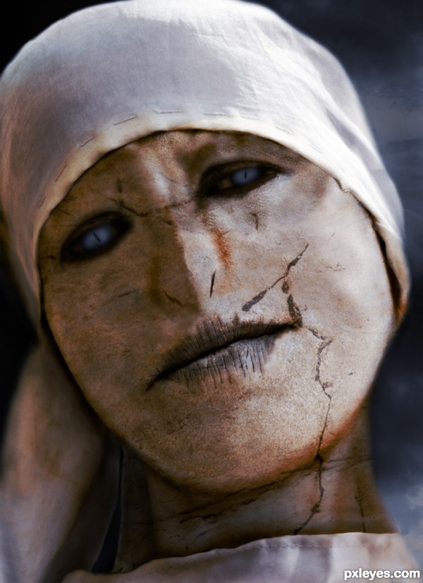
Great concept, but the nostrils are sloppy and offset. The one on the left goes up into the cheek, and the one on the right is noticeably thinner and is placed too high compared to the one on the left.
They are also obviously painted on, appearing solid black, instead of trying to match the darker tones of the rest of the image.
Better, but now they are a bit too small and "slit like," and the addition of the weird cracked stone texture is very distracting - especially the heavy diagonal mark above the lip. It doesn't really look like a statue, nor like "Tom Riddle's sister," it looks like a facial mask treatment gone bad... 
Howdie stranger!
If you want to rate this picture or participate in this contest, just:
LOGIN HERE or REGISTER FOR FREE

Play on the Mark Twain Classic ... Tom Sawyer (5 years and 3433 days ago)
cool thing with great colors...gl author
Smart idea, I liked that book.
Very cool white fences ya got there, and 'Do it yourself!!!' author - it's perfect! 
(well, all except for Tim's spelling, LOL, should be 'too' in both cases, but then he did skip school - along with his twin brother Tom - a lot as I recall.) 
Oh Yeah!! it is TOO, dammit LOL (I Had to use Tim because TOM SAWYER PAINTING is a real business, some place in Texas)
Howdie stranger!
If you want to rate this picture or participate in this contest, just:
LOGIN HERE or REGISTER FOR FREE

(5 years and 3645 days ago)
ahahahahah i like it
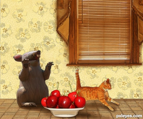
the light source is different between mouse and cherry

Howdie stranger!
If you want to rate this picture or participate in this contest, just:
LOGIN HERE or REGISTER FOR FREE

Credit to werksdesiq from sxc for the tree
credit to qrnqobstpr from sxc for the sky (5 years and 3724 days ago)
hehehe.. I get first squeeze!!!!!
Please fix link 1.
ooooooooo.... aaaaaa  nice ..don't forget your sbs ;P GL
so cute 
Very nice...good luck
and me
nice mood and great job..... Gl
great job
great job
this is cool  good luck
love a mearcat
love a Meercat
GL on this creative entry.
Nice composition and well done.....B.O.L. Author.
so cute... i really like this entry.. GL author, Tom, Dick, Harry 
wow..gl
congrats.....
Congrats!!!! 
Howdie stranger!
If you want to rate this picture or participate in this contest, just:
LOGIN HERE or REGISTER FOR FREE
I think you've gone too far with the effects, the poor child looks like he has leprosy and you've lost the rich color of the flowers.
Removed the neutralizing filter (was going for that moody thing other people do, guess I missed the mark)
Intriguing concept. His reflection in the countertop is stronger than that of the vase, however. And his hand on the vase is disturbingly vampirish and weakly shadowed IMO.
Howdie stranger!
If you want to rate this picture or participate in this contest, just:
LOGIN HERE or REGISTER FOR FREE