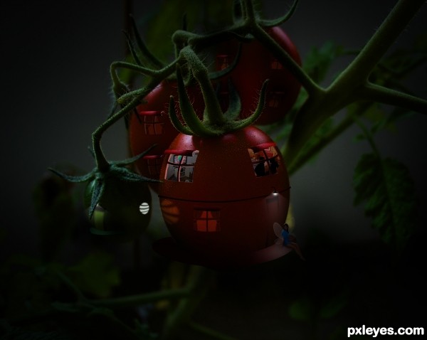
Hi
Hope u all like this.... Please have a look on Hires for details...
worked on a thought like, human being lives in tomato and can fly...
(5 years and 3400 days ago)
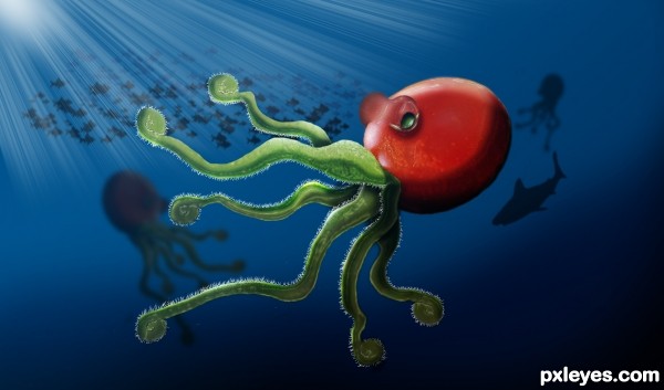
As in the previous picture I could not use the ocean floor, created the background. I drew the fish after I turn brushes i gave a slight blur. Read the step by step tutorial and learn more about the whole picture. (5 years and 3400 days ago)
cool!!!!!
well done.., 
cool!!!!!
Try to let the octopus with octopus same color, apply a cyan and blue for the color of the ocean influence the octopus. Good Luck!
Neat idea! Kind of reminds me of Sponge Bob, in a good way!
hsuahsa squid is a mollusk carved tomato 
Super cool work author...love it...best of luck
Thanks Erathion 
Great imagination! I like the thought and execution you put into this, it works!
Cute, great idea = )
Howdie stranger!
If you want to rate this picture or participate in this contest, just:
LOGIN HERE or REGISTER FOR FREE
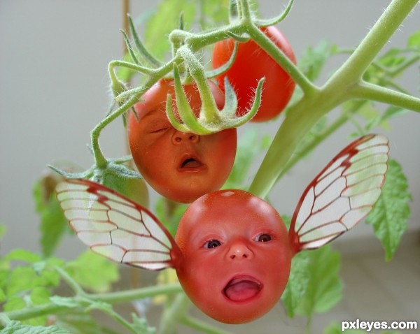
working with SBS (5 years and 3400 days ago)
WEEEEEEEEEEEEEEEEEEEEEEEEEEEEEEEEEEEEEEEEEEEEEEEEEEEEEEEEEEEE
(can't wait for the thumbs down on this comment)
giggle snort.. super fun image author.. really is a smiley one 
really makes me thump thump thump (Big Smiles.. thanks)
Very cute! Nice chop.
hahahahahahahahaha...very cool...gl author
Nicely done, author! Good chop, great expressions on the faces. 
This actually made me smile. Nice job, author!
thanx
Howdie stranger!
If you want to rate this picture or participate in this contest, just:
LOGIN HERE or REGISTER FOR FREE
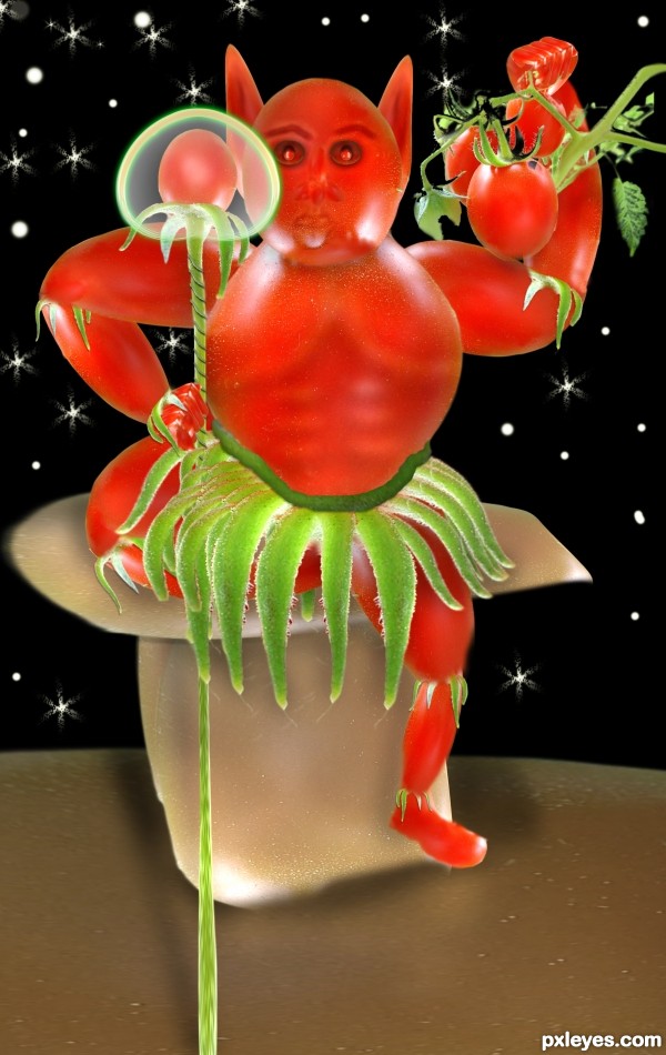
Only the source image and PS. (5 years and 3401 days ago)
Very nice job man.., good luck
Thanks for your comments and suggestions.. Yes I do agree the seat and I will change the colour of the same. 
Maybe if you put a background in this image, changed the color of the floor, everything is red, a little more work the lights and shadows, I believe will get a more realistic result. Good Luck
cool creature author...gl
Thanks for your comments 
Howdie stranger!
If you want to rate this picture or participate in this contest, just:
LOGIN HERE or REGISTER FOR FREE
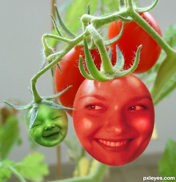
Desaturation of face images, with simple Cut & Paste and Layer Blend Mode changes.
A little Liquify to emphasize the baby's smile, and a bit of touch up painting to even tones. (5 years and 3404 days ago)
The dimensionality of the baby head really works, but the "mom head" needs to have the same quality...right now she looks like an inflated balloon. Suggestion would be to do some dodge/burn on her, or shading & highlights on adjustment layers. GL author. 
Good call, CMYK, thanks!
The light intensity on the plant and kid face is different. You should add some highlights on the baby's cheek and nose (with some bright green or pale yellow) to get rid of this. good luck 
I see you've changed her face. I like this one much better! She relates much better to the baby. Cute idea nicely done! (Just one tiny nit pick, there's some edges showing on the right and lower right side.)
Swordfish and Spaceranger, THANK YOU so very much!
"Too close to the trees (or tomatoes) to see the forest (or edges and lighting)..."
It always helps to have other eyes to spot the small things. That's what helps me improve!
Thank you again!
Red tomato face looks flat, since this isnt a very original concept there are lots of tutorials to show you how it should be done, hope this helps.
http://jengrantmorris.blogspot.com/2007/10/fruit-faces-tutorial.html
Good luck 
Nice tutorial, Geexman, but the result is too "bright" for this image. Trying to erase the forehead and cheeks made the face too dark, going back to the "balloon" effect CMYK pointed out with the previous face, and erasing back to the original image made the teeth and the eyes WAY too bright...Oranges and tomatoes just don't quite work the same...But thanks for thinking of me and trying to help.
Very sweet!
Adorable!!
That baby is just ADORABLE! The woman's cheeks look nice. I just don't like her teeth and eyes. But the baby gets high marks from me!
Very cool...love the idea that both of them are smiling...gl
Howdie stranger!
If you want to rate this picture or participate in this contest, just:
LOGIN HERE or REGISTER FOR FREE
grt work!!
Thank you...
Great idea, i like it a lot. Just wish it were a tad brighter...but thats just me. Nice job
Beautiful!!! Should finish top 3 IMO
Too dark! Can't see what's really going on.
i agree with mossy, maybe brighten it u a bit..i'll hold my vote
very very nice scene author...image is a bit to dark and i am sure that would be way effective if u create some cool lights...for example fire flights, lanterns and something like that....GL
i love the detail how the circle light reflects on the tomato
and yes it's a bit too dark
Thanking you all for the comments, and i made it little more brighter... thanks
Very nice and creative, enjoy the full image, change everything, and not change the main image at the same time, it is very difficult to achieve a result as cool as this guy keeping the original image. Congratulations!
thanx peter.....
Well made image, its tough to put light into an image that for realism has to be dark... best of luck
Very cool in HR, I felt like a peeping Tom, lol.
thank u all
Howdie stranger!
If you want to rate this picture or participate in this contest, just:
LOGIN HERE or REGISTER FOR FREE