(5 years and 3366 days ago)
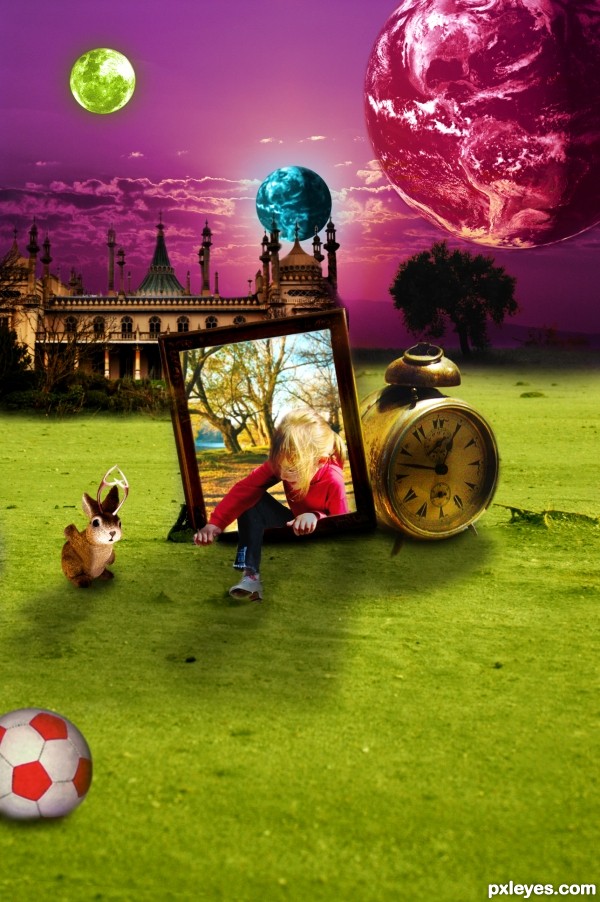
After playing with her friend ... Alice comes home. (5 years and 3482 days ago)
This is an amazing image only it appears that you have gotten the lighting wrong.. The sun I think is on the left so the shadows should be to the right.. Or is that planet providing the light?  GL
GL 
Thanks Toothpick.... the light comes from the planet... 
If so then you might want to decrease the amount of light the light on the left is creating.. I would do this by simply taking a really soft black bush and paint on the light and then decrease the opacity of the layer to something that improves it.. I would estimate if would be something like 40% opacity but check... GL
Also I'm not sure but isn't source 4 already manipulated?? And therefore would not be allowed.. Just be wary of Mods deleting this and asking you to change source 4...
OMG HOW COOL!!! I've alwasy wanted to try the "something coming out of the frame" picture but not quite ready yet. 
This is indeed a very cool creation, the only thing I noticed is that some of your sources have already been manipulated images, and I had my own creations pulled out of the contest because of that. Just heads up.
cool work author....lot of things going here and i love it...Great selection of colors...best of luck
Thanks Toothpick.... light decreased.
The way you've set this up light-wise is the sun is directly behind the viewer. (Full moon, full Earth). Therefore the sun in background doesn't work. Shadows of things on the ground should be adjusted accordingly. I love your concept. 
Thanks CMYK46
Howdie stranger!
If you want to rate this picture or participate in this contest, just:
LOGIN HERE or REGISTER FOR FREE
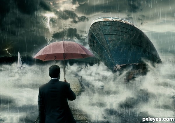
Basic techniques are used. Here I like to thanks MarcelTH for the wonderful sky pic and michaelaw for small boat. (5 years and 3497 days ago)
Great rain effects 
Really nice...
Best of luck my friend!
Thanks Adhir and Ponti... I'm so happy to receive a comment from a artist like yoU!
Two boats with identical damage? One would be enough, and improve the composition. The one at left is not necessary.
Well you're right. But I can't imagine the composition with only one damage. So I replace left one with different boat.
Very nice contrast, movement, and lighting. Well done.
Nice idea, well executed! GL! 
oOo scary! And that guy is crazy, why isn't he running for his life?!?!?! lol. Very creative idea, and nicely done!
Howdie stranger!
If you want to rate this picture or participate in this contest, just:
LOGIN HERE or REGISTER FOR FREE
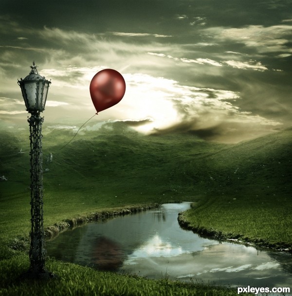
Thanks to Chulii-stock for her "Misty Mountains" (5 years and 3673 days ago)
Stunning.
loving the way the clouds appear to wisp off of the top of the hills!
wow...very nice
Great work on the lighting
Nice one!  Good luck!
Agrees with Lamantine!!
beautiful blending..............
Great choice of colors!
Remove the reflection of the balloon, the balloon is in front of the water so it can never give a reflection IN the water, a shadow: yes. Furthermore there's a reflection of a cloud which should be behind the mountain not in front of it.
The overall mood is good though.
So beautiful... GL! 
awesome......
Nice mood! But the reflections are of the old source and don't fit this image. As robvdn said, also the balloon wouldn't have a reflection because it's in front of the water. Good luck!
I disagree with the comment about the balloon reflection but that may just be me. This is beautiful....the only issue I have is that there are two light sources hitting the front of the balloon. From what I see, the sun is behind the balloon so this is a little confusing. Great job though!
I give high marks for this one, But...... Every time I come back to look at this, that dang reflection keeps jumping out at me. screaming " I'm here and I'm not supposed to be and there's nothing you can do about it". Maybe I'm going crazy! I would really appreciate it if you could replace him with another. Good luck!
Absolutelly stunning work,love the mood,colors match so well,blending is fantastic...Congratulations author. 
Wrong balloon reflection I think =) But Really nice work . Good luck =)
excellent... gudwork
realy cool and lovely
Great mood and very nice composition. 
Nice 1! GL 2 U!
Great and full of hope 
You did a good job with this author...
Nice work Ponti. Grats on 1st.
Congratulations!! Beautiful entry!
Congratulations and jubilations *sing*
Congrats, lovely work 
Congrats....fantastic job
Congratulations for the 1st. place, Matteo! 
Congratulations Ponti! 2 very creative entries!
congrats, you're so great...
Congrats! What an amazing landscape you've created
Howdie stranger!
If you want to rate this picture or participate in this contest, just:
LOGIN HERE or REGISTER FOR FREE
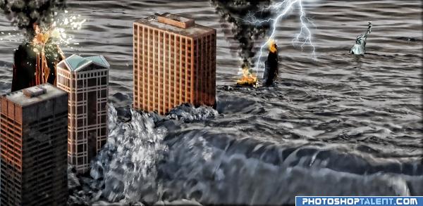
It took me 3 days to complete this image)) including figuring out What to do and How to do it... Pretty satisfied with the result.
I Do like comments and hi res views) Thank you! (5 years and 4026 days ago)
Hahaha - i started one just like it.. I ended up trashing it! Could not get the right feel to pull it off to my liking.. You really need to be sure of your perspective. The buildings should all be on the same angle from our viewpoint. The two outer ones are close but the on in the middle needs to be rotated more. A bit more time on your edges also would help. 
good idea
ohhhhh cool.
haha awesome, perspective is totally off but doesnt matter its comical the way it is.
Yeah, I know perspective... but the ground is kinda shaking and the buildings are dancing around... Anyway I like it the way it is now)
theres different light source on the buildings and water, goodluck 
Howdie stranger!
If you want to rate this picture or participate in this contest, just:
LOGIN HERE or REGISTER FOR FREE
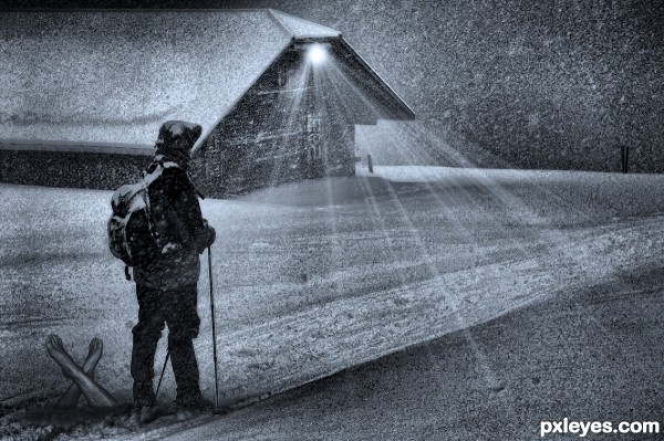
Very interesting but I am not understanding the legs sticking out of the ground. Maybe its just my lack of imagination! heehee
The guy killed someone and he's going to bury the legs tomorrow (You'd make an awful serial killer rbsgrl, LOL)
THANKS!
Thats so true...or I am just playing dumb!
very cool work author...idea is top notch and execution so cool...IMHO the light on the house looks a bit odd...i don't think that will be cast that far with weather condition like this...any how this looks so cool and crazy and i like it very much...GL
i love the mood to this! it looks like an old newspaper clipping
It looks to me like those illustrations in the old mistery novels!! I want to know how it continues!!
Great work author!!
good suggestion Nator, I'll see if I have enough time
 )
)
(went with a blue on low density, keeps the creepiness with out looking like the color of urine
Thanks Nator
nice..good luck
Howdie stranger!
If you want to rate this picture or participate in this contest, just:
LOGIN HERE or REGISTER FOR FREE