(5 years and 2868 days ago)
thanks to eirian-stock
shudder stock,faestock
gloomwriter,FairieGoodMother (5 years and 2881 days ago)
i like how you made the grass and trees a smaller land line  cute image author, goodluck
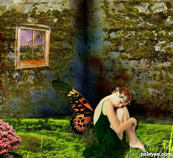
The figure needs some fixing on the edges, white lines and some over erasing near the wings. You've given a drop shadow shifted to the right that wouldn't be there. Figure is lighted from upper right so shadow would be beneath and to the left. The blades of grass are in the foreground and they would be over the figure. Mask work is essential to a good chop, many use the pen tool for this but however you prefer doing it you should use layer mask for this. Layer mask allows you to restore edges you cut into by mistake so you can go back and forth to tweak the silo. Study the shadows in the model source photo as a guide to creating your shadows. The overall look is good, the devil is in the details.
Edit: I see you've changed things, you reversed the girl but now you have angular knife sharp edges.
I agree, the grass on the foreground should be before the fairy toes, and the shadows are not proper, it seems like she's floating. The use of dodge and burn would have made the 3 dimensional effect looks better, moreover, more depth of field is needed. By the way, the composition is good, maybe there's too much saturation, but plenty of people love color explosions, so it's just my opinion.
Howdie stranger!
If you want to rate this picture or participate in this contest, just:
LOGIN HERE or REGISTER FOR FREE
(5 years and 2917 days ago)
Great work!
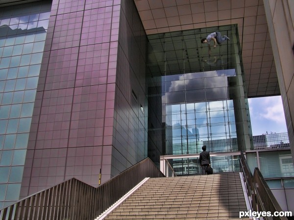
Is that a reflection of the outside floating guy? Or is that another person floating inside the building? Almost looks as if you need to flip it if its a reflection. I'm guessing from the title that it's another person experiencing the same thing.
oh crud, I was trying to make it a FLOOD reflection, as in water and I've already uploaded this to a different website and stashed the SBS, LOL.. won't have time to fix with my other chops.. BUT THANKS!!!
total dummer on my part LOL
Howdie stranger!
If you want to rate this picture or participate in this contest, just:
LOGIN HERE or REGISTER FOR FREE
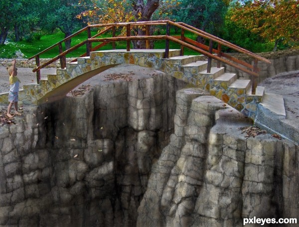
The girl and both texture photos are mine. The rock structure was drawn with the mouse. The biggest challenge with that is being left-handed. ;-) (5 years and 3048 days ago)
Lotta work! I think I'd make the left edge of the foreground rocks & the ground by the girl's feet sharper. GL author! 
Not a bad suggestion. I may have at it later on.
Edit: I went back and added details and textures to the foreground that were lost during earlier texture applications. 
Reminds me of those chalk drawings a few talented artists do. Nice work on the rocks, author. 
Howdie stranger!
If you want to rate this picture or participate in this contest, just:
LOGIN HERE or REGISTER FOR FREE
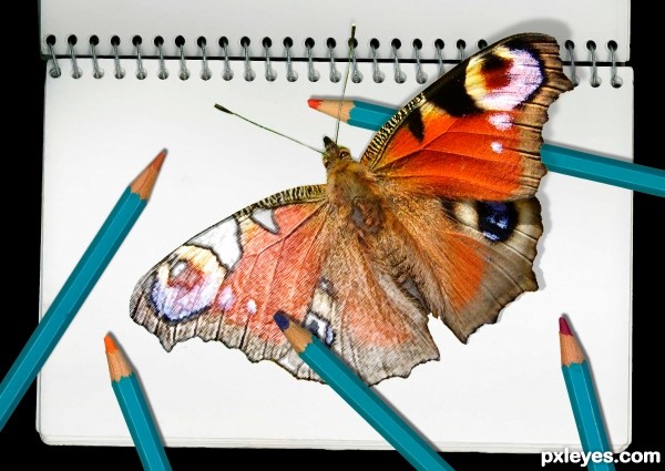
sketch book and coloured pencils scanned in from objects at hand (5 years and 3055 days ago)
I liked it better if the image was turned in a diff direction so there would be more shadows fallen on the butterfly..
Thanks for that comment, I guess I don't know what you mean by turning the image in a different direction because I don't know how that would cause the shadow to fall on the butterfly ... unless the wing were raised up high enough to cast a shadow on the other side, which I don't want to do because then the raised wing would look quite small because of foreshortening.
I mean more shadows from the pencils on top of the drawn wing sorry I was not clear  right now it only gets shadow on it from the one pencil and only very small part which is hard to see.
good eye! thanx for the suggestion...
Nice work! Love the bright colors.
yes! thats what I meant  looking better now
This is a fairly nice looking piece of ...filter work. Your blending between the "sketched" part and the live butterfly is commendable. There are however some inconsistencies in the shadows. Look at the shadows cast from the binder's rings versus the shadows of those pencils and the butterfly.
Nice blend and creative thinking. I like this kind of style in general!
Thanks for the helpful comments and encouragement, I was so worried about the shadows in and around the butterfly and pencils and completely overlooked the others...
pixelkid -- this kind of stuff is what I like about photoshop too: something that can't be done purely photographically, nor can it be done with paints or pencils alone.
Howdie stranger!
If you want to rate this picture or participate in this contest, just:
LOGIN HERE or REGISTER FOR FREE
Lol funny entry :P great blending as well! Good luck.
Thank U very much
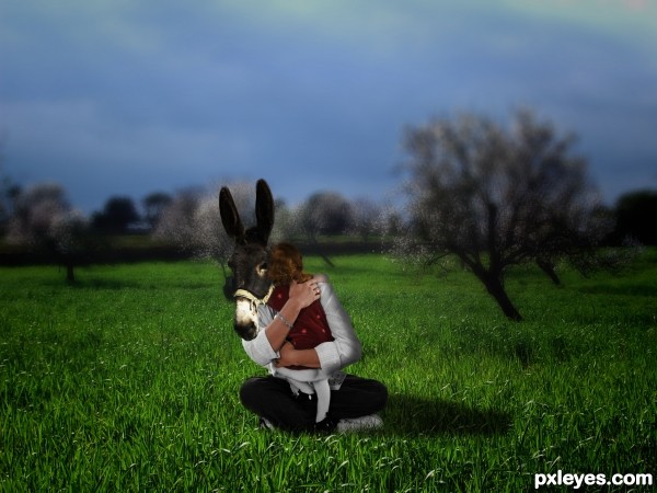
Nice idea. I like the fact that the tree trunks have the same inclination as the man's body.
Just pay more attention to your masking. The man's edges seem transparent, at his legs there is a white rim, the donkey's head where it meets the sleeve looks transparent too. Also, do a better blend for the girl's head where she touches the donkey.
thanks for the advice' now it's better?
very funny
thanks
Yes, it is much better now. As a final touch you can add little shadow where the girl's hair meet the donkey's face. You can also use the smudge tool to add some hair there, so they look more natural.
now it should be OK right?
Very good!
thanks
Howdie stranger!
If you want to rate this picture or participate in this contest, just:
LOGIN HERE or REGISTER FOR FREE