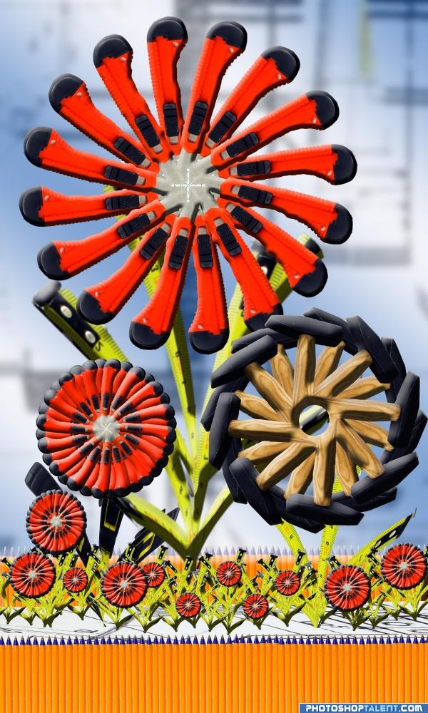
haven't done a flower in a while (5 years and 3941 days ago)

Source only (5 years and 3942 days ago)
wow. aren't we anal...LOL Just kidding.. the perfection and attention to detail is amazing
inetresting idea keep it up
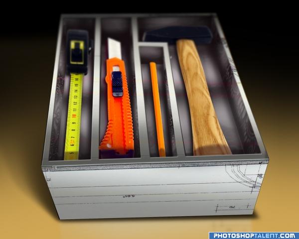
very nice work.. just remove the shadows under the box.. judging from the direction of the light source, it looks like its floating.. gl 
good work. good use of source
Nice work, I think you have blurred the far end of the box and tools a bit too much 
alles ist ordnung!  good luck!
good idea but too much blur
very original idea
Great idea, creative use of source. Agree about blur...also the top right corner of the pen's compartment angle needs to be slightly pulled up to match the angle of the top of box. Great job, however! 
for source only you need an sbs
Pretty nice result. Agree with the critic about the blur and the shadow under the box. Also, I see some red lines over the box (but not tools), why is that? Good luck!
Too much blur...you probably don't need any at all...nice job.
Hi guys, firstly i would like to thank everyone of you for taking your precious time checkimg out my work. and thanks for the comments and suggestions, you guys are right about the shadow and the blur i now can see its bit too much. since i have editted the artwork, but thought it would be unfair to replace the above one, since some of you guys might learn from these mistakes. Lastly im from South Africa and we are hosting confederations cup, im so crazy about soccer tomorrow we are playing against Spain and we'll beat them!!!
Love the idea. Nicely done!!
graet work author  lovely idea
good work
Howdie stranger!
If you want to rate this picture or participate in this contest, just:
LOGIN HERE or REGISTER FOR FREE

I wouldn't use these if I were you...
Thanks for the comments guys..
I made the revisions and added a rust texture to the blade.
(5 years and 3946 days ago)
OMG....best and funny transform i ever see...good job
 hahahaha definitely I wont use that
hahahahaaaa i didn't say in first moment tape measure! 


lol nice work 
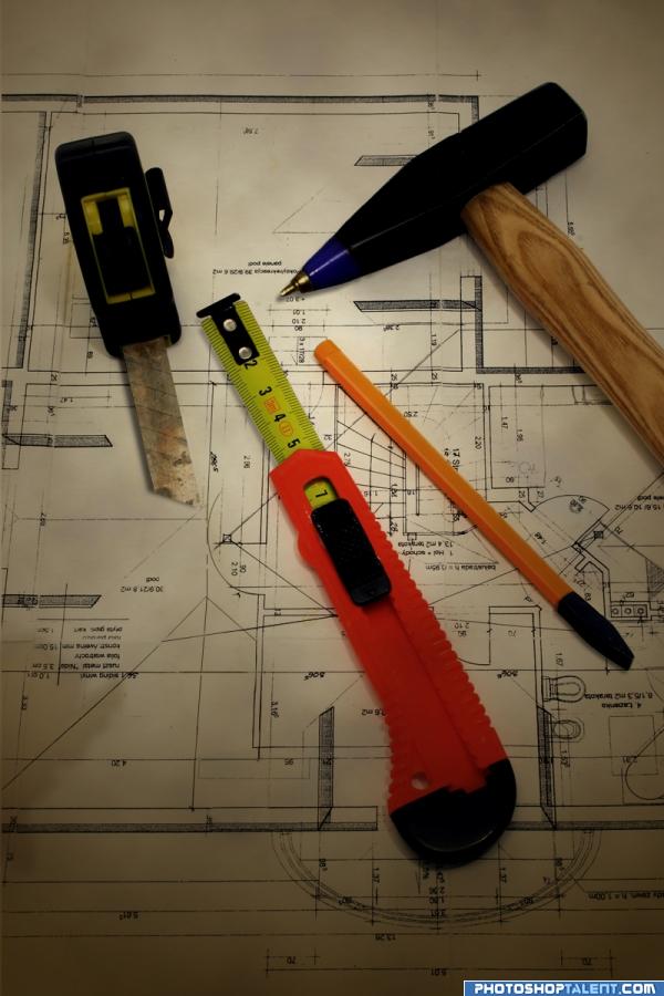
Very well done! - Great idea too... The only thing that looks odd is the pen point on the hammer.. Looking along the highlight towards the taper, the new pen highlight does not follow the same angle. Also the perspective on the end of the measuring tape, as you have rotated it, it is now off. You need to tuck the tip under the tape some more as it then gives it some height - to justify the shadow. Otherwise it looks like the tab is pointing into the air.. Again, a great idea.. GL.
I'm not sure if I understood animmax's suggestions correctly, but I did a quick revise. Thanks for the help! 
hehe cool! gl
Sorry author: the tape looks a lot better  The other part - where the hammer tapers down to the tip. You can see the edge highlights of each side. These lines dont match the new lines from the pen tip [for the hammer] Mainly the middle line. It should follow the same line as the hammer.. Hard to explain. Sorry.
high High HIGH mark.. just wonderful... awesome actually.. and I see ANIMMAX is helping in the perfection department..AWESOME.. just a great idea all round
good work, I like it
lol 


looks real
Nice job! Great work!
Creative!
If this is what's in his toolbox, I don't want this guy building any houses. Well done!
Very well done, I'm LMAO here.
Well done author.
nice changes loved it.........................
Yes!! This I like a lot. Thank you
ill use those what can happen nice work and idea
 very smart, neat and clean work........
 Great idea!
Great job i love the switch around i would not use them ether
My favorite in this contest. Take a look at the shadow under the tape measure right next to the 5 inch mark. It looks like the shadow is missing for about a quarter inch. Should go all the way to the orange handle. All else appears perfect.
There, the shadow comes all the way to the orange handle now. Keen eye you've got there.Thanks chaplain! ("(^-^,)"
so many details to take into consideration nice job!
Haha, that's pretty convincing and funny, nice work! Good luck!
Brilliant!
you did very well, keep going
Howdie stranger!
If you want to rate this picture or participate in this contest, just:
LOGIN HERE or REGISTER FOR FREE
nice idea! gl
great
good work
I just noticed, that when you look at the big red flower and scroll up and down pretty fast, it looks like the flower is moving. I just did this the past 2 minutes Good luck!
Wonderfull work! Excellent! Well done!
very good blending, i love your garden, good luck author
nice entry, gl
Howdie stranger!
If you want to rate this picture or participate in this contest, just:
LOGIN HERE or REGISTER FOR FREE