(5 years and 3985 days ago)
- 1: mountains

(5 years and 4010 days ago)
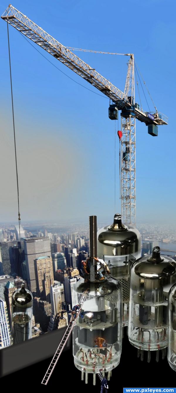
awesome indeed the hi res really is great!!!!!
Can i rent one?
This is great!!! Good job!
great job author..brave to work in such a tiny area..hehehe.. good luck
A different take on this. I like the idea Author 
pretty cool! 
Howdie stranger!
If you want to rate this picture or participate in this contest, just:
LOGIN HERE or REGISTER FOR FREE

please see in high resolution (5 years and 4017 days ago)
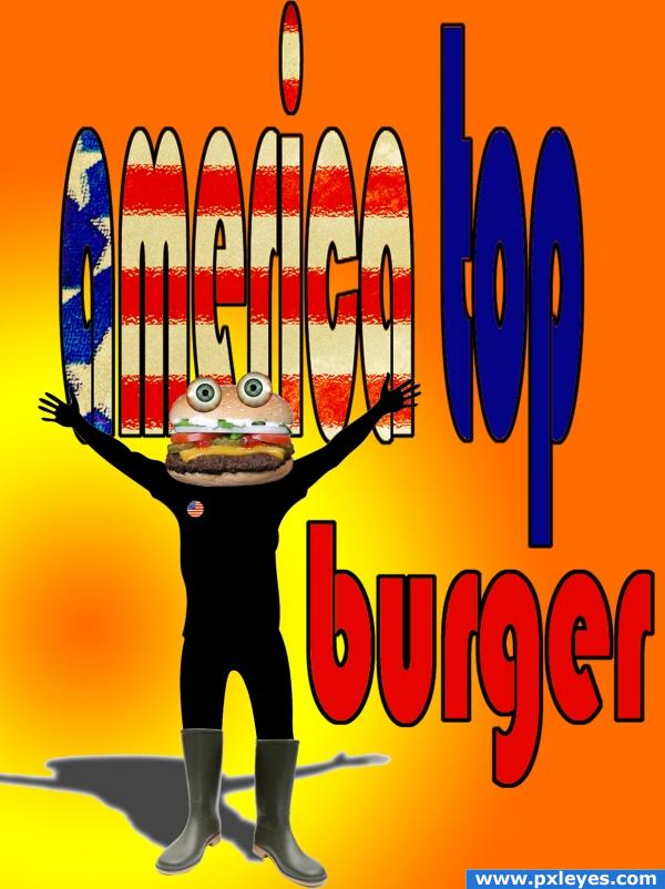
very fun Idea.. but the lettering is way too distorted.. if you bring the text into the realm of readability you will have a much better piece (also the eyes are a bit floaty.. shading and bring the burger to more detail might help fix that (burger is a bit too blurred (the bun part)
very good piece author.. I just see where it can be better
also you need to blend the boots into the silhoette better( try the warp tool), and their shadow needs work...nice idea
I'd just extend the text, otherwise do what i always do and hold shift while resizing from the corners, that makes the image being resized maintain its proportions
thanks for the helpfull comments
honestly, this image just lacks some spark and i have to agree with lchappell
I'd like to add that the shadow our burger buddy is casting probably doesn't need a stroke on it (thin as it may be). Still, this piece made me laugh! Nice job.
ye steve u rigth i gonna change this soon as possibel, problem is that i flatt burger, but is not a big deal thanks a lot
thanks Tuckinator i know that i still have to work some things here but this is pure kitch, to me, with a bit dádá same as america top... (u know) apreciate your comments u´re wellcome, see u.
good, but body is flat and shadow having a white edge. correct it
colourful


Howdie stranger!
If you want to rate this picture or participate in this contest, just:
LOGIN HERE or REGISTER FOR FREE

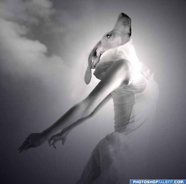
Source and portions of 3 of my own photos. Did black and white to simplify blending issues.
(5 years and 4039 days ago)
hahaha! so nice 
Hilarious! Very well done! I'll never look at haute couture quite the same again! Gotta love CG!
very well but add somme darkness over upper left side then it will be a legend
woof!!! 
good humor
hey thats one of the better looking models hehehehe
Haha, very funny! GL! 
very funny............gl
lol made me laugh, always a good sign Good Luck 
so funny


Pretty elegant. Perhaps I expect some more light coming from right on the dog though (and with that also some shading on the forehead and ears, left side). Good luck!
i really like that image
lol
Howdie stranger!
If you want to rate this picture or participate in this contest, just:
LOGIN HERE or REGISTER FOR FREE
i love it!
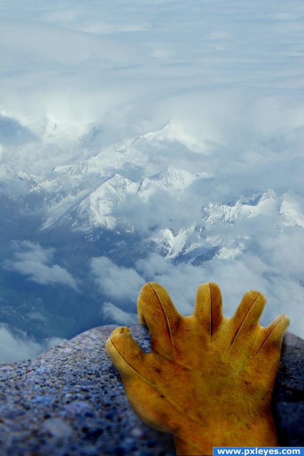
nice imagination author.. it looks visually impressibve.. u could add more shadows between the fingers.. about the veins, it looks quite awkward for them to bulge from the middle of the fingers, even if u decide to leave them that way, u should try to continue them along the lenght of the hand like u did for the thumb.. good luck
now my nails hurt .. good job
hmmmmmmm i dont know...
Nice idea, great image- good luck!
I'm not exactly feeling vertigo and nausea, but I do feel a little dizzy and that maybe I'm going to vomit. Nice perspective and I love the hand. Great job!!
Sweet idea, very nice view!
Howdie stranger!
If you want to rate this picture or participate in this contest, just:
LOGIN HERE or REGISTER FOR FREE