
(5 years and 3234 days ago)
9 Sources:
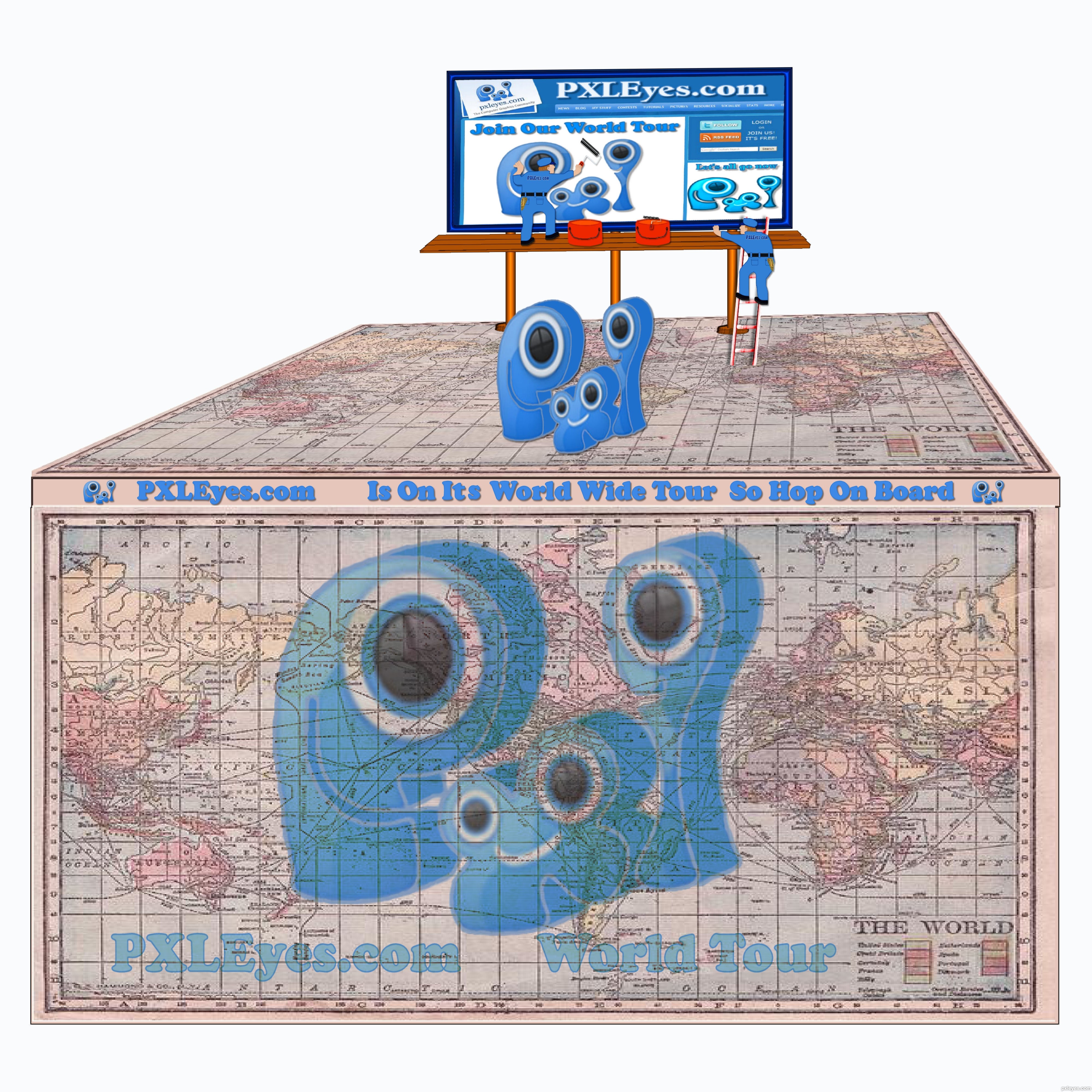
Spec Thanks to Perpetualplum for use of this picture found on Flickr photo sharing.com (5 years and 3235 days ago)
In my honest opinion, if it's any worth, this would work better with a white background. Not that the source is bad or something like that, but having "cartoony style" elements backed with a photograph... well, just doesn't do. Don't be affraid to try a second time and enhance your work! 
I think there is some great ideas here.. think outside the square author.. REMEMBER this is a t shirt image not a scene construction.
some ideas: ditch the background but keep the billboard.
The billboard is a great idea that will work on a shirt.
love that you have used the website page .
GOOD Luck . i look forward to see if you get time to rework this entry .
Fun concept but I don't get this as a T-shirt. It's mixture of cartoon and photo with blurry PXLEyes-Web-site screen shot (which should be the real focus) just doesn't work IMO.
I'm sorry I didn't get it was for a t-shiert I looked at it quick first time around I had jus redone But I will go back in again and get red of backround Thanks all
I think this would look cool if the map was your background
Ok all I did a redo I didn't see that it was for a t-shirt i hope I'm on the right path now. Thanks everyone for comments.Oh someone said a wh backround Now I understand why.
Oops, you made the same spelling mistake I made in my earlier comment (please slap some sense into me!): no apostrophe in possessive pronouns [his, hers, its, yours, ours, theirs].
This seems too detailed for a T-shirt plus I think more than one PXL logo is too many. The map is cool but the right edge needs cropping to match the other three sides. A simple billboard (no workmen) atop a much more tilted map could be compelling. "Less is more."
DanLundberg Thanks for pointing that out to me...lol I took care of the spelling mistake
Oh Yes I took care of the border...Thanks
Howdie stranger!
If you want to rate this picture or participate in this contest, just:
LOGIN HERE or REGISTER FOR FREE

(5 years and 3236 days ago)
Great idea. Perfect displaying and message.
Can you make it a bit bigger within the space you have? we have an A4 space to print and there's a lot of wasted space this way, the logo can be bigger on the shirt 
Maybe you can add "www." in front of the URL?
thanks for including Tasmania in your world map many don't 
Love this concept for a T shirt.
It seems to me that the PXL logo should be clearly the biggest element and the "for addicts" is restrictive and possibly derogatory to those who regularly participate on this site. The background map seems redundant given the globe and distracting overall—I would delete it.
I love the way all of this is put together. I don't think it is derogatory and I don't think the map is redundant. I think this is the best one so far and would look great on a t-shirt. I like how you also put the web address so people can go to the site to see what the shirt is all about!
Thanks k5683..it's nice to see that u got my point of view on this contest.
The site's tagline is "For Pixel Addicts" why not use it in the design....Dan??? Good concept for this author , nice looking design.
Howdie stranger!
If you want to rate this picture or participate in this contest, just:
LOGIN HERE or REGISTER FOR FREE

(5 years and 3237 days ago)
Beautiful work author! This is a lovely entry as well, the colors are attracting and the finishing is clean!
You should add Lebanon too , just because I am from there!
I am joking, I love the background and the idea!

Looks like a great t-shirt to me! 
Pretty cool! Your SBS doesn't explain, but I assume you hand-drew this. The top four lines of the background ['Serbia' spelled with a V?] are like rows of brickwork aside from the falling 'USA,' but the rest of the rows seem to be crumbling and possibly incomplete at the bottom. The mandatory PXL logo actually seems out of place. Maybe a mini version in a bottom corner would be better.
@Dan: there's a source given... a mini version of the logo at the bottom doesn't work and I do not want a small logo on it. You are right about the top looking like brickwork, wasn't intended like that, I fix that later on as well as the spelling error, thanks for pointing that out.
@ Joe, Loyd and Bob: thanks!
Perhaps a much bigger PXL logo so your text is more clearly background (e.g., starts below the top of the logo)? It does appear that you did adjust the kerning of the font to add drama-- very nice.
This is by far the best entry so far. IMO it should include www.pxleyes.com
Howdie stranger!
If you want to rate this picture or participate in this contest, just:
LOGIN HERE or REGISTER FOR FREE
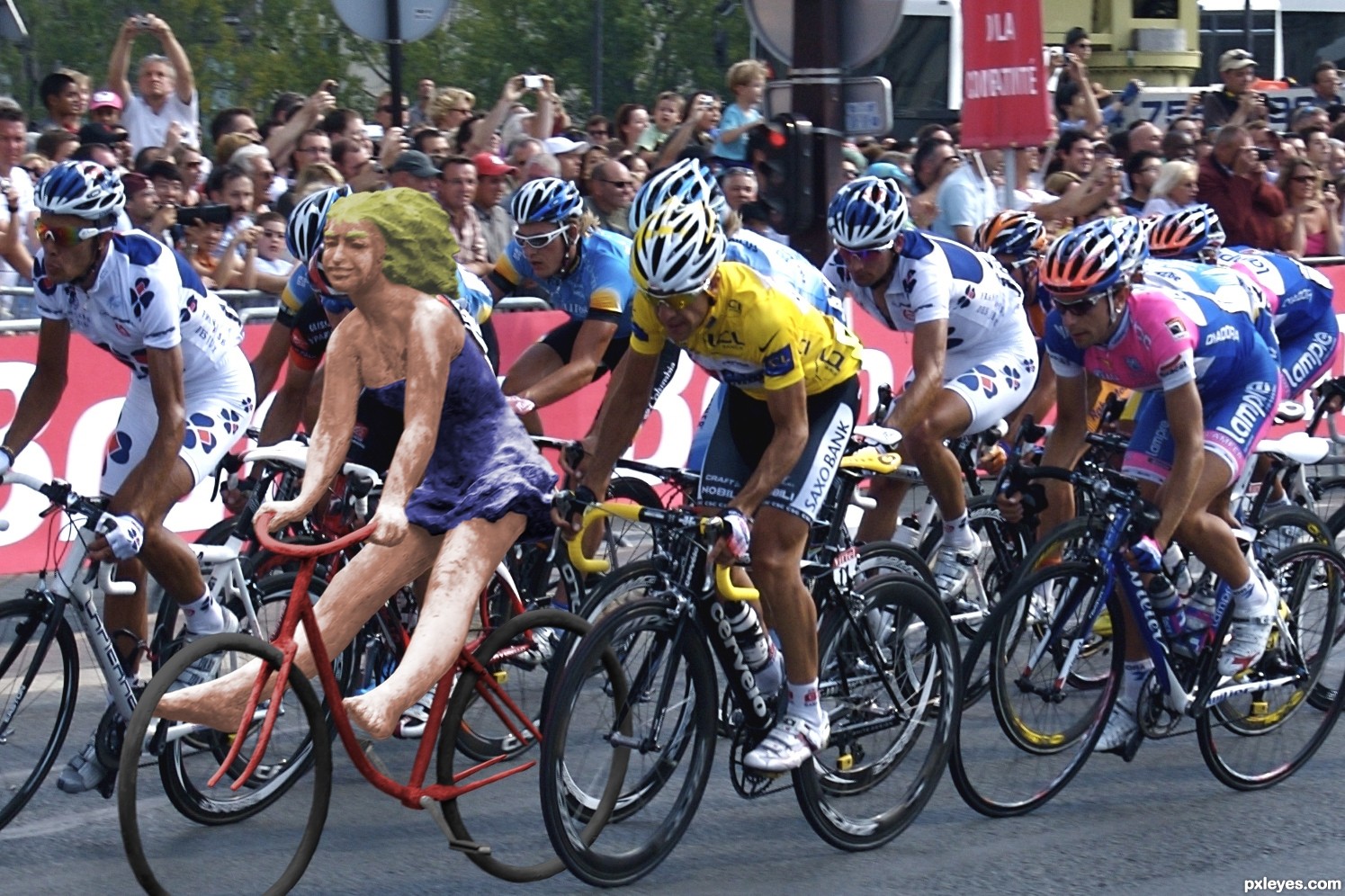
I always knew there was something not quite right about cyclists... (5 years and 3281 days ago)
If I were you, I'll add some sport elements into the statue like cool sunglasses, etc. Also I'll make her head down a little bit just to mimic the other "TRUE" contestant. Lol. XD
Good luck, Author. Let's see if you could WIN this one to the FINISH line. *Cheers!*
I love it!!! Made me LOL when I saw it!
Howdie stranger!
If you want to rate this picture or participate in this contest, just:
LOGIN HERE or REGISTER FOR FREE
Photography and photoshop contests
We are a community of people with
a passion for photography, graphics and art in general.
Every day new photoshop
and photography contests are posted to compete in. We also have one weekly drawing contest
and one weekly 3D contest!
Participation is 100% free!
Just
register and get
started!
Good luck!
© 2015 Pxleyes.com. All rights reserved.


very nice concept......
Like your idea.... is what the logo is about. Good luck.
Needs www.pxleyes.com. Also the PXL logo is hardly visible.
thanks Dek, George and Bob..
good thinking author...
Why not putting the logo instead of the word "PXL" ....................... people may not understand the word PXL but a photo ( logo ) could be more attractive plus of corse the pxleyes URL
good luck author
thanks Mehul and Designed..
great work...
nice work
thanks passionboy and neo...
Howdie stranger!
If you want to rate this picture or participate in this contest, just:
LOGIN HERE or REGISTER FOR FREE