(5 years and 3186 days ago)

what wrong with this new LCD or my 6fingers model? A fighting inside?
I cant see the parade
A missing parade,huh? (5 years and 3526 days ago)
IMO you should spend abit more time cleaning it up. it has alot of hard cut edges. is a really good idea just needs more time spent on it I think.
thanks alot
i should explain more about the edges on the clothes which the man wears
i do it on purpose so u guys can see the man as a "weirdo", therefore, u guys can understand my theme better
oh ok i get it
ahh ok I got ya now  G/L
G/L 
thanks
Edge exuse doesn't work for me...
gotta agree the bad edges dont add anything for me, nor does the random jaw bone... spend a little more time on the crop and use clone tool to remove the jaw bone .. best of luck author
thanksfor ur comments
i just edited it hofefully it will work well this time
lose the filter altogether
kinda gives the id of the author away when the same source is used in the entries.
on the left there you find one finger more....
its 6 fingers yah
do on purpose
i already explained it
Howdie stranger!
If you want to rate this picture or participate in this contest, just:
LOGIN HERE or REGISTER FOR FREE

(5 years and 3722 days ago)
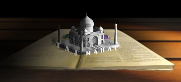
IMO...your letters stand out a little too much, and the shadows aren't connected in some areas, and some have none at all. I don't see how they would pop up when the book is opened, but the actual building is well put together, and makes sense. I think you could have spent some time on the pages of the book because the two don't work together... and you thought about the pull tabs even if they are a little flimsy... on the whole though a very good effort GL
off theme, just looks like a building plonked on top of a giant book LOL
that's just because it's the only element... and doesn't blend well with the pages... that's why it looks so 'plonked' (lol)
its to copy/paste and should be blended way better...but i like the idea
nice idea , good luck.
Thank you for source images: (1) book & (2)table------ nkzs
Sorry, I agree with barnacle. This isn't a pop up book.
Howdie stranger!
If you want to rate this picture or participate in this contest, just:
LOGIN HERE or REGISTER FOR FREE
Hi author good entry, just wanted to give you the heads up that sources 1, 3 & 4 requires a credit to the original author you may want to add this as wouldn't want to see your entry to be pulled by the mods. GL
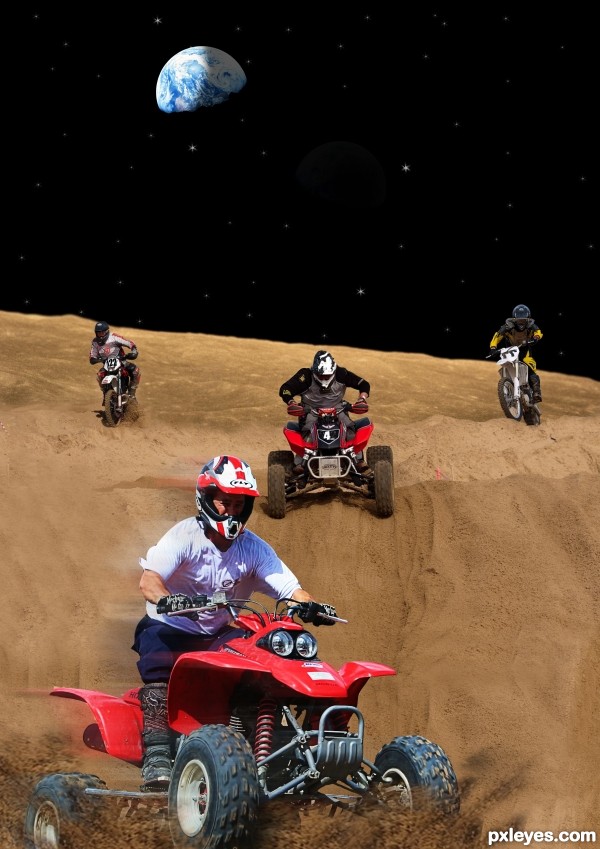
Good blend. The light on the rider in the foreground is from upper left. Might be good to rotate the Earth to match the light source.
ok thanks junkieball hope its ok ,,, cmyk46 what do i have to do whit the earth ???
Author, look at the Earth. Where is the light from? High right. Where's the light on the foreground rider from? Upper left. So either flip the rider, or flip the Earth. Either way the light source should match.
ok thanks hope its good like this
Now it works...good luck author!
Howdie stranger!
If you want to rate this picture or participate in this contest, just:
LOGIN HERE or REGISTER FOR FREE