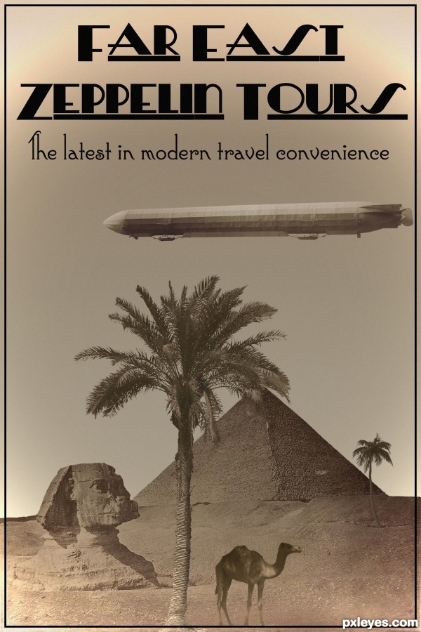
Expanding travel horizons at the beginning of the 20th century. (5 years and 2553 days ago)

(5 years and 3048 days ago)
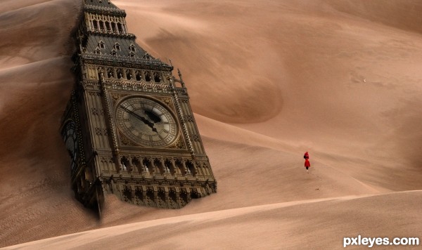
Figures need the same shadows as the building, sand in front of building should conform to the contours of the facade. Looks good otherwise. 
Howdie stranger!
If you want to rate this picture or participate in this contest, just:
LOGIN HERE or REGISTER FOR FREE

(5 years and 3284 days ago)
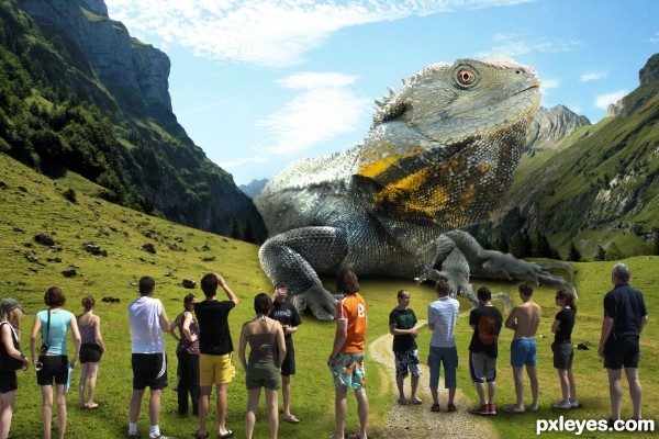
Good chop, but I sure wouldn't be standing around...
Thanks cmyk46. He is harmless thou, nothing to fear here...
Really cute, but the drop shadow on the lizard (especially on the LH side by the arm) does not match the background or the shadows of the people, which takes away from the believability of the image.
Thanks MssyB, lightend up LHS 
Man that's a lot of silo work on the people! Nice work!
Thanks, it was a lot of messing about..
nice work! great idea!!!
Thank you 
interesting work author...GL
Howdie stranger!
If you want to rate this picture or participate in this contest, just:
LOGIN HERE or REGISTER FOR FREE
Damn...great minds think alike. Looks like 2 antique looking posters now. Nice font work BTW.
This is good but like all the other entries the border and outline is far to sharp, blur and or a outer glow to make it look printed and not so Well photo chopped.
Excellent color & font work. Nice!!
Howdie stranger!
If you want to rate this picture or participate in this contest, just:
LOGIN HERE or REGISTER FOR FREE