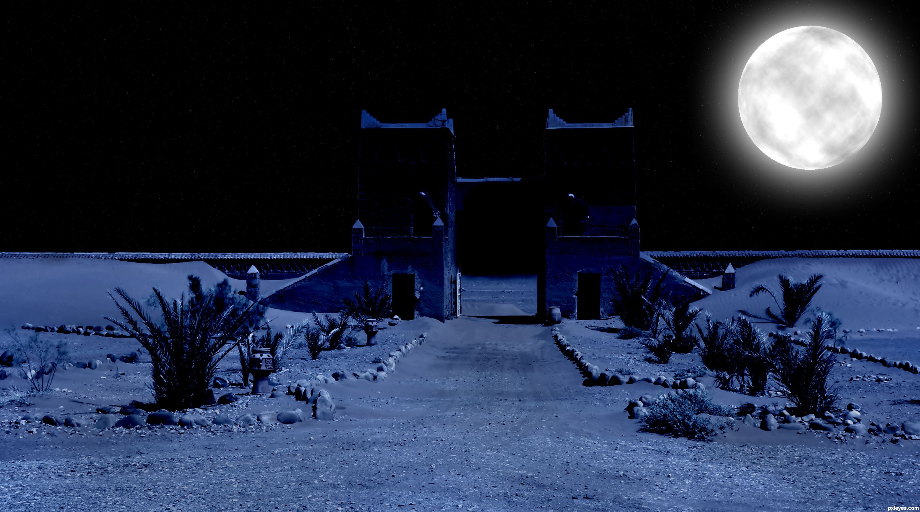
Hi, thank you Admin's for message ;) I changed picture a little :) (5 years and 3535 days ago)
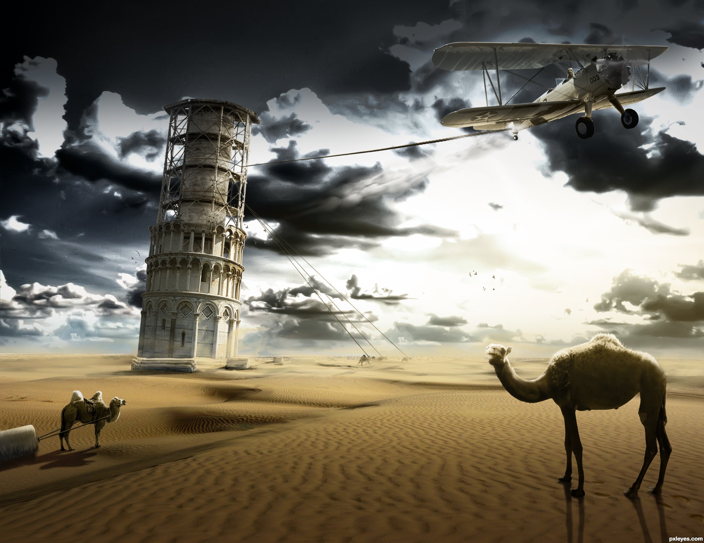
A reconstruction of the Tower of Pisa. This is how it became a leaning tower, they pulled it too far. The scene is surrealistic.
Please look at the used sources and High res before voting. Thank you!
11th source: Pilot
http://www.flickr.com/photos/toots/2075975006/sizes/l/ (5 years and 3573 days ago)
I airplane pulling on it is not really too realistic. I understand it was meant for a more surrealistic approach but surrealism really isn't the idea in this contest. It's more to really reenact and make it look like something that would have actually happened, but that is mainly IMO.
That's weird, your comments on the pyramid entry sound otherwise. IMO that's pretty surrealistic too. It doesn't say anything about surrealism in the contest goal either. I just used a fantasy approach on the contest goal that makes the image unique. But I don't make the rules in here, it would be really sad for all the work I put in it.
I do really like the surrealistic element, and i think you've created a fantastic image. Great job.. 
The camel at left should be bigger, and you've got 3 different light sources. The idea and color are good.
sweet entry, the mood is really nice. however the setting is somewhat confusing since Pisa is a little town in Italy = no camels and no desert. funny idea though... all the best author!
Thanks for the comments. CMYK; camel is bigger now, also changed few lighting problems on the objects. 
Great creation author...I have few nit picks beside Jaw's about the contest goals...First is,camel in left side of the image is in some kind of shadow,but look she's hump,bright sun,also u had to work on her shadow a bit more,especially part near foot.Second thing,camel's at right side are far the tower,but thickness of the rope is the same.Also,u have to blur them just a bit.Tower it self is positioned very well,but frame is not crop-ed that grate,u have lots of white halo there.Any how author,don't take this suggestion as attack,if u have time,made some correction's and this will be great entry...good luck
To me the left camel is floating a bit, I like the plane.
Good idea and chop Author.
Thanks for the comments, fixed a few things
Coudn't resist, added some footprints for the right camel and a sandstorm in the background
Very original take on the theme of this one, nice job with it. GL
Great.
Gefeliciteerd met je 2de plaats, Ressiv!
Congrats!
Howdie stranger!
If you want to rate this picture or participate in this contest, just:
LOGIN HERE or REGISTER FOR FREE
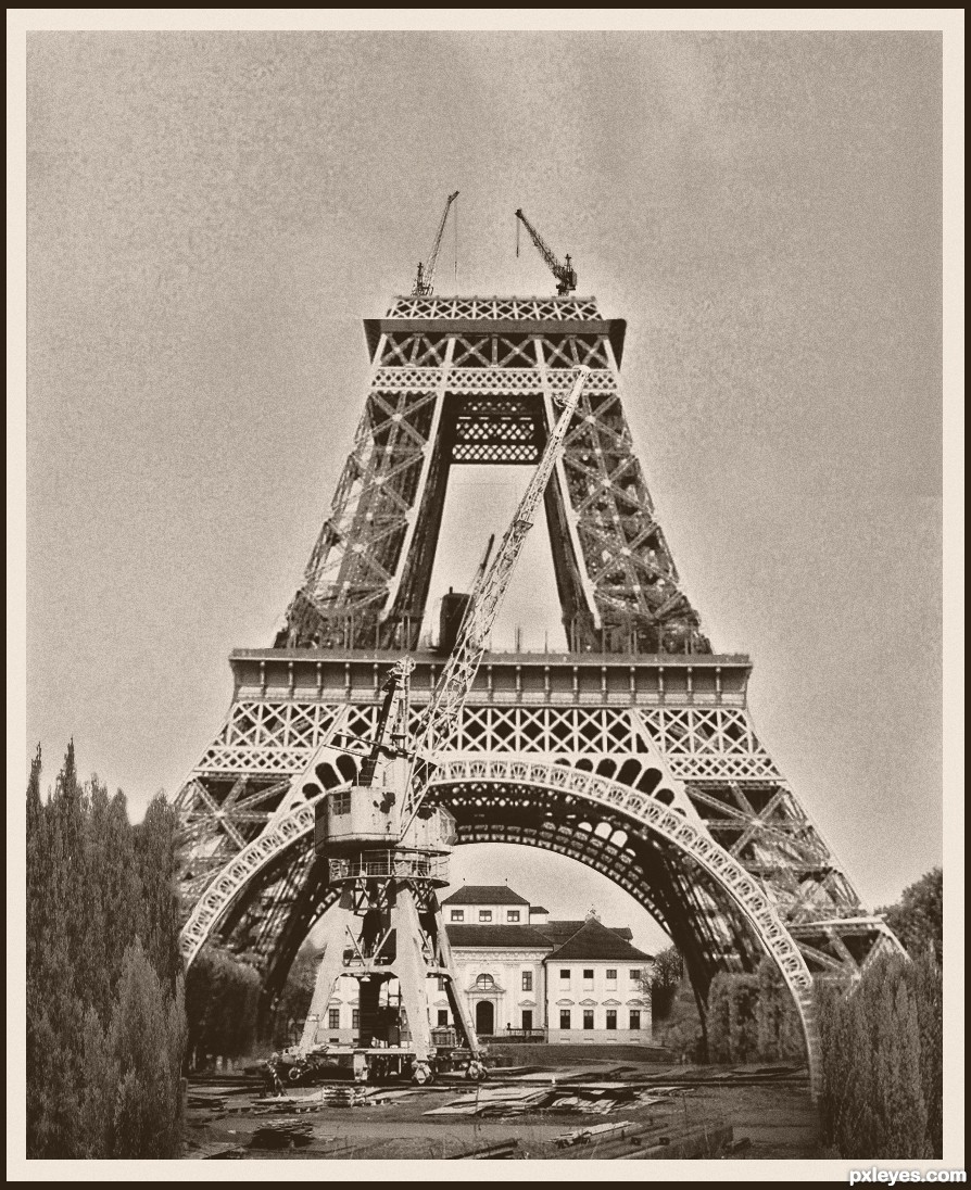
Thanks to hyundai, two-ladies-stocks.deviantart.com and zoranpe (5 years and 3573 days ago)
Not bad. Not bad at all. There seems to be some resolution issues but for the most part, it's very well chopped. GL!
Very well done, author! It really seems an old photo depicting scenes of that period! 
good idea nice work Author. Good luck
Nice job on making this look like an old photograph!
Awesome chop, I love what you did here. Very nice approach to this, best of luck!!
Very well done.
Not too bad.

Nice old photo effect. Very convincing
Congrats for your third place, Nasir!
Congratulations, Nasir!
Howdie stranger!
If you want to rate this picture or participate in this contest, just:
LOGIN HERE or REGISTER FOR FREE
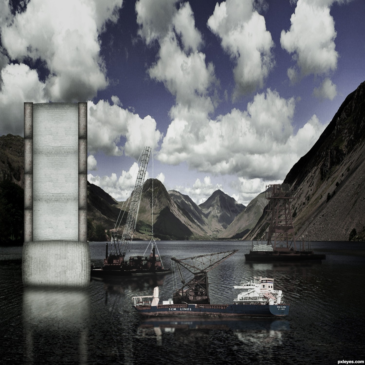
I thought ud like to see some info about it ... http://en.wikipedia.org/wiki/Tower_Bridge (5 years and 3574 days ago)
Reconstruction of Tower Bridge...Tower bridge is in London on river Tems,not surrounded bu mountains,completed at the end of XIX century,so with this boats don.t look very realistic...sorry author but this work demands more work...good luck
I would have to agree.
GL to you
Best of luck.
Howdie stranger!
If you want to rate this picture or participate in this contest, just:
LOGIN HERE or REGISTER FOR FREE
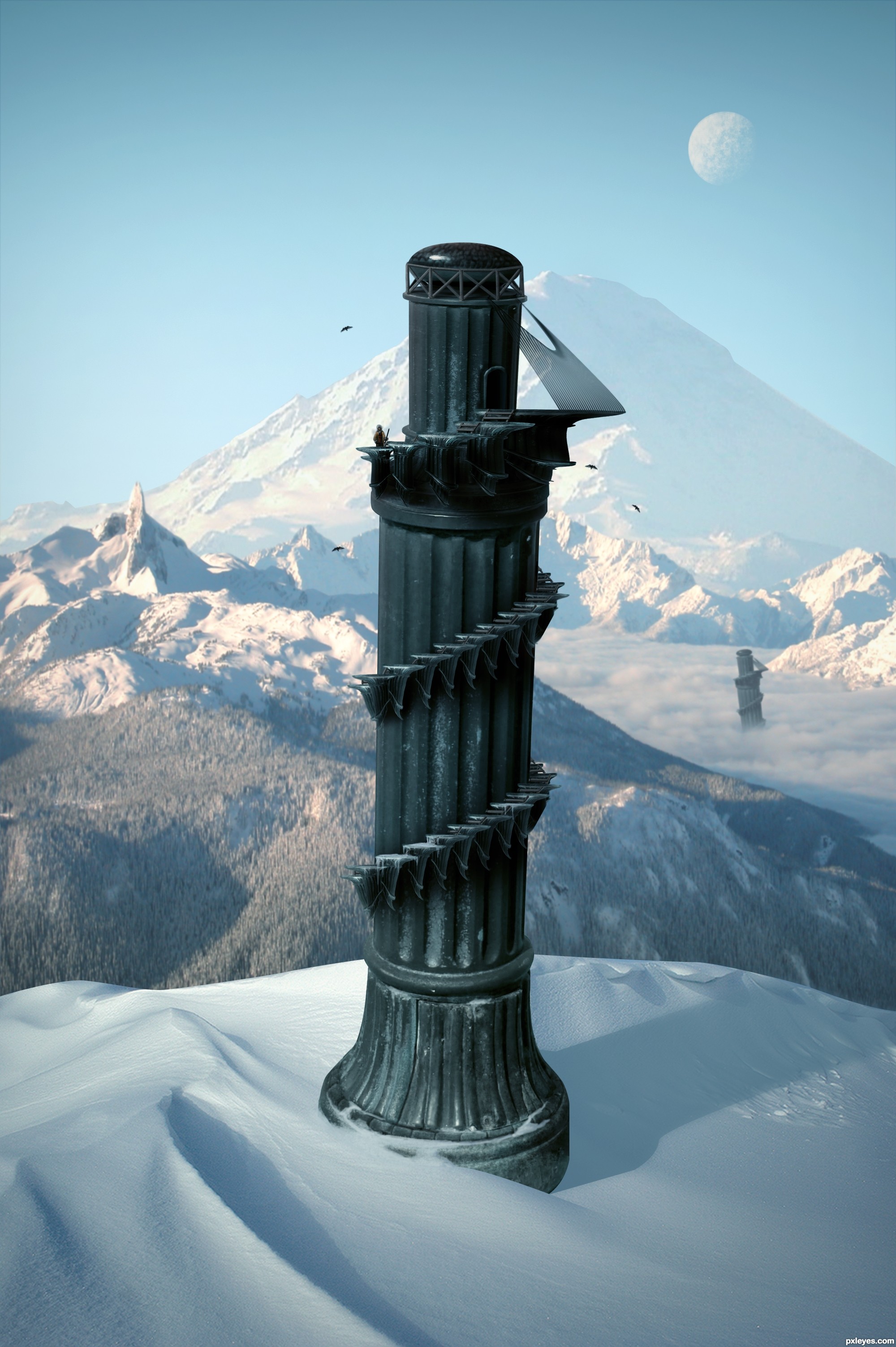
Edit:
- Fixed some masking problems.
- Decided to go with a colder climate than the last image. (5 years and 3606 days ago)
Beautiful work...
great great work
Pretty fast submitted entry! I like the idea, you may want to mask the top of the pawn a bit better (some white edges here and there). Good luck!
Pretty good, but room for improvement!
Im not entirely certain, but wouldn't the shadow be bent outwards over the slope rather than inwards? - the shadow from the furthest tower is too dark in relation to the closest - and - maybe a little addition to some shadows from the terrain would help place everything better - especially from the mound covering the foreground tower as it's casting nothing...
Oh and the glare fom the bottom of the 'tower' it's not true to where you're placing your shadows from, so maybe get rid of it and add some highlights to the relevant side
Thanks for the comments.
Cool over all. I personally don't think the duplicate background towers add anything, however. Also, the palm trees look fake. And the hi-res version highlights the white edge around the tower's top and the fakiness of the tower-bottom and sand-dune edges.
The top of the tower still remains sharp and white spots are there . but this is a good image... you have to make some touches there... good luck...
Great but as above you could just try the matting controls, use the "layer" / "matting" from the top drop down menus and remove white matt or defringe to get rid of them, Then quick select and feather those edages slightly.
nice creation ................ i like it ........ Gl to u ..........
Thanks for the helpful feedback. Image is now complete.
Very nice, like the Pizatower, but in the mountains 
I like it! GL!
yeah a much better image!?!... GL
i like the colder climate version!! great job!
This is why I don't participate in this contest
Nice work, and well done, gl
Very nice, good luck
Fantastic work author...IMHO u don't need other tower...any how this is great,high marks from me...best of luck
nice
Good.
GL
Thank you.
Super! It looks like the tower will fall out of the image at any moment
Howdie stranger!
If you want to rate this picture or participate in this contest, just:
LOGIN HERE or REGISTER FOR FREE
Photography and photoshop contests
We are a community of people with
a passion for photography, graphics and art in general.
Every day new photoshop
and photography contests are posted to compete in. We also have one weekly drawing contest
and one weekly 3D contest!
Participation is 100% free!
Just
register and get
started!
Good luck!
© 2015 Pxleyes.com. All rights reserved.


cool
not bad, the towers are kind of dark though. your 7th sbs looked good before you darkened them. GL
Howdie stranger!
If you want to rate this picture or participate in this contest, just:
LOGIN HERE or REGISTER FOR FREE