source (5 years and 3614 days ago)
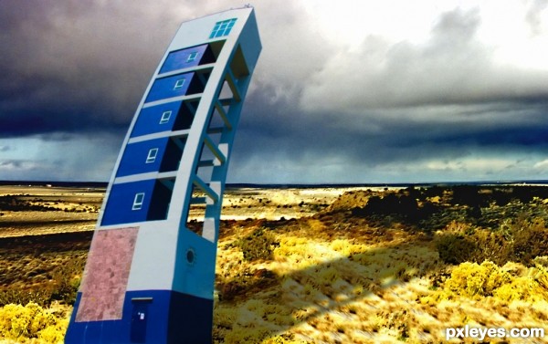
Hmmm a silly idea. But I am happy as I am new to PS. (5 years and 3617 days ago)
Good job: )
Thanks bro!
Author, I know how you feel, 'cause when we learn to use PS and can do anything and see the result... It's simply great! 
Just one thing (a detail that many times we forget, but it makes all the difference): you need to add a shadow for tower, following the light source! 
@erikuri
Thanks and its true when its first time.
Now I added the shadow
good job.... nice idea tooo....
gud luck author..... 
@hereisanoop
Thank you and the baby avatar was awesome
@swordfish
Thank you
nice
Always great to find out what you can do with PS...good start......best of luck.
Howdie stranger!
If you want to rate this picture or participate in this contest, just:
LOGIN HERE or REGISTER FOR FREE
Thanks to:
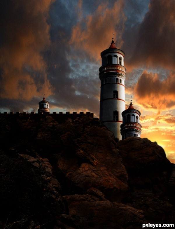
Lelaina for the pic of Sunset.
CMYK46 for the pic of cliffs. (5 years and 3618 days ago)
Excellent, Stunning work ! Very well done 
That's nice  . However, the towers look repetitive, maybe you can clone the windows (especially the blocked one) to different place to make them look different, also the edges of the rocks look too sharp. Good luck!
impressive. very well done author!
Wonderful! The castle got a different mood, it looks like a fortress now... 
awesome mood
Looks really good ! 
Very nice lighting and blending
Thank you for your comments and suggestions. I will check the edge of the rocks.
great job 
Thanks again. I blurred the edge of the rocks. Thank you Langstrum for suggestion. The towers will remain as they are. Who knows who the designer was, probably he/she wanted the towers to look similar, this happens in buildings......
great job, author.. Best of luck!
Very beautifull work, i somehow think the bird doesn't fit well here.
Wonderful!!!
Edges of mountain on the right are blurred while tower edges are sharp. Agree with Akassa regarding bird. Also bird's wings masking, need some work. Nice composition. Good Luck 
EDIT : Much Better 
fantastic lighting effects
Blurred edges of towers, the seagull is gone. Thanks to Akassa and Nasirkan for suggestion, the rest of you, thank you for comments.
excellent work author....but i don't understand the purpose of that small tower near a big one.... who construct these towers..... 
Great entry.....nicely done.....GL
good work
A striking entry. GL
Thank you very very much for using my picture to create this wonderful entry! Good luck! 
Lelaina: I think your pictures of sunsets and landscapes are just "beautiful" I like to use them in some of my entries. Thank you. Good luck to all participants this week.
congrats george
congartulations!!!...
Thank you all for making my entry "Favorite" and your congratuations. I appreciate that.
Congrats!! 
Howdie stranger!
If you want to rate this picture or participate in this contest, just:
LOGIN HERE or REGISTER FOR FREE
thx for sources (5 years and 3671 days ago)
imo i think you should clone out some of the windows.
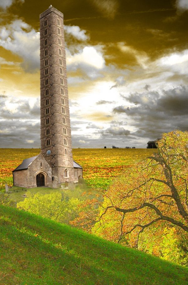
Might be good to straighten the tower...
Nice... 
i don't think the background chosen works with the church... the focal point of the added image is more to the forground, so the area where the church is at is less in focus, so the church fels out of place where it is since everything around it is not in focus but the church very much is in focus...
its a bit messy at the lower right part of your tower but i think it's a very nice entry ! 
leaning tower of old church! lol
The tower is too tall and slanted which make is it looks like it is going to tip over any time now!!
Nice work...good luck author
Agrees with CMYK
Howdie stranger!
If you want to rate this picture or participate in this contest, just:
LOGIN HERE or REGISTER FOR FREE
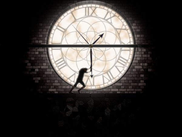
I used for this entry Photoshop and Eye Candy plugin for textures. The clock is made by myself. Thanks for view and comments. (5 years and 3679 days ago)
nice idea,gl.
Coooool... 
Nice idea...create some ladders for poor guy to reach whole clock...
How can I post a photo in this contest???
Albiss, you are level 1, and this contest is for level +8. You can get more information in "Rules & guidelines"
Thank you nayway I had a good foto for this competition.  ))))))
love it so much, good idea, you made a nice clock
Good idea....Nice work....
Very nice entry, has a "story" and is well done, the only thing I don't get is the cropping... a little more space at the top would balance this out.
Thanks everybody!!. Annabat, you are right, I hope to get time to improve this. 
Would like to see more of the process, but I like the piece.
Would have been more effective to use real textures, but good idea...
From the title I thought there would be a guy in a hampster wheel, I like your lighting and such. Good luck.
Nice representation of man's struggle against time!! Well Done! GL
Like the use of a silhouette in this image
Howdie stranger!
If you want to rate this picture or participate in this contest, just:
LOGIN HERE or REGISTER FOR FREE
run away! it's gonna crush )
)
poor building...i hope all pips are evacuated...lol...good luck author
this is so different for you - I like it a lot! cool ships.
Cool nice!
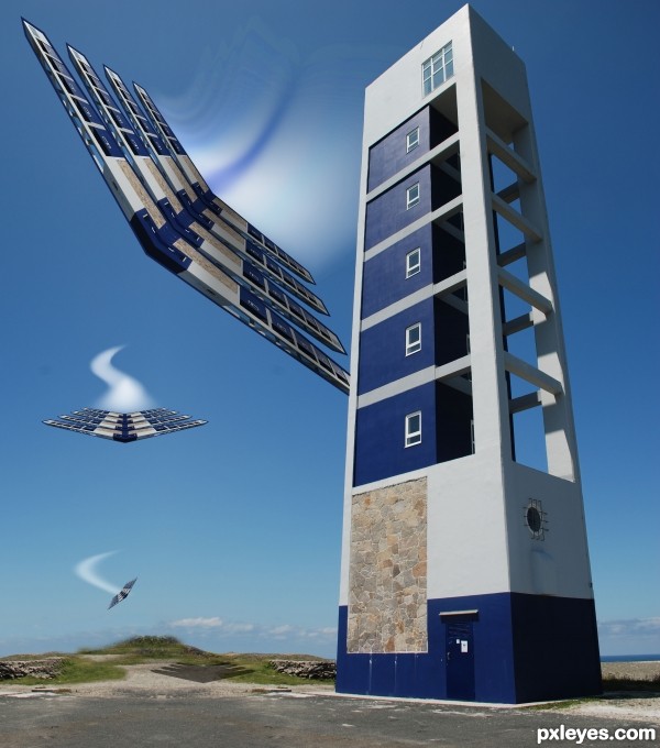
The multi-wing fighters are very cool except for their dark blue border. Retaining the matching blue lighthouse contest source really reduces the overall impact of the image IMO because it becomes obvious where the planes came from. Additionally, the near plane looks like it's about to clip its wings on the tower.
Buzzing the Tower
 Akassa is one fine photographer
An aerial stunt in which an airplane tries to fly as close to a control tower as fast as the pilot can come without collision.
Obviously only acceptable if staged because it is so dangerous.
and I retained the original image because I love it so much
This is awesome and well built.........


coooooooool
Nice work......GL
wow........... am sure to the top 3...............
cool chop good luck
Howdie stranger!
If you want to rate this picture or participate in this contest, just:
LOGIN HERE or REGISTER FOR FREE