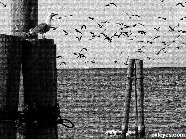
A peaceful dock scene. (5 years and 3472 days ago)
- 1: Flock of Birds
- 2: Background
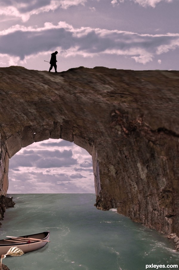
(5 years and 3517 days ago)
Very creative. You really went above and beyond on this one. Great job!
The upside down clouds look weird, and the leaf is so far in the foreground that it wouldn't have that shadow. Good effort otherwise. 
Plus, the top of the arch looks incredibly blurry...too much to ignore. And there seems to be a little bit of a transparency crack on the right side. I also agree with CMYK. But definately, nice effort and great idea.
CMYK, I took the shadow out, I will find other clouds, meanwhile i flipped them right side up. thanks for the help.
gamemastertips, the top of the arch? do you mean the part of the tree over the arch? it is the source image. can you give me more info, i dont see a transparency crack? (Sometimes cause i have looked so long and hard i dont always see things) to the right is just the tree. thanks for your comments.
edit: are you talking about the spider web? i liked it! do you think it should go?
Oh okay, maybe it is a spider web, then. What I mean is that there's an incredible difference from the very sharp base of the arch to the very blurry top half that I believe is the texture from the tree.
I agree with gamemastertips - the blurry top of the arch is distracting, although I know it is part of the source. Perhaps add another rock texture and blend it in? Otherwise, cool idea, and nicely executed. Good luck.
ok guys, not sure it makes it better, but i changed it some, let me know
It's still blurry... I suppose it happened when you stretched the image of the trunk on the arch.
lol! no erikuri. i didnt stretch it. oh wow. didnt you see the source? it IS blurry. i didnt do anything to it to MAKE it blurry. to try to help it (because of the comments) i did do some work on it, and now it is less blurry. i really didnt want to change the tree at all since it is the source and i was really trying to do a creative use of it by turning it on its side and using the knot hole as a waterway.
i like it
thanks everyone!
Howdie stranger!
If you want to rate this picture or participate in this contest, just:
LOGIN HERE or REGISTER FOR FREE

I thought it would be an interesting concept.. :)
Thanks to nkzs from SXC (5 years and 3563 days ago)
Beautiful 
Great work author.
Very interesting idea! 
Very clean work 
Very good. Can you please also post an sbs?
Another nice piece of work, I know this is nitpicking but what dose it look like if you flip the leafs?
To me it looks as tho the rain is going in one direction an the leafs are being blown in the opposite direction......
s author.. Warlock rit..
i agree with him
Thank you all for your comments! Warlock i tried flipping the parsley leaves horizontally but unfortunately there were a few layers linked to the parsley so it's almost impossible to flip without ruining the image. However, i do agree with you, and it's unfortunate that i didn;t think of that sooner.
Nice surrealism, just a small nitpicking ;- )
Right now, the snow is kinda flat against the radish (almost perfectly lined up with the surface of the radish). Since snow has dimension and it's not flat, I would draw a bit more snow on top, so it doesn't look like it's a piece of white paper on top on the radish 
and congrats again Matteo! 
Congratulations, Matteo! You are one of my inspirations... 
Congratulations for 3rd
Congrats for 3rd 
Congrats
Congratulations, Ponti,
Beautiful entry, and am thrilled to be a winner along with you and Nasirkhan.
Howdie stranger!
If you want to rate this picture or participate in this contest, just:
LOGIN HERE or REGISTER FOR FREE
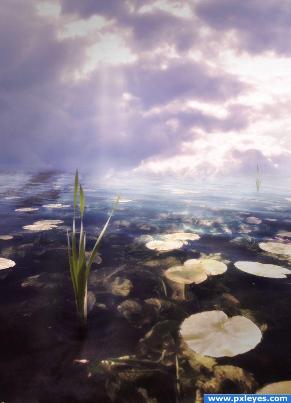
I hope i did this great photograph justice.
I adjusted the horizon with some fog, thanks Pingenvy and Loopyluv. (5 years and 3818 days ago)
This has a nice mood-a foggy sunrise. IMO the right side needs some fog covering the horizon area. Judging by the waves, we are seeing water about 30 to 40 feet away & then immediately sky. It just seems too low to me. Some horizon-level fog would mask that I think.
Good work, I will ahve to agree with "pingenvy" , try adding some fog to correct the horizon issue  Good Luck
Excellent advice, thank you very much, i'll get right on it.
Edit: Okay, i applied some fog, thanks to both of you, i added a seventh step on my guide to show you.
Wow very nice... gl
Great work...nice blending.
Nice Color .... 
Wow, minimal use of source but wow, looks so cool. Less is more.
yet another brill piece of work from you, author
Great lighting!Well done!
nice
great name for your entry... says it all. 
good image.
Beautiful!
the sixth place....congrat to you ponti55  (sad, but i think you should get more point for this nice entry
  )
)
Howdie stranger!
If you want to rate this picture or participate in this contest, just:
LOGIN HERE or REGISTER FOR FREE
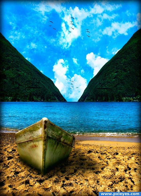
Calm scene in a beach, remembers me of serenity, tranquility...
Credits to svenic, Zhonk, sundstrom and antixstar. (5 years and 3893 days ago)
You should have used the original background. The symmetry kills this...
What do you mean? I did some adjusts with liquify to make it look like the front part of the boat, it's not so different from the back part anyway and i think the perspective is fine.
I'm talking about mirroring the mountain in the background when the original background was better. The symmetry is distracting. The rest of the pic is just fine.
Oh i thought u were talking about the boat lol i didn't like how the right mountain looked so decided to clone the left one with some lil differences.
Beyond the above opinion about sysymmetry (mater of opinion) you have done a beautiful job with this high mark from me
I've made the right mountain a little bigger and flatter with some irregularities, hope the symmetry feeling is way less now o.o
cool background
beautiful! I wish I was there:P
Nice mood, the shading around the bottom of the boat is a little harsh though, but the rest looks great.
Howdie stranger!
If you want to rate this picture or participate in this contest, just:
LOGIN HERE or REGISTER FOR FREE
I think it can be better without the texture effect, and with playing with light. Good luck author !
Great concept. I do agree with Lolu though ...You can add very nice and easily editable textures by:
Add a 50 percent gray layer with the blend mode set on Soft Light (Overlay and Hard light work too ... just stronger); apply filters (you can combine them until you get a look that you like - e.g. stain glass, monochromatic noise ...you can do this in more than 1 layer). You can warp them or transform them; you can paint some out or back in (using gray); you can blur or sharpen.
Once you think you like what you have created. Voila! You now have a texture that you can work on, change opacity, lighten (use lighter grays to white), darken (use darker grays to black) and all without harming the main image.
Trick: the neutral gray layer is also a great way to play with the lighting almost like dodge and burn but non-destructive ... use white for highlights, black to darken and/or intensify and 50 percent gray to bring back to neutral (no change).
Arca gives a nice tip, you can try it. Beautiful image, though.
nice
I like the treatment here, it really looks like one pic.
Howdie stranger!
If you want to rate this picture or participate in this contest, just:
LOGIN HERE or REGISTER FOR FREE