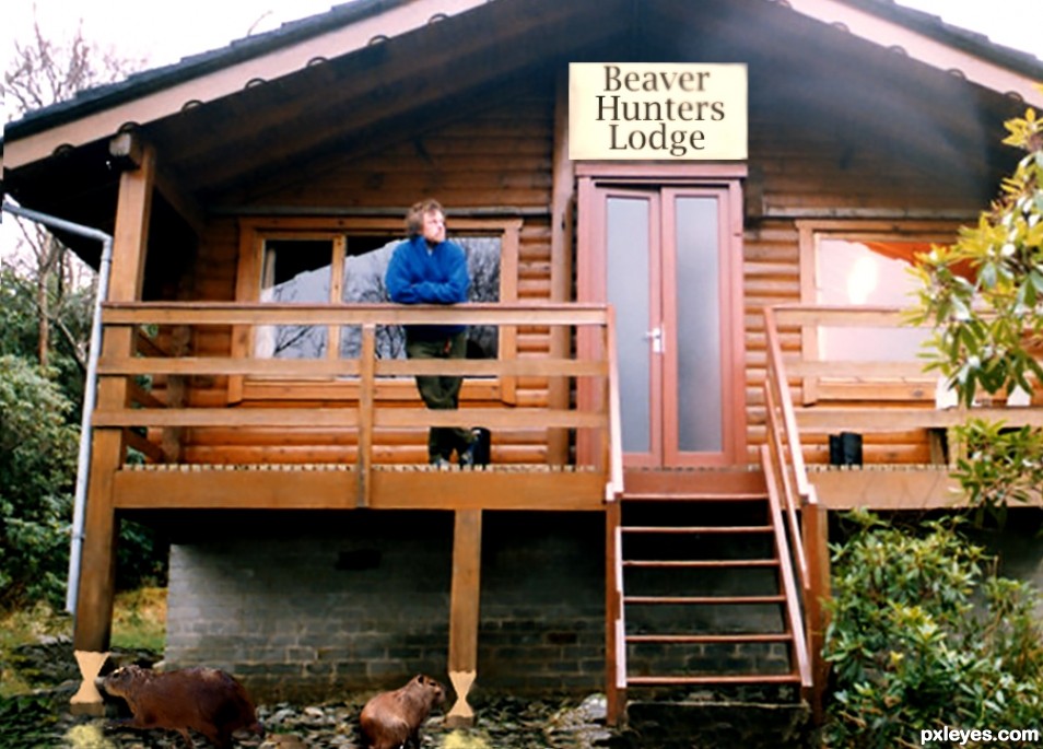
The beavers hatch a plan. (5 years and 2525 days ago)
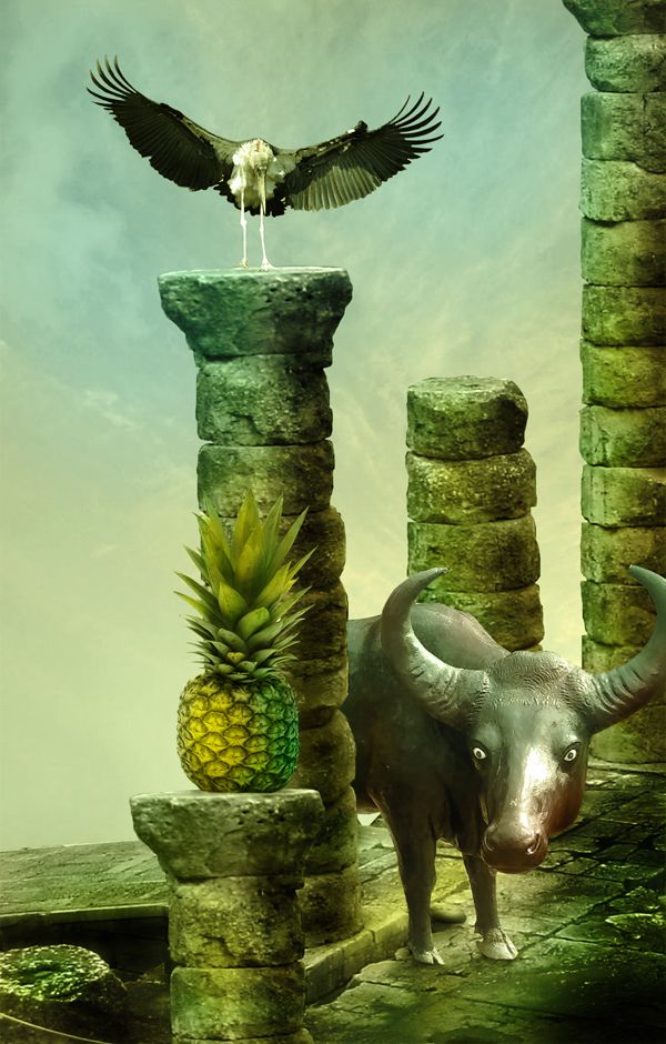
thanks to doc and jfonono for stock images (5 years and 3612 days ago)
Pretty nice storytelling image, could be from some exotic fairy tail. Small nitpick: for some reason I expect the cow (it's a cow, right?) from behind the large pillar, since the front paws are on a same line as that pillar (in perspective, that is). You could think about if you want to mask away that bodypart. Good luck!
Edit: I knew I should've paid more attention in biology classes cow=waterbuffel
its a water buffalo not a cow lol
wazo is right abt the masking.., and wrong abt the 'COW'...,no it's not a cow..., water buffalo not equal to cow.... 
Thanks for the comments friends.I edited the entry ,thanks Wazowski 
Edition was nice & beautiful.................
Great work author...u could use few colors adjustment layers to made better blending and maybe to get few % on the effect...my advice with color like this is to use dark brown color,blend mode set to color with low opacity and maybe some nice blue-gray color also color blend mode set to color and low opacity...and if u want to spice it a bit,add dark green and set blend mode to soft light,that will pop up the figures a bit...good luck
erathion, you are a genious, i applied adjustment layers with blending mode color to each image, hope it looks better
Cow and buffalo are not so equal, but not so different; both are bovinae. (http://en.wikipedia.org/wiki/Bovinae) 
I think the buffalo's rump must appear behind the column - a little, at least. I like the coloring of the image.
nice coloring and Gud luck to u author........... 
@Erica: As far as i know there is a lot of difference between a cow and a Buffalo......colour, horn, body shape etc........ and buffaloes are stronger than a cow........ In our country we use them for ploughing ...............
Cool entry 
GL 
Now i can vote...great improvements author...well done
Good one
beautiful colors
cool!
love it.... gl
Nice blend.
Congrats for your second place, Steed!
Congrats!
Congrats for your second, and fifth place
Congrats on second place...your work was my personal favorite...
Congrats on 2nd .......... 
Congratulations!
But cow and buffalo both moo... 
Howdie stranger!
If you want to rate this picture or participate in this contest, just:
LOGIN HERE or REGISTER FOR FREE
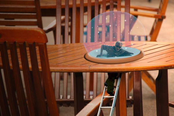
ive never done something like this before so any advice you can give would be helpful. thanks! (5 years and 3801 days ago)
nice done
I think its very good done. Maybe you´d like to flatten the hole a litte bit, so its in proportion to the tables "flatness"...
Haha I love this creative idea
i love it!
the perspectiv is a bit wrong, and the globe isnt very circular, hold shift while drawin your circle with the marquee tool ( if you want a perfect circle) .. Either cool  ,, maybe some shadows would help too ..
nice
you need to add highlights and maybe a glow on the circle, it's too flat looking
Nice idea,very funny
I like this kind of thinking.
I don't get any story here, but it would be surreal if the snow globe were realistic. MaXed is correct that the perspective of the base doesn't quite match that of the table (but I don't agree that the globe itself has to be perfectly circular).
I like the idea of this! The globe does need some work, with highlights and reflections ; )
tin my snow globes defense, not all snow globes are round. also, im not sure i know how to make highlights or reflections 
About the perfect circle .. it wasn't ment to make him make a perfect circle.. just a suggestion.. still needs some shadows i think and the perspective could be worked on .. 
Here is but 1 tutorial on making nice glass balls. http://www.lunacore.com/photoshop/tutorials/tut009.htm
great idea good luck
Cool...lol
Globe is elliptical rather than circular.....Other than that a nice idea and concept.....
wow
Really creative, great job.
Howdie stranger!
If you want to rate this picture or participate in this contest, just:
LOGIN HERE or REGISTER FOR FREE
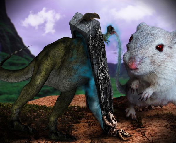
Once upon a time, there was a smart mice which likes ... dinosaur meat. But how can he do that? There was a magic portal (or door) can be used as a "Dinosaur trap", which converts everything from small size to huge size and vice versa.... Let's see how it works. Have fun ^^
Credits to alegion-stock (DA) for the dinosaur, demoncherrystock (DA) for the mouse, moon-willowstock (DA) for the desert scenery, castock (DA) for the jurassic valley background, caltha-stock (DA) for the roots, hatestock (DA) for the brown mouse, and lucky13 (DA) for the dinosaur bone.
It's the biggest photo I've ever manipulated (around 7000pxl:5400pxl), so it's quite slow in downloading. Because it's very large, maybe some errors I can't see, so please help me to figure them out, then I can improve it. Every constructive criticisms are appreciated. (5 years and 3807 days ago)
U cannot use dinosaur image,that is some others manipulation and its not allowed to use it for contests.And something else,i don't see any doors here...
why can't I use? did you see some stock images with manipulation? I think it's acceptable if I show how did I manipulated it. If you are correct, so many people broke the rule when they use brushes, because they are manipulated also. As I explained, the one I call the trap is a door, it fullfills the topic "This door can be anywhere, can have any purpose you like and can be made out of any material. Just design the craziest door you can think of". The one in the center of the image is my door, a magic door, I don't think it's difficult to imagine.
I think the Dino is ok, since this is what the user says:I, Colin Foss, aka "alegion-stock" hereby give permission for my stock images to be freely used in any and all dA Prints.....
Its not hard to imagine that and u are right,for the doors.But check rules and guidelines,brushes are allowed but some others manipulation are not.
Yes that is ok for the author of the Dino,but PXLeyes rules are clear....That should be guide line for all
@erathion: here is the sentence from Pxleyes guidelines: (UPDATED 08/2009): If you use 3D renders or illustration as sources, the same rules apply as for normal stock photos. So it means I can use the 3D render or illustration.
Excellent strangeness. 

very unusual, nice imagination.. a portal could be classified as a "door" too i guess
Thank you CMYK46 and elficho, I always wanna bring something extraordinary to the contest but I'm afraid that a part of the voters doesn't accept the strangeness 
Original and nice color too. 
Great imagination....
Very creative idea, but I'm having some problems with the perspective of the stone monolith and the portal. It looks very twisted and almost like falling.. dunno if it's intentional. I'm ok with the portal instead of door, as this is a contest without a source. I don't quite see the point of manipulating this kind of picture with so high resolution, but well.. if your comp can handle it.. You could have shrink the high resolution version still ½ the size or something, not that much small details here really..
Thank pixelkid, Govindrathod, Widiar. @Widiar: I intentionally created the portal with that shape (a little bit weird in the shape, but no problem in perspective, because it was made by Swift 3D. About the resolution, it's high to me, because I had to restart PTS every 10 min to keep it work normally. However, because of the differences in source qualities, so in some area, there are not many details, but on the Dino or mouse, the quality are high. Just my idea, because it's high or not depend on each person. Thank you again for your comment in details.
Cool! 
I think it's too cluttered and the giant mouse doesn't seem to fit, IMO.
Howdie stranger!
If you want to rate this picture or participate in this contest, just:
LOGIN HERE or REGISTER FOR FREE
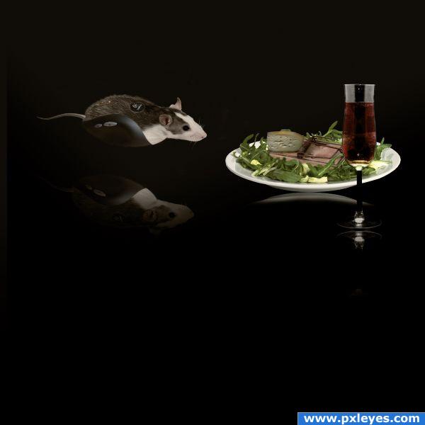
Special thanks to authors(Kai Kuusik-Greenbaum,Jasper Kuperus,Peter Galbraith,Nick Normann,Piotr Lewandowski and Helmut Gevert) of great pictures which i used for this project . (5 years and 3913 days ago)
You should tweak the reflection a bit... Looks like they are floating... But if you intended to make them look as they are floating then it's okay... 
Thanks for the suggestion i change the reflection little bit...
You would only see the bottom of the plate in the reflection, and it should be closer to the plate and the reflection of the glass is crooked...
I hope it's better now...
the reflections should be directly beneath the objects. which means you cannot select everything, flip it and put it lower. this way the plate and the mouse look like they're floating. also, this looks like a flat surface these objects are on so there would be no distortion on the reflections.
Extraordinary!
cute
reflections are hard to get correct for sure.rule of thumb is usually remember reflections connect with the original image and either reflect in the surface below or stretch out depending on light source.. love your creation  GL
GL
Howdie stranger!
If you want to rate this picture or participate in this contest, just:
LOGIN HERE or REGISTER FOR FREE
hehehe, clever idea (You may want to use a small soft burn brush on the sign and nibbled areas to give them more dimension, really fun concept
Thanks, I made some minor corrections.
I can't wait to see how they chew through the concrete block foundation...
Howdie stranger!
If you want to rate this picture or participate in this contest, just:
LOGIN HERE or REGISTER FOR FREE