(5 years and 3489 days ago)
- 1: source1
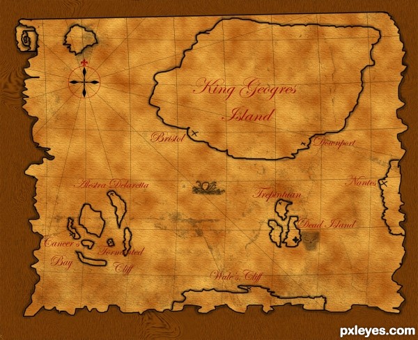
I hope you will like this map ;)
Map edge and islands creation: I used brush with random mouse movement,
Map colour was created by mix two colours with clouds rendering.
Dirt created by downloaded 2500px brush.
Compass: four fleur the lys main arrows + circle + 6 lines
Map curved lines: one multiplied line with curved shape.
Rounded map shape: Photoshop spiral as a base and created as other edges
Skull and sea monster are 100% mine ;)
(5 years and 3542 days ago)
I think it would be nice if the edges of the map were made of real old and torn paper.
very neat
great idea author,but as Erica sad,maybe would be better if u use some old parchment...best of luck
Howdie stranger!
If you want to rate this picture or participate in this contest, just:
LOGIN HERE or REGISTER FOR FREE
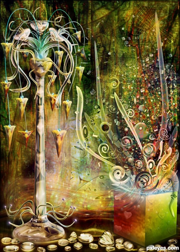
The image is created with Photoshop and Illustrator. Please see sbs before voring. Thanks:) (5 years and 3545 days ago)
WOW! Amazing work author. Congrats! 

 Love it. My fav.
Beautiful image, love the depth and use of Illustrator with this. Looks like a kind of Pandora's box - that swoosh near the bottom is cool!

Wonderfull, again  GL
GL
incredible deatil -- great work
Well fine.. that was exactly what I was going to do author.. now I can't put in my entry because you did it already... grumble grumble
(and if you believe that! I got a bridge to sell you named Brooklyn)
Love the shells on the base.. WONDERFUL
wow this is no less than what i expect from you author! superb work
Can not forget it
You have a wonderfully style author!.....a very sophisticated and well executed image.
very nice ,and very good work ,good luck
Such wonderful colors and composition - as always!
Such wonderful colors and composition - as always!
Good work.
Author, not only your work, but YOU are wonderful! I'm really with no words... 
Fabulous work as always 
Spellbound creation............Congratulations in advance.
wow!! 
this is a abstract gl
Thanks to all for the nice comments and favs! 
Congrats! 
the winner is ........you again,......congrats,...your works are always that amazing.....
Congrats no surprise here fantastic image!!
Congratulations on another terrific entry!!!!
Congrats for 1st place.
Happy Dance
Another absolutely beautiful work Cornelia, congrats 
Congratulations - AGAIN!!!!
Congratulations, Cornelia! I knew this work would be the 1st... 
Congrats! for 1st. Amazing work as usual.
wow congrats Cornelia
gulp!! feeling dizzy.... congrats for such a beautiful chop...
Congrats Cornelia 
congrats for the first place 

congrats
It's fabulous ! congrats 
this one is realy nice congrats
Many thanks to all for the congrats and support! 
Howdie stranger!
If you want to rate this picture or participate in this contest, just:
LOGIN HERE or REGISTER FOR FREE
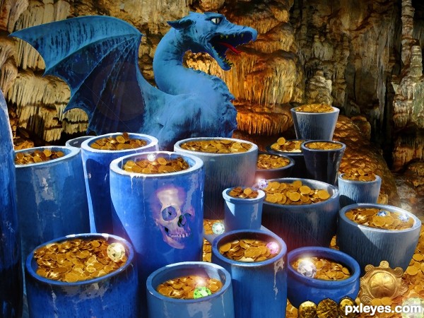
This one took FOREVER so I hope the end result was worth it. Lots of cutting, copying, pasting, cloning and filters to get the desired effect. (5 years and 3608 days ago)
money money money,,nice take..i feel the dragon is distracting you work..a bit too much..IMHO..good luck
Thanks very much to Duthcprof for his Skull image I used in this project.
This would have been a stronger image if you had left the dragon out imho. Nice idea and good luck.
beautiful entry ................
Good job putting all of this together, blending looks pretty good, a high resolution would have been nice. Nice picture!
Congrats for your second place, Heinrich!
congrats on second great job
Congratulations for 2nd
Congrats! 
Congrats!
congrats for the 2nd place .......... 
congrats
Congrats!!!
congratulations!!!...
Howdie stranger!
If you want to rate this picture or participate in this contest, just:
LOGIN HERE or REGISTER FOR FREE
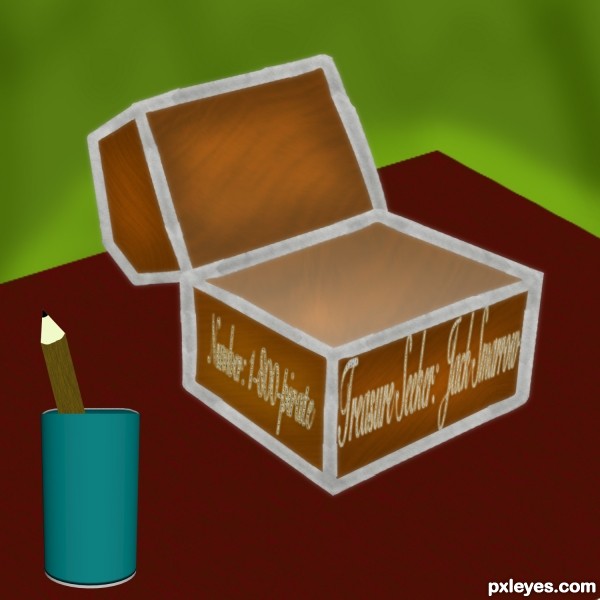
if you cant read it says:
name: jack Smarrow
number: 1-800-pirate
I added an office effect =) (5 years and 3612 days ago)
You have to make internal part of the arc; the way it is now it looks flat... Perspective of the pencil holder doesn't match the rest... try to fix it, author!
Where are the inside planes of the box & lid? Why isn't the font legible? Fix the perspective on the pencil cup.
....................
nice
nice idea, good luck
Howdie stranger!
If you want to rate this picture or participate in this contest, just:
LOGIN HERE or REGISTER FOR FREE
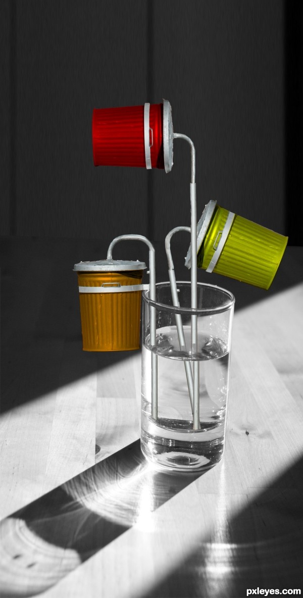
There is a very strong source of light in this pic, so unfortunately the shadows on the bins don't quite fit on this image.
Dust bins need to cast shadows on the table...
Ha! this is quite funny and creative, but I agree about the shadows...
  Good luck!
Good work. listen to the previous comments. good luck
No ones gonna drink water from garbage cans.... :P
Howdie stranger!
If you want to rate this picture or participate in this contest, just:
LOGIN HERE or REGISTER FOR FREE