Credits to :
Source 1 : Accent
Sources 2 and 3 : CGTextures
Source 4 : latebraking
Source 5 : Dustin Maretz
Source 6 : ^FantasyStock
(5 years and 3430 days ago)

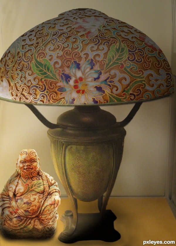
Thanks for the images of the egg by irum, and the lamp by unforth. (5 years and 3524 days ago)
Very cute, but Buddha seems to be floating. It needs a slight shadow under it. 
Thanks for the observation erikuri, have amended the shadow! 
Absolutely brilliant sweetheART love it lol! ;} happy hippy hugglez
nice work !! g l
shadows need some work
Congrats for your third place, Disco!
Congrats, Diane! Nice... 
Congrats! for 3rd 
Thank you for the good wishes Nasirkhan, erikuri and Lelaina!
Congrats
Congrats...
Congrats! 
Congrats!!
Howdie stranger!
If you want to rate this picture or participate in this contest, just:
LOGIN HERE or REGISTER FOR FREE

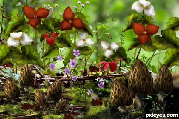
Searching for morels in the spring was always a spring ritual as our children grew up. Red and white trillium and violets were everywhere. No outside sources were used. All flowers and mushrooms were made with brush, smudge and eraser tools. All details in my SBS. Please enjoy!! (5 years and 3595 days ago)
Beautiful, I love it!! What wonderful talent you have. Best of luck to you!!
So kind of you!


Wow ! I was not expecting less from you 

Really beautiful!
wow ............. great work .............. very beautiful creation ............. all the best to u author............. 
very nice work author...best of luck
I don't need to say it's a fantastic work, do I?... 
Nice one.
Amazing 
Thanks to all for your very kind comments! Would love to cook up these mushrooms for you all to enjoy!
Congrats artgirl ......... 
Congrats for your first place, Lois!
Congrats Artgirl, lovely work 
Congratulations Artgirl! Well deserved 
Congrats for your first place !
Congrats!
Congratulations for so deserved qualification! 
Congratulations! for 1st place 
congratulations!!! 
Congrats!
Thanks to you all!! Thanks to all who gave me this win for my 75th bday!!!
congrats!!!
Congrats!
Howdie stranger!
If you want to rate this picture or participate in this contest, just:
LOGIN HERE or REGISTER FOR FREE

(5 years and 3747 days ago)
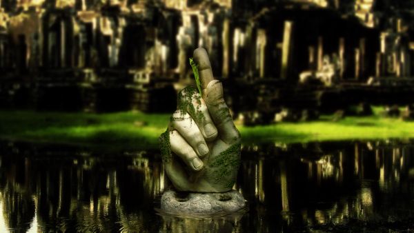
Really good job. The blurred background really adds depth, I think. In High Res it looks like something is wrong with the thumbnail and the edges of the Ivy are too sharp. Still. I really like this, especially the ripples in the water. GL.
Thank you very much Chaplain! I blurred the contour of the ivy very slightly, the strands connecting each leaf together are very thin, and any more blurring would result in a total loss of the stems, so i did what i could. Thank you very much for the comment 
this is very cool pic well done
Stunning work 
is this gaussian blur? try experimenting with lens blur. nice job overall
Yes it's gaussian blur, although the result i got using lens blur definitely looks more realistic. I'll try it out on future entries, thanks Elficho, and thank you all for your great comments 
congrats Matteo! 
Congrats 
Howdie stranger!
If you want to rate this picture or participate in this contest, just:
LOGIN HERE or REGISTER FOR FREE
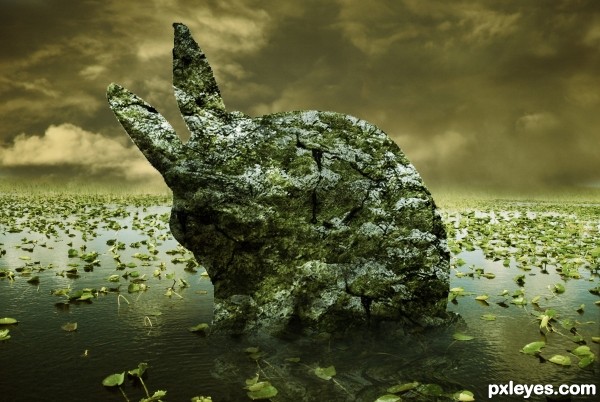
very interesting take on the theme.. (You may want to go around the edge of the bunny with a soft blur brush to get rid of the choppy edge (It's super noticeable in high RES and you know how some of the voters get about that nit picky stuff)... a little burn highlight tool set super soft to enhance the shading to give a stronger 3d effect might be helpful as well ... (very clever idea and good luck)
great idea but try to work on the edge of the bunny.. GL
Agrees. It seems like some shading in areas might help you get more depth. It just seems a little flat. GL!
DUDE!!! 48 FRIKIN' STEPS? you're a hero! I get that you want to make it a tutorial right away , but you have to improve it:
-place some shadow/ highlight layers ( use that original bunny to know where to paint), cause people & I think this is flat. Work ESP. around the right side of the HEAD, you must make sure it stands out.
- the edges suck, but the thing is you can' t make them smooth since this is a ROCK, not a sculpture.. right? so you must make the shape irregular like a natural stone.
- reflection is a bit forced.. see what DisMap gives you.
-And i don't get what the "cover it all in ivy" step, gets me? it looks pretty much the same without it. You can get a better stone effect with clouds & mezzotint like in that stone wall tutorial ( lunacore or smth).
Anyway keep it up, you're good with colors which is a big thing!
It would be great with a bit more of shadows and depth for the rock
very nice work...gl
Howdie stranger!
If you want to rate this picture or participate in this contest, just:
LOGIN HERE or REGISTER FOR FREE