(5 years and 3930 days ago)

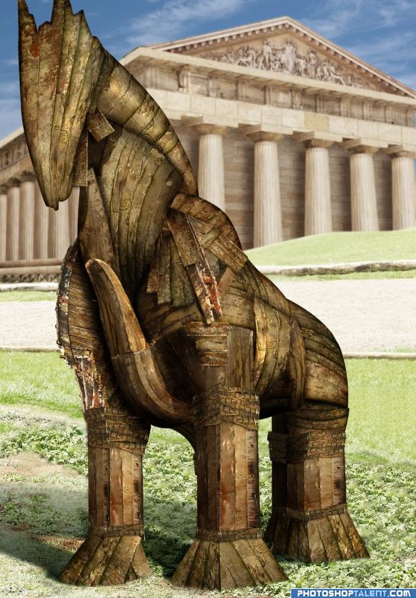
Copy paste and warp. The horse is only made with the given source.
I also had to reconstruct the Greek temple as there were all half destroyed in the photos. (5 years and 3967 days ago)
Horse looks pretty good, maybe you can put the horse's right front leg (left for viewer) a bit more behind (and some more to the right), so it looks better with the perspective (compared to the other front leg). Temple looks good too, I'd blur the edges a bit more maybe. Overall nice work! Good luck!
very nice creation.you should work on lighting
Thanks Waz and Gopan, listened to both your suggestions 
nice idea
great
great entry!

great job!!
favorite part is the support beam on the chest.. it really give the piece a heavy feel.. nit pic that doesn't really matter but the photographer cut of his EAR!!! hehe.. no big whoop, actually gives it THE TOO large for the camera feel LOL
with already high marks i think the fourth horsehoof in backward could also appear a little for truthful, if you care...  good luck!
Horse is very Nice............. G/L Author.
great!
Didn't the trojan horse have wheels under it? Good job on horse though.
backgound light is very intense as compared to front object.......otherwise gr8 use of source....
Nice work!
good one i love it..good job nice SBS
NIce construction of the horse, very convincing. I like the temple background.
congrats
WOO HOO.. the trojan horse takes the cake... and an entire greek army pops out of the cake.. good job and congrats
Congratulations for 1st mymy
Congrats!
congrats Giallo's Mom
Congratulations.
Congrats!
Congratulations!
Howdie stranger!
If you want to rate this picture or participate in this contest, just:
LOGIN HERE or REGISTER FOR FREE
Woweee very nice!
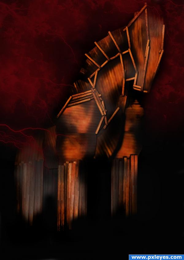
Sweet one! I like he colors and the mood
very nice work .. good luck
Very cool work, good luck
Love the colours very atmospheric piece of work top job!
good idea. would also look good with a hint of a burning city in the back.
Looks familiar
No reference, really? Funny how it reminds me this: http://www.pxleyes.com/photoshop-picture/4a389a143bd87/Troy.html
if you have seen troy ....and is one off my best movies you will see the horse looks like this that was my reference
wsonderful image just wonderful
Interesting!
I was thinking the same as mymy..u could always prove us wrong and post a reference
very nice
nice, but Mymy's entry is better
Howdie stranger!
If you want to rate this picture or participate in this contest, just:
LOGIN HERE or REGISTER FOR FREE