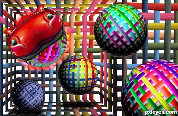
carnival picture with source (mine) (5 years and 3299 days ago)
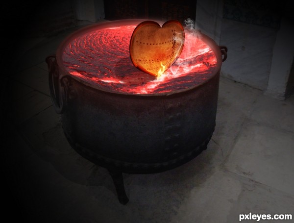
I used the Iron Beams as the edge of the heart (5 years and 3548 days ago)
???
wheres the contest source?????????
how u do this?
maybe you didn't read the description
Howdie stranger!
If you want to rate this picture or participate in this contest, just:
LOGIN HERE or REGISTER FOR FREE
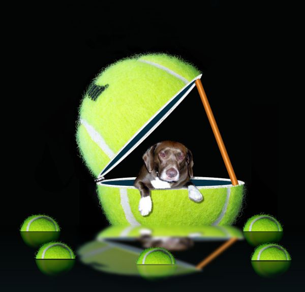
no outside sources used.
Dog used was my daughter's picture in sbs. (5 years and 3674 days ago)
I think some balls reflections must be hit by the waves, am I wrong? 
By the way, Coco is very cute, he's color is fantastic! 
i agree w/ erika. the big balls reflection is too wavy while the smallers ball's to calm.
ball should not be that much brighter... (darkening the top left of the tennis ball will give more good resut. THat what i think.. feeel free to ignore) by the way nice idea and Gl.
Thanks to all for advice... hereisanoop is this what you ment about darkening top of ball?.......also guys I took out the wave on reflection any better?...
Oh.. this is not what i mean,,, just shade the upper edge ( the round egge..) its not good now..... Ok i will give you some tips. check your mail
hereisanoop Thanks for reaching out I redone it but I don't know if it was what you ment I couldn't get it right so went back to original. I did retouch small balls
nice idea, but what happened to the top of the ball? nice to see some fur on the ball, how did you do it cos it took me ages to mask the original!!
PixelWhisperer.......It takes some practice but I'll be honest with you I didn't know how to do some of these things when I came to PXLEyes. but there were members who gave me tips and help along the way. Take your push brush and play with different sizes between one and four.Let me know how it works out for you.
Good masking job. GL!
Howdie stranger!
If you want to rate this picture or participate in this contest, just:
LOGIN HERE or REGISTER FOR FREE
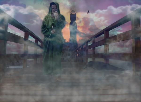
All additional images I've used in this entry are my own.
(5 years and 3783 days ago)
Photo of woman in SBS is not the one used in this entry...
CMYK, look carefully, this woman is not in the front, but on the back.  Honestly, she is there.
Edit: To avoid misunderstanding I've uploaded fullsized picture, that I used as a source.
I can see that you want a foggy misty feel, but the woman is somewhat transparent and you can see part of the building and bridge through her, perhaps leave her as she is but mask out what is directly behind her 
Interesting take on the source. Only suggestion I have is tone down the fog a little but that's just my opinion.
Thank you guys for comments. Sorry, mods, I came to the site too late today, and was unable to upload each picture in separate step. I'll take it to attention next time. Madamemonty, I mean it to make her little bit ghosty, other wise I would make her layers in normal instead of screen and multiply, that gives kind of sheer look.
good choice of stock photos. interesting outcome.. GL
Howdie stranger!
If you want to rate this picture or participate in this contest, just:
LOGIN HERE or REGISTER FOR FREE
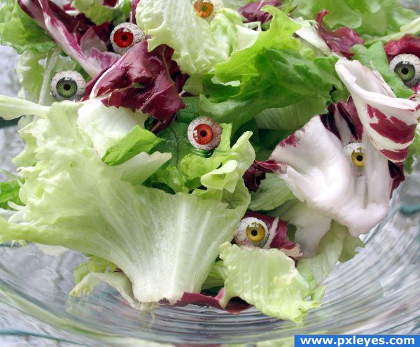
thanks Mike Licht, NotionsCapital.com (5 years and 3851 days ago)
This is a great idea, but the masking on the eyeballs is terrible. Try getting the edges better and you'll have something! 
yuck! Oddly, those goes so well in that picture 
Howdie stranger!
If you want to rate this picture or participate in this contest, just:
LOGIN HERE or REGISTER FOR FREE
very cool work author...work on a spheres is fantastic...best of luck
Cool...
Wow, this is quite imaginative. Made me smile when I saw this. Love how you made the spheres - hey, I'll bet you're good at lattice pies, too.
Your new engine looks great..!
Howdie stranger!
If you want to rate this picture or participate in this contest, just:
LOGIN HERE or REGISTER FOR FREE