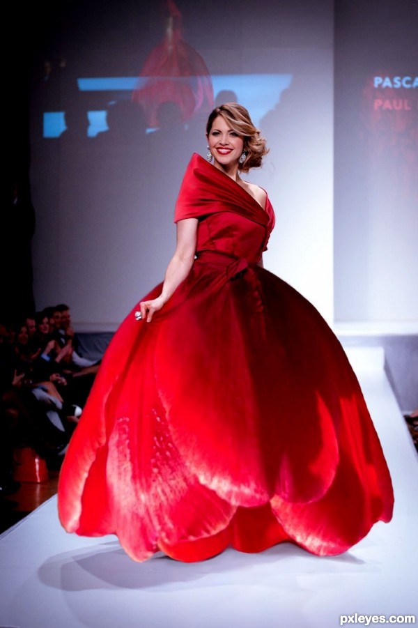
ok I know it has been done many times.--- my first. (5 years and 2666 days ago)
- 1: model
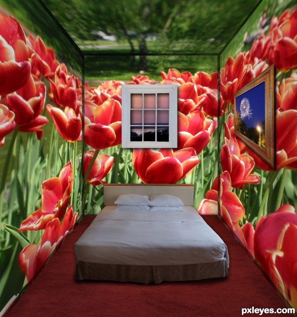
Fireworks photo on the wall - my own - will attach in StepByStep (5 years and 3263 days ago)
The angle of the bed is tilted a bit too much, you'd slide off the bottom. Your corners are also a bit too thick and don't meet up quite right in the upper RH corner.
It would be nice to see something outside that pitch black window. Even the darkest night isn't quite that opaque...
Beautiful color scheme, though!
Thank you very much for your help  I've tried to fix up a few things.
Looking better, but who puts a window curtain or blind on the OUTSIDE of the window??? 


MossyB perhaps the idea was to show the outdoor picture as a room so it stands to reason the indoor view should be outside? ;D
Howdie stranger!
If you want to rate this picture or participate in this contest, just:
LOGIN HERE or REGISTER FOR FREE
(5 years and 3742 days ago)
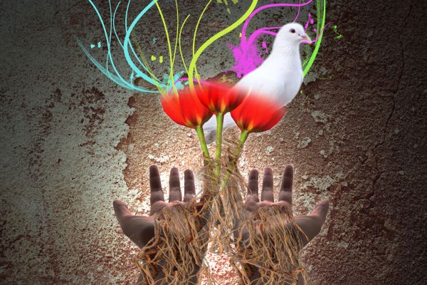
Work on the masking & blending on the giraffe.
I agree with CMYK about the giraffe... 
hands,tulips,stripes fits perfectly,but giraffe is distraction,maybe to put some other smaller animal who fits better...
Now it's pretty nice! 
Howdie stranger!
If you want to rate this picture or participate in this contest, just:
LOGIN HERE or REGISTER FOR FREE
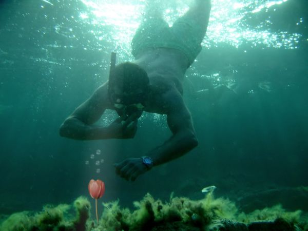
Can you find this on the bottom of the ocean? I don't think so :)
credit to source 1 by "manolo" (5 years and 3743 days ago)
Very interesting idea... Don't you think source image a bit sharp comparing to the background? 
Yup, erikuri has a good point, the flower & bubbles can do with some blur. You also may wanna experiment with a blue-ish photofilter for the flower, so that the colors match better with the background. Good luck!
yes the points above r to think about.. now it looks as if you pasted it.. needs to blend with the rest of the image..
Very very nice work author...
good rework.. its looks better now.. 
the blend is better now 

Howdie stranger!
If you want to rate this picture or participate in this contest, just:
LOGIN HERE or REGISTER FOR FREE
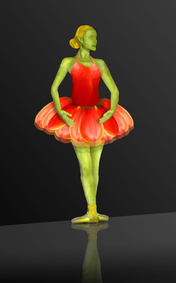
First try at something like this.. so do comment and let me improve this skill.. :) and as I said this is my first time, I wasn't able to get the face.. :( but I'll get it in future for sure.. I'm referring and learning a lot from the works of pxleyes users on creating faces and bodies.. :) (5 years and 3746 days ago)
High res please. Ballerina dress looks like it has an extra layer that is transparent and not necessary. I'm assuming you turned her green to match the source more?
For a first attemp is very it's very neat! I understood ballerina dress; there are many layers of fine cloth, and you wanted to simulate them with tulip petals, right? Nice... 
@jawshoewhah: the high resolution is provided.. and the extra layer is like the many layers of fine cloth and I didn't turn her green.. I used the stems of the tulips to create her body.. All the parts the dress, the body, the hair, the shoes.. these are all created from the source image.. 
@erikuri: Thanks buddy and yes you are right.. 
Her shoe and shoe belts are very flat, you can shade it.. and totally its a nice work...
I like the simplicity, but I think that either the ballerina's positioning should conform to the Rule of Thirds [move her to the left-third boundary] or else you should reduce the amount of black space around her -- and bring her a bit more foreward from the back wall. A multi-layed tutu is certainly appropriate, but that doesn't explain the underskirt escaping beyond the overskirt on the left side. And why not add a third underskirt? Perhaps facial features and some sort of tulip headgear would more depth and content.
Thanks DanLundberg... I corrected the escaping underskirt and cropped the image to get rid of that extra black background.. if you can read the description I've mentioned that this is my first attempt at creating something like this.. and that's y I couldn't work on the face.. I'm learning from the works of pxleyes users to improve that part.. and @ hereisanoop, I hope the shoes are no more flat..
Looks much better. Use the Burn Tool to add a hint of facial features. Create an eye- or mouth-shaped selection beforehand to constrain where the burning occurs. (BTW the vertical neck shading would be better deleted IMO. And the collarbone shading needs the little dip at the bottom of the throat.)
Great job author...good luck
ok people.. that's the best I could do about her face.. hope I didn't ruin my entry.. its really tough to get the face right.. phew.. added an ear as well.. hope you all like it.. 
You didn't ruin your entry... it looks better with the facial features. Great effort. Good luck.
Thanks Bluesparkle.. 
pretty!
i like it
Howdie stranger!
If you want to rate this picture or participate in this contest, just:
LOGIN HERE or REGISTER FOR FREE
This would work a lot better I think if the tulip dress was sharper in places. At the moment you can tell it's just an enlarged flower. You need a source image of a model that's bigger to begin with so when you match the two the sharpness is similar
I agree to previous comment. The dress is kinda blurish on some places, yet I really like the idea! The different shades of red are also well combined, looks natural.
It may look blurish, but if you look at the source it is also blurish as it has not been alterd
i suggest to manipulate also the model on the screen behind, GL author!
done
great atmosphere, fine photo, bravo
Howdie stranger!
If you want to rate this picture or participate in this contest, just:
LOGIN HERE or REGISTER FOR FREE