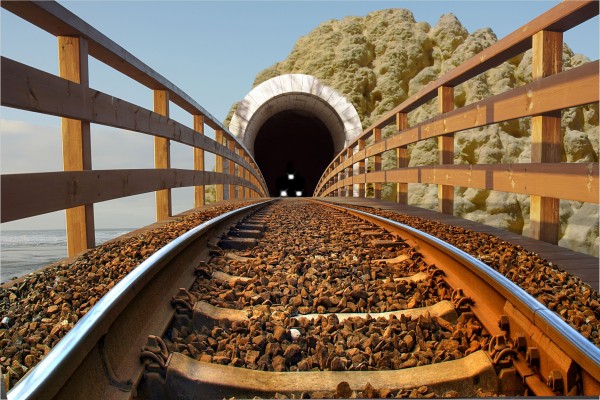
(5 years and 3767 days ago)
- 1: Railway
- 2: Tunnel
- 3: Hill
- 4: Train (used for tracing)
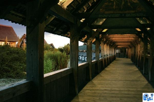
(5 years and 3777 days ago)
Very nice piece, reminds me of the dunes and lake "ship entry"  . Can't fault this, nice job
gd job
Good idea, but the bridge just ends...
I know, but when i was manipulating, i thought u can not really see the end due to one of the wooden columns of the bridge..So i just left it like dat
Howdie stranger!
If you want to rate this picture or participate in this contest, just:
LOGIN HERE or REGISTER FOR FREE
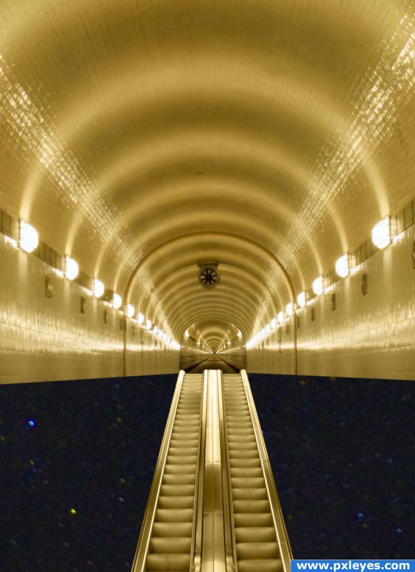
thanks to Loire & maeya for use of image (5 years and 3854 days ago)
beautiful, well done. 
You know what author.. I can see some frustration here.. like you were trying to figure out what to do... and I think you have done quite well.. ( the source is an incredible enigma))
Don't give up on this one, author! The area at bottom of 'space' is very distracting and not necessary imo...it almost looks low res. Try creating your own 'space' scene. It will look far better. If you so decide to do something else with the bottom...it might serve this image well. I really like the top section with the escalators. Keep going...it has a ton of potential. 
done...
Howdie stranger!
If you want to rate this picture or participate in this contest, just:
LOGIN HERE or REGISTER FOR FREE
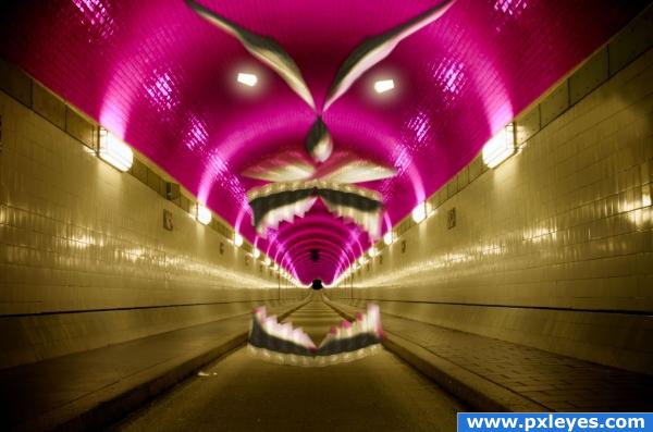
No external source. (5 years and 3857 days ago)
Tunnel of love gone utterly awry... the floating face is really cool but the bottom part of the mouth looks awkward due to the lack of contrast (such as the top has between the pink and the gold).
Cool! Very freaky
I thinks I made a wrong turn at Albuquerque!
Howdie stranger!
If you want to rate this picture or participate in this contest, just:
LOGIN HERE or REGISTER FOR FREE
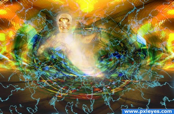
This tunnel does not go the 'normal' places (5 years and 3858 days ago)
Nice, but so much going on!
Another one that's freaking me out man! Nicely done
Howdie stranger!
If you want to rate this picture or participate in this contest, just:
LOGIN HERE or REGISTER FOR FREE
Well done!! I like it very much
Nice idea & blend. Source for sky & sea?
Sky and Sea are from original source ... thx for the comments
great masking ,nice image . G/L
cool work
It's a really good blend and one of the best I've seen but... The lights don't look real in high res. But like I said only noticable in high res.
cool idea.
great blend work author.. nice use of source.
nice
Thank you all for the votes
Congrats for your third place, Numbsock!
Congrats!
Congrats!
congrats!
Congrats!!
Howdie stranger!
If you want to rate this picture or participate in this contest, just:
LOGIN HERE or REGISTER FOR FREE