(5 years and 2771 days ago)
- 1: Dmitri MIkitenko
- 2: wfunderber
- 3: nomatch
- 4: photon312

A wrong turn or unseen hands guiding the girl? You decide.
All sources are listed and I would like to give credits to all the owners of the pictures used here. :) (5 years and 2940 days ago)
Howdie stranger!
If you want to rate this picture or participate in this contest, just:
LOGIN HERE or REGISTER FOR FREE

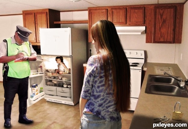
"I am sorry ma'am, but I am going to have to write you up. That child is clearly not old enough to be locked in the fridge!"
Stupid Law: http://www.stupidlaws.com/children-under-the-age-of-5-must-not-be-locked-in-a-refrigerator/ (5 years and 3026 days ago)
lol i think that law falls under the child abuse law, since this is a canada ottawa law it seems very useless indeed 
Hehe I thought it was funny because the law itself that it is perfectly ok to lock children over 5 in the fridge. I'll remind my teenage daughter of this ability when she acts up! :lol:
Nice work! Funny too!
hehe great idea author.. just dont put anything too yummie in the fridge or u might find it empty lol
Howdie stranger!
If you want to rate this picture or participate in this contest, just:
LOGIN HERE or REGISTER FOR FREE

(5 years and 3254 days ago)
Boy, his hairline is low enough for him to be a Neanderthal...
His chin is also now too narrow to support a lower jaw with teeth.
Strange looking youth, that's for sure!
Face is much better this time, but the hair still isn't right, Isn't hair hard to do?
I am beginning to hate hair..lol
but disagree with chin too narrow
Howdie stranger!
If you want to rate this picture or participate in this contest, just:
LOGIN HERE or REGISTER FOR FREE

(5 years and 3258 days ago)
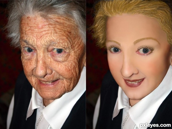
I would put some texture/pores into her skin.
Yes I agree! And for some reason I would like someone to change clothes and/or generation look of the picture, but this one is right on theme!
Edit: I would love to see a: 70's, 80's, and then like 2011 look?  Maybe even a photoAlbum theme!?
I agree it would be better with some skin pores. SO many effects help you learn how to smooth skin texture, but I've yet to find a decent one to add back pores (without using another source, which is verboten for this contest...). The Healing Brush tool allows you to retain some skin texture, but it totally trashes the skin tones, leaving a horrid, mottled effect.
I like the idea of a "progressive" effect through the decades. Maybe that will be a future contest!
Its a very good effort, however there would be more shaping shadows in the face as well as the texture of the skin.
Shadows to define the mouth - for instance:- the curve below the bottom lip and dimples under the nose that shape the top lip. As one ages the muscles soften and drop the fine edges of a structure and if there are false teeth they push the top lip out and straighten it. The Older face actually has higher cheek bones than you have given credit for and there would be deeper hollows over and a slight shadow under the eyes . Cartilage grows all of ones life so the nose may well have been shorter and slightly turned up at the end.
Good work. I will come back and vote later.
what about trying to take a small portion of one of the less wrinkled parts of her face (maybe nose) and use that as a pattern for some texture in her face? Or just painstakingly put millions of tiny dots on her face for pores. lol
U did good work author but she looks more like wax figure...try to add some skin texture here to achieve more natural look...best of luck
You did a great job... just need to make it a lil more realistic,,and since we could not use other skin it was hard
She looks like a porcelain doll - you just went too far with it, author, tho you have the right idea. The trick is to leave some pores there, and soften her skin overall. Nice lip shape, tho. 
Howdie stranger!
If you want to rate this picture or participate in this contest, just:
LOGIN HERE or REGISTER FOR FREE
very well done == like the blended effect gives more impart than a totally stone face
Really nice work, author. Thought it might be you!
IMO there wouldn't be cracks (or very few) on the human side, just for more contrast. Well done image, though!
agreed CMYK
Congrats on 2nd, I feel like that sometimes!!!!!
Congrats, good work.
Congrats!
Congrats Rick!!
Howdie stranger!
If you want to rate this picture or participate in this contest, just:
LOGIN HERE or REGISTER FOR FREE