Just make simple editing. :) (5 years and 2600 days ago)
- 1: KLCC

own photographs
1. tiger
2. tiger (5 years and 2865 days ago)
Great photos, author! The blending on the neck of the head on our left could be better...it's too low on the back. (Think where spinal cords would join, and matching stripes) Well done otherwise. 
IMO you could have given more body to the second tiger...it looks like his/her head is coming out of the body of tiger 1. Nice image over all. Good luck.
Nice one.
Howdie stranger!
If you want to rate this picture or participate in this contest, just:
LOGIN HERE or REGISTER FOR FREE

(5 years and 2865 days ago)
I like the blending but the animal seems deformed, it's legs are glued o.o?
Hi Akassa,I just used the same original image..its that way  source 2
In my opinion it is too symmetric but I think you use only one source cut in half and blend together 
Otherwise nice image
good luck!
Hey thanks..Mario
You should add something to the background to break up the monotony
Hi TemporaNigra,I tried to give more focus on the rhino heads,that why I made it a bit easy on the background,you are right!,if I can I'll do something about it..gonna be busy on the weekend,I hope I can do it.
Author....Mario is right, the image is too symetrical, you could have used two different images of rhynos and work with them...it looks like you cut the source in half and pasted it, flipped vertical and here it is!. Even so, it is not a bad image,IMO, GL.
Howdie stranger!
If you want to rate this picture or participate in this contest, just:
LOGIN HERE or REGISTER FOR FREE

(5 years and 2867 days ago)
great!
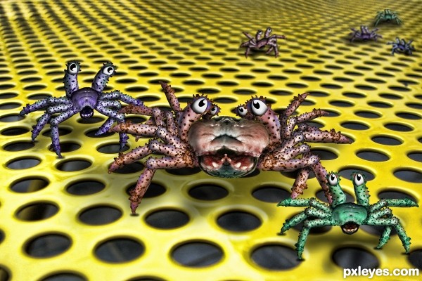
I do not want some of those underneath my bed sheets..... Creepy! But, funny image.. good luck!
Howdie stranger!
If you want to rate this picture or participate in this contest, just:
LOGIN HERE or REGISTER FOR FREE

(5 years and 3097 days ago)
Howdie stranger!
If you want to rate this picture or participate in this contest, just:
LOGIN HERE or REGISTER FOR FREE
Good idea.
Thanks,Bob...
so nice
Thanks,Pikkar.....
good use of source
Thanks,Keith...
Howdie stranger!
If you want to rate this picture or participate in this contest, just:
LOGIN HERE or REGISTER FOR FREE