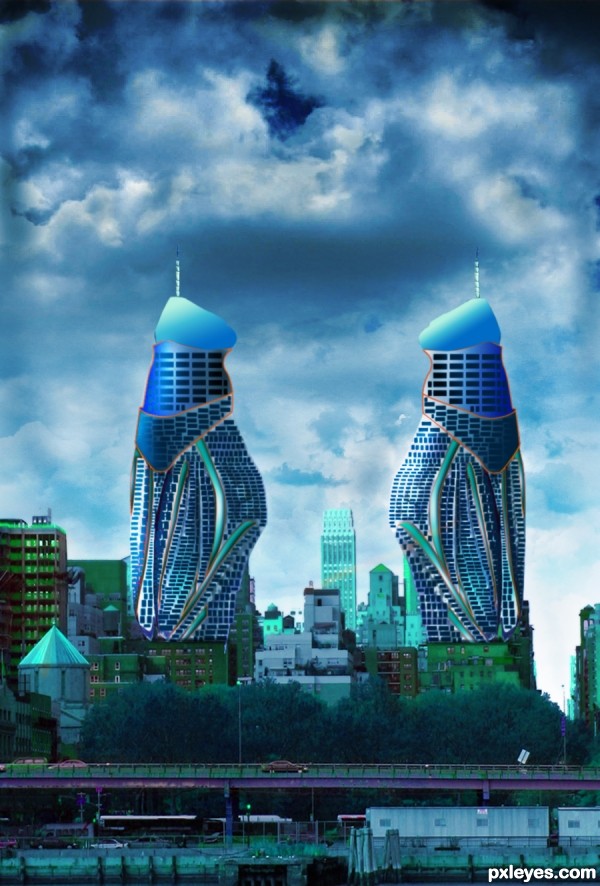
Source image used to create two towers. (5 years and 3344 days ago)

SOURCE
with My Picture (5 years and 3347 days ago)
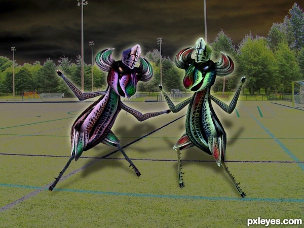
Nice one. Like the idea. Shadows are cool. GL 
great construction author and fantastic title imagination...i would just a bit lower the opacity of the shadows...now they are a bit to strong and create small distraction from the Farina and her sister...
much better.. thanks Erathion 
My pleasure...just tell me author...which one is Farina? If i could guess i would tell that Farina is Red one...
Farina is more red and green (on the right ...our right.. never could tell the difference) .. for she represents the Christmas Colors and the silliness of making clashing colors a concern... her heart has endured too much so she has decided to unite with her evil twin and take control over the world at hand...
Or I was just really confused as to what to do with a Macro of a fricking Grasshopper and just decided to go nuts (great macro is it not? MnMCarta is a master).. can't shake the guilt of manipulating it.. hehehe.. but I'm going to do it anyway hehehe
(can you tell I've relinked with my college roommate who was a brilliant writer... she gets my creativity going LOL)
Great stuff
Howdie stranger!
If you want to rate this picture or participate in this contest, just:
LOGIN HERE or REGISTER FOR FREE

(5 years and 3854 days ago)
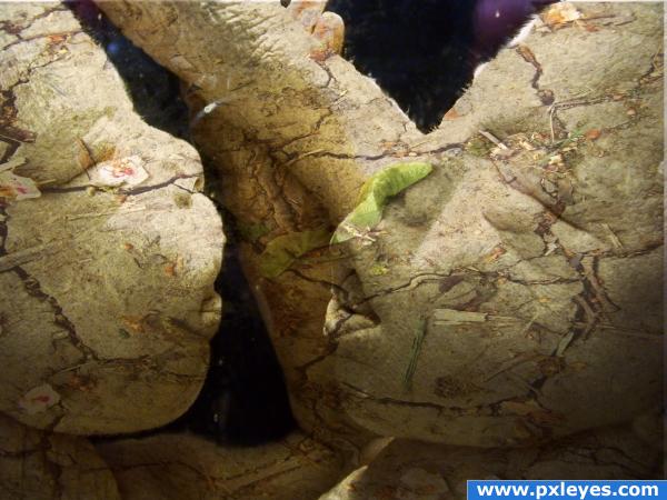
Took me a while to be able to tell what they were, but very clever!
wow, thats so freaky! Good work!!
had to look quite a while to see them, like it!
Saw it the first time.
spooky and super, great job.
I see Dentyne is needed here... great job
needs a little more definition to each face...try a layer mask....looks good though
great work
Wow thats freaky! I thought what a load of crap the first time i looked lol. Love it now 
wonderful image. fantastic use of source.
Howdie stranger!
If you want to rate this picture or participate in this contest, just:
LOGIN HERE or REGISTER FOR FREE

SHe looks better then me
thx to nemolumos for the use of ur image
http://nemolumos.deviantart.com/ (5 years and 3931 days ago)
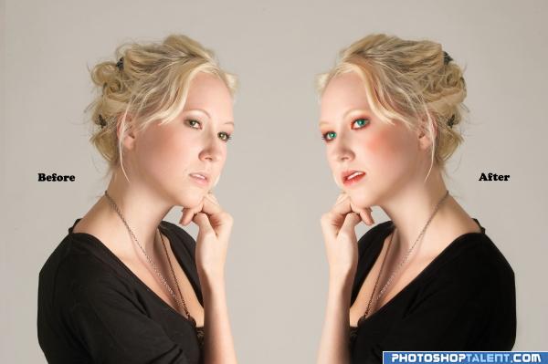
I'm not sure but I think they are suppose to be flipped the other way.. unless you meant to remove the make up for the AFTER picture.. stll very good work and good luck
Thx GolemAura i made the changes
I think the makeup is a bit overdone
her eyes are a little scary...
red color of the eye is too much. reduce it. You can change the hair style.
I agree; the makeup colors are too strident for her skin tone
nice 
i dont know why but now it looks like she is chewing something, makeup looks good, maybe a bit overdone
Howdie stranger!
If you want to rate this picture or participate in this contest, just:
LOGIN HERE or REGISTER FOR FREE
this is a pretty neat idea author.. way out of the box.... you may want to try and get rid of that orangy red stroke line around the top... it defeats the realism a bit (IMHO).. you may also want to reverse the burn dodge on one of the towers so that the shading matches the angle of light (it's not really that important, but I've noticed if you don't correct the lighting on a subject many members have a snit)

Good luck.. and great idea..
Thanks Drivenslush. Think, I should get rid of the orange outline. Will work on it. Your advice is to the point. Thanks again.
Yeah, I appreciate your view about lighting. It took 15 hours work to reach here. Maybe, my eyes got color saturated.
very interesting concept...construction is well made and as Ernest sad i will to remove orange stroke...best of luck
Excellent tenacity .. wish you major luck
Thanks Drivenslush !!
As Drivenslush has already pointed out, the lighting on half of your image is wrong. When considering making a realistic style image such as this, lighting is important. Check out this valuable tutorial: http://www.psdbox.com/tutorials/manipulation-secrets-3-shading-and-lighting/
Thanks CMYK46. Link is truly eyeopener.
Not sure if it's intentional or not, but you have a brown outline at the top of each building. If you remove those and soften the edge a bit it would help. Nice image and great imagination too.
Thanks pixelkid for the suggestion.
Cool idea, somehow reminds me of the architecture in Dubai.
Corrected the picture aided by suggested expert comment from Drivenslush about red line. Hatss offf.

CMYK46, I like your critically hurting yet actual comments. I tried to correct the lightings. Hope you think it is ok now.
pixelkid, the red line came through copy layer styles, think now, it wasn't appropriate, so removed it.
Thanks erathion, sweetest and in my opinion, a very creative person in my pxleyes world.
Thanks pearlie, you always shows way to do the better way in a very honest and unhurtingly factual way, you did to me and I also read many of your comments to other pictures
Howdie stranger!
If you want to rate this picture or participate in this contest, just:
LOGIN HERE or REGISTER FOR FREE