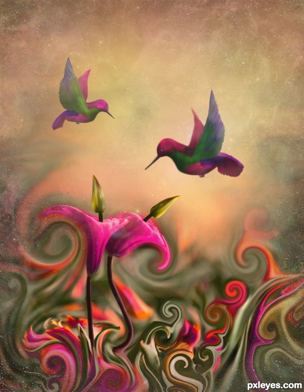
Thanks to dsleeter_2000 at flckr.com for the source photo used for background textures.
Source was used for flowers and to get body of birds. Please see SBS for details. (5 years and 2585 days ago)

Fonts used: Photoshop's: Stencil; impact and Arial
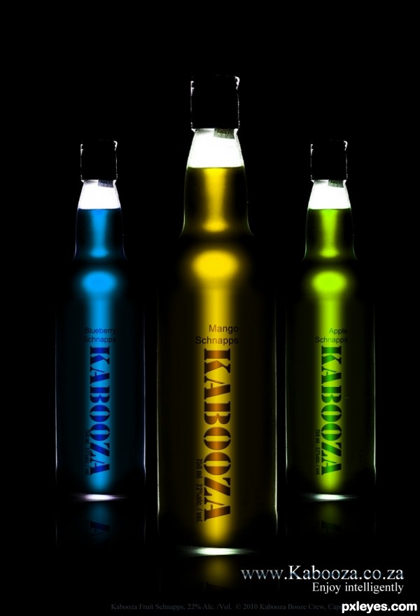
Thank you to André Banyai of Flickr for his bottle. (5 years and 3499 days ago)
use a reflection ; ) gives a nicer effect!
An earlier version had some, I forgot to show the layers when saving! Thanks for pointing it out. Have corrected it now. 
Dramatic. Maybe too much so as I had a hard time discerning right away that these were bottles. Part of that may be my monitor, but I do notice that your source bottle has more white outlines and larger white base. Since "Schnapps" seems to be centered over the vertical "Kabooza," I think the flavor text should also be centered. I like the inclusion of all the fine print for completeness.
Very chic! Maybe a little bit light background... 
Excellent
Good work author! The reflection on the floor can be little more.
superb!
Very cool entry...good luck
Howdie stranger!
If you want to rate this picture or participate in this contest, just:
LOGIN HERE or REGISTER FOR FREE

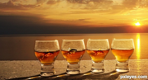
Photograph is my own, thanks to surely for his fish (5 years and 3515 days ago)
nice work...gl
Not bad, but you need to remove the sun glare from the wall.
Yep, I agree with CMYK, sun must be higher for glaring on the wall, as the original source. But colors are very nice. 
Thanks for the comments - spotted them too late though.
Congrats
Howdie stranger!
If you want to rate this picture or participate in this contest, just:
LOGIN HERE or REGISTER FOR FREE
Well done, nice dreamy color combination. The lensflare is no must for me (bit too artificial for my taste compared to the more organic shapes of the rest in the image), but that's maybe just me. The sirls on the left side look more elegant than on the right side (looks a bit too obvious liquified), but overall mission accomplished . Good luck!
Thanks for your comments. I meant to remove that lens flare and will still do it if I can figure out how. Thanks again!
beautiful, love it.
Thanks so much.
oh wow. awesome picture. hope you win with this one. I'd love it as an ipad wallpaper. well done & good luck 1
Congratulations
Howdie stranger!
If you want to rate this picture or participate in this contest, just:
LOGIN HERE or REGISTER FOR FREE