(5 years and 3122 days ago)
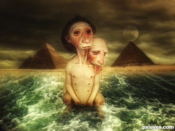
Father and son are going to start taking a shower..the father doesn't seem to be ready for it..neither the son...he is thinking about it.
What a strange position!... (5 years and 3146 days ago)
we have six nipples? hmmm, let me count, 1,2,3,4, aah, no no, we have only two nipples....wait a second, uuh, no this is my belly button, ooh and what is that, oooh, no can not say in puplic, "blush"
LOL...
You found a good source pic. The hard edged reflection doesn't work on the rough water, and it's too narrow. The moon should be behind the pyramid, not in front of it.
Yeap pretty good one!..
and Its not a reflection cmyk..
its just a simple shadow.
Shadows don't have color.
Well like I told u..its a simple shadow..
Whether it has color or not, the outline would conform to the contours of the water.
Very nice surrealism.. great pic find !!!
Hey thanks Drivenslush!..pretty rare too!..hahaha
just the things that I like hehe
Thanks nator!!..
Howdie stranger!
If you want to rate this picture or participate in this contest, just:
LOGIN HERE or REGISTER FOR FREE
(5 years and 3163 days ago)
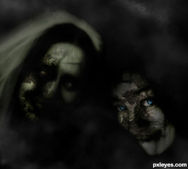
It's so dark, you can't tell who it is (or is supposed to be). Could be any two faces coverd up with textures. The bright blue eyes work well as a focal point, but there's just not enough clarity to give the composition much direction.
why there is stuf in "black" background, not profesional, it's beginner work, blend is not good, textures are to flat, you was tired when cuting face from background, because they are with smooth edges.
Helloooo..Gransbergis..take it easy partner!..i put a simple blackground to focus the main pics..about the tired thing?..mmm maybe u saw it that way..sometimes i like to do simple pics..if u call this picture beginner work..i invite u to see my profile and portfolio...Thanks for commenting,im gonna try to fix the background later on.
yes you have good works in your profile, and this work now is better with that background, i just say what i see when first time see a picture
thats spooky...
Howdie stranger!
If you want to rate this picture or participate in this contest, just:
LOGIN HERE or REGISTER FOR FREE
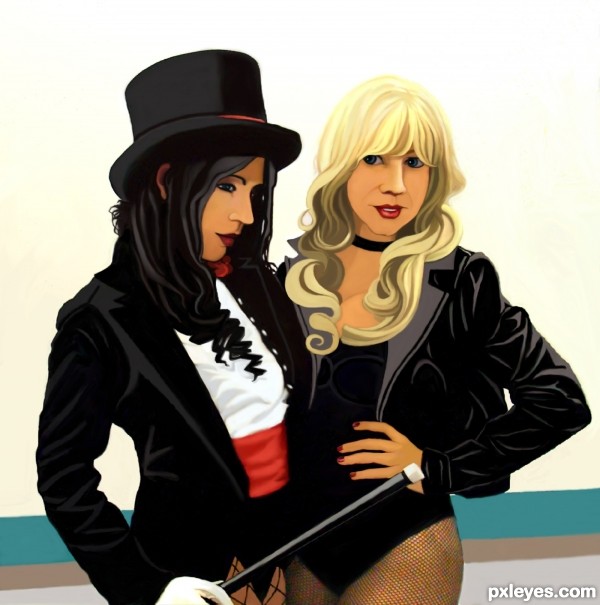
Just a stab at an all hand drawn entry
no sbs, all hand drawn. (5 years and 3209 days ago)
Most excellent.
Very nice indeed. Even though it's not required, a SBS would get you a much better vote. We're all here to learn, and a SBS can be like a mini tutorial that helps everyone. Just my 2 cents. 
CMYK46, yes I know but this thing took me way to long to do and I almost ditched it a couple of times.
It was basically turning the photo to gray scale , turning the gray scale to a sketch in corel draw then picking colors and painting the drawing.
Howdie stranger!
If you want to rate this picture or participate in this contest, just:
LOGIN HERE or REGISTER FOR FREE
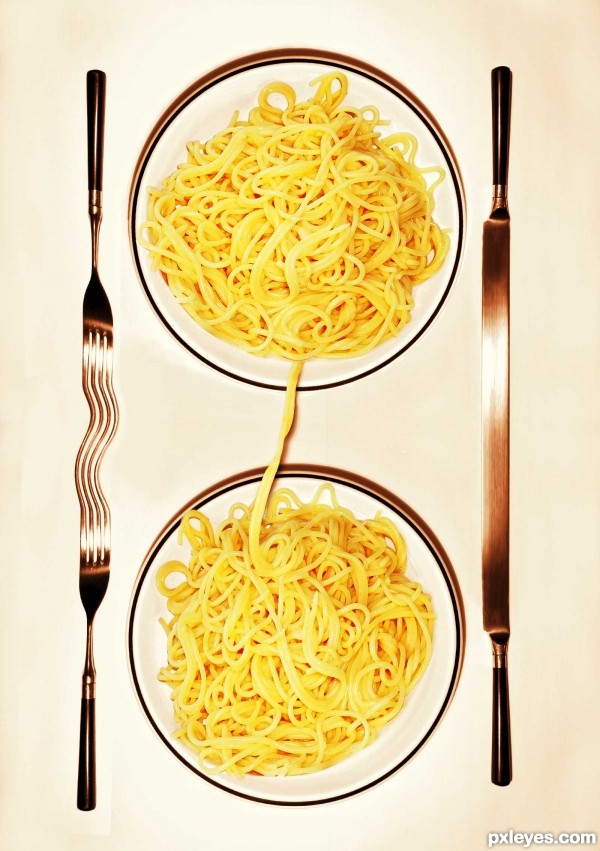
(5 years and 3219 days ago)
The pasta reminded me of the movie "Lady and the Tramp," but the conjoined silverware hurts the illusion.
Gotta agree about the cutlery, even a surreal mind must question how it would work? ( I wont even start on the use of a knife with pasta, my grandfather would turn in his grave) ....I would make it romantic with a single fork on the right hand side of each plate, leaving the suggestion that the lovers will meet in the middle of a strand. 
I like your idea, but agree with Geexman...no joined silverware, how can you eat like that?.... nice work BTW..... GL author.
Howdie stranger!
If you want to rate this picture or participate in this contest, just:
LOGIN HERE or REGISTER FOR FREE
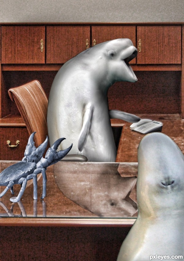
I'm glad you came to this meeting. Thanks, I'll have mine on rye. LOL!!
they would munch him .. wouldn't they LOL
Howdie stranger!
If you want to rate this picture or participate in this contest, just:
LOGIN HERE or REGISTER FOR FREE