Exiting your persona can lead to better or worse things. Made adjustments from the suggestions given. Thanks! See high resolution. (5 years and 3067 days ago)

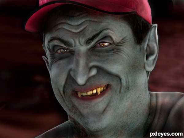
What evil lurks in the hearts and minds of man? Only Photoshop knows...
*Update: Liquified the chin a bit to make it narrower and longer (pointy) (5 years and 3232 days ago)
Nice work. The eyes give him a real Sylvester Stallone look (and he's scary). 
hehehe, it's weird how perfectly his face transforms, great job!!! (lots of detail  )
)
nice one author...gl
Very cool !! I indeed like the eyes very much and I also like the yellowish teeth!
GL Author
a vampire with the sweetest smile in the world or in hell.....
Wow, he seems a really bad guy, excelent. GL!
the transformation on this one is awesome. very well done. and great use of liquify!!! Good luck!
very good work
great!
nice work author
Evil eyes and nasty teeth. Exceptional good work! That guy looked pretty nice before you got to him! 
very nice work author ..GL!!

Congratulations! Well deserved! 
congrats on the second place finish elemare, well done indeed.
Congrats!!
Congratulation!!
congrats, good work
congrats!
Thank you, everyone!
Congrats on winning...
Howdie stranger!
If you want to rate this picture or participate in this contest, just:
LOGIN HERE or REGISTER FOR FREE

(5 years and 3784 days ago)
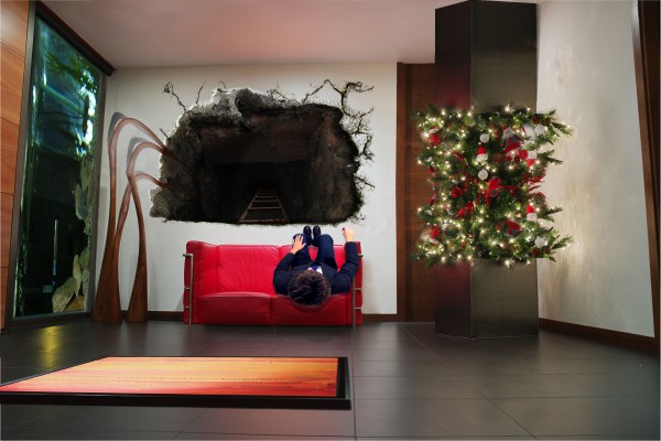
Great weirdness! 

Nice deviation! Lighting of frame pic seems too bright for the 'wall' its hanging on...if you darken it...it will help. 
I detect a hint of Pink Floyd influence. This is actually quite trippy when you stop and look at it long enough. 
Thanks for your comments guys. First time CKMY46 didnt bitch about lighting and directionLOL. As for outside influences (Pink Floyd) Hmmmm a great artist, but no, Illusion is my speciality but you gave me the biggest compliment of all, thank you, i am truely delighted with that 

congrats
Congratulations for 3rd
Congrats for your third place, Barnacle!
I think I got the pink floyd influence because it resembles their covers and I like art that just makes you stop and and say "WTF"  so congrats to you and your placement.
congrats!
Congrats
Congrats on 3rd place, Barnacle!
Congratulations!
Howdie stranger!
If you want to rate this picture or participate in this contest, just:
LOGIN HERE or REGISTER FOR FREE
Very nice. I might do some more soft erasing on the left side of the foreground sand, but it's a well made and intriguing image. GL author.
Try to work a little bit more on the feet on the sand it's make not realistic ! otherwise good work !
good collection of sources put together well
CMYK and lolu: Thanks so much for your help. I have blended the left side foreground sand more...and also fixed the shoe in the sand to make it more realistic. Looks better! Thanks so much you two!
This image proves what i have always said, Men would also misplace their heads if they were not attached.
JUST LOVE< LOVE < LOVE, the choice of images, the mood and construct of your image. BIG THUMBS UP
very nice, makes me kinda think of rene margritte and salvador dali mixed up
Wonderful, amazing work.
On the scale of 10 I would rate 9 on your idea and 8 on execution. Actually you made this kind of image before and it inspired me to make one of my work. However, I have some critiques that might help you to improve that image if you're willing to (1) The perspective or the angle of the sand is different from the gray ground, so viewers can feel the inner image (inside the frame) is actually closer and higher than the outer image; (2) the pattern of the sand and the gray ground are very different, so even though you used a high feather radius, they are not blended well
@ All: Thanks all for your comments. @langstrum...thank you so much for your observations, they are much appreciated. You make some great pointers...unfortunately I can't commit any more time to this as of now. Glad I could inspire you to do a similar approach on an entry. Thanks again for commenting and offering ways to improve. I'm always looking for that kind of critique. I guess I must rely on the 'so strange' mantra to answer any inconsistent elements.
That's what I planned to mention, the "so strange" elements, but didn't have enough space for that. From that aspect, everything is fine lol. I understand that it's close to the voting period so normally we don't have enough time do make any change. Best of luck to you, author
So glad to see you....I really like this image, I can totally relate Best of Luck

Congrats Rob, wonderful work
Howdie stranger!
If you want to rate this picture or participate in this contest, just:
LOGIN HERE or REGISTER FOR FREE