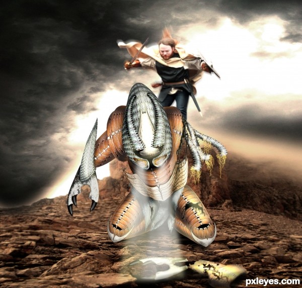
Sorry for poor SBS, I wish i had a little more time.
Credits to:
Mourge-stawk from DA
AdenarKaren from DA
Dewfooter form DA
(5 years and 3274 days ago)
thank you (5 years and 3353 days ago)
You can post you entry via my contest entries and make the SBS so that you post all these in the same time. There's a small box to chech at the end of the uploading page.
I admire your type of work and you really inspire me because I just find it really impressive when someone like you can take a simple image, cut it um warp ect and make this!  Well Done!!!
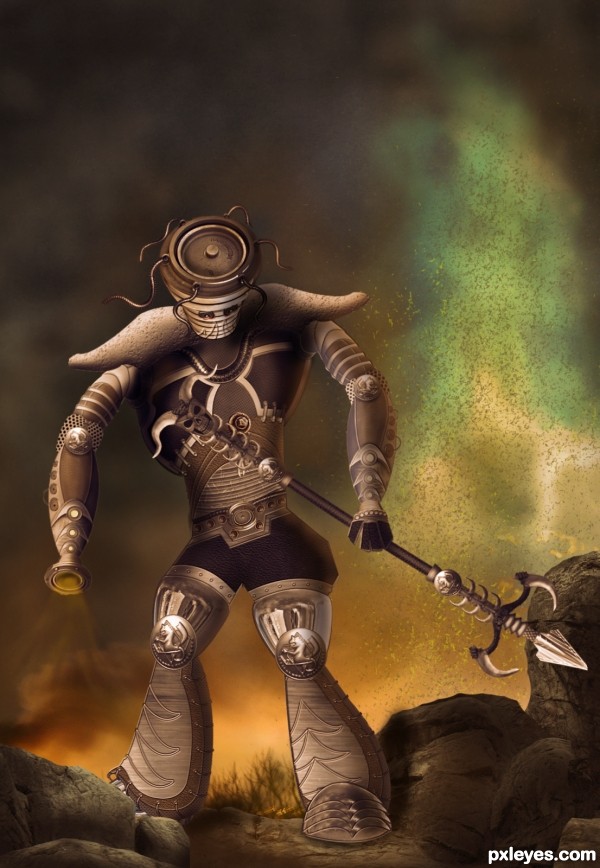
Ok, now that I've seen the SBS: the design is Ok, i like it cause of the contrasting elements that compound it. However i think the source could have been used more. For ex: texturizing + color adj, the red part of the Hydrant would give you something close to leather.
And you can make some of those metal textures from the source too - it would take time though.
Source was used for shoes, hips, belt & head - mainly.
Instead of those little eyes that make the Executioner look like a sad little boy, and not imposing, you can select that side of the disk they are standing on, and add a glow - red would be nice.
I like the background a lot - you didn't mention the source for the grass - or if it's painted, it's really good, anyways.
Thanx for ur suggestion greymval...and yes i did paint the grass...a few strokes of hard brush with a low opacity and then applied a bit of gaussian blur to make it merge with the background.....
Really like this. When I look again here, I kinda wish the light coming from the left arm were more intense. Way to go!
Great job, agree about the eyes. But I really like it! GL author!
Awesome chop! GL author! 
NICE! Creative thought 
Creative.......G/L Author.
WOW author...fantastic piece...great warrior...to tell u the truth,when i saw the picture i was sure this is creation of one other amazing artist too,but now author...hat down for u...fantastic work maybe yours best on PXL...well done and instant fav from me
THanks a ton to each and everyone who voted and for all the favourites and wonderful comments.....Erathion u wont blv how much that comment of ur's meant to a photoshop beginner lyk me....it really gave me inspiration and impetus to try and do much bttr....thaaaankkk yoouuuu
Congrats on 2nd!
Howdie stranger!
If you want to rate this picture or participate in this contest, just:
LOGIN HERE or REGISTER FOR FREE
(5 years and 3493 days ago)
very cool work...best of luck
oh thanks a lot
Howdie stranger!
If you want to rate this picture or participate in this contest, just:
LOGIN HERE or REGISTER FOR FREE
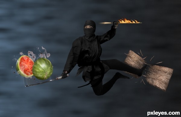
The ultimate ninja! Can you catch a flaming arrow? Slice a watermelon in mid-air? Break a plank of wood with your foot? All at once??
Some photos used are my own. All external sources used are mentioned, see SBS for my photos. (5 years and 3646 days ago)
Very nice work! There's a lot going on in the image, but i think it all works very well. Legs and feet seem a bit small.. but great job overall!
I agree, nice refreshing change, good fun idea 
Man, this ninja is crazy!!!  One of those actions is practically impossible for a mere mortal, imagine all of them...
Are you oriental?
Thanks ponti and barnacle.  I'll look into the legs tomorrow. I think the right leg needs a bit of fixing anyhow (the thigh looks as if its behind the lower leg). And, no, Erica, I'm not actually. XD
Compliments for the SBS, entry itself is nice too  (perhaps a biiiit less motion blur, but that's up to you). Good luck!
I love ninjas.. I mean the art.. hehe..  my all time fav ninja is Batman..
I can (Slice a watermelon in mid-air? Break a plank of wood with your foot? All at once??) but cant catch the firing arrow.. didn't tried yet.... But always likes to do something like that..... And can challenge you that i can do two of them at once................... Want to challenge me.....
really good effort... both on the entry and sbs... well done... jus to nitpick, i wud have used match colour for the wood pieces coming out of the wooden plank... now the colours are diff... 
edit: much better author... i like the way you took the suggestions...
Thanks for everyone's input!  Will see what I can do. Oh, and, Anoop, I'd love to see a YouTube video of you sometime!
EDIT: Made suggested changes: got rid of the blur trail on the watermelon, which was perhaps a bit much (thanks Wazowski), enlarged the right foot a bit (thanks, Ponti. I tried enlarging it more but then it set the other leg out of proportion and the layers were all getting messed up. =.=); fixed the color of the splinters by adding a the texture of the wood to it (thanks closedeyes). Look a bit better now?
yes we all would love to see it anoop.. I can do all those 3.. but unfortunately I can't record it as its all in my dream.. :P hehe..
Try putting a camera under your pillow. 
LMAO!!! freakin awesome ninja!!
i like the ninja, great action Author. Good luck 
agreeee....... but u have to bet me... author.. (take a look at my album before bettting.....I think I am that kind of freak and I can do that..... LOL)
nice idea author.. but you won't be able to see me as ninja.. coz if you can see a ninja, then he is not a ninja.. 
Oh sweet, Anoop! Saw your pics!  Now just take a picture doing two of the above things and I'll believe you.
  And good point, iquarishi lol.
Howdie stranger!
If you want to rate this picture or participate in this contest, just:
LOGIN HERE or REGISTER FOR FREE
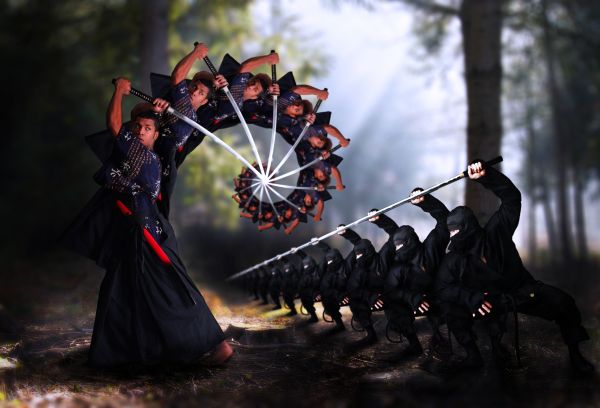
This is not exactly the droste photo that you usually see. Just the man on the left I used this effect. I wanna use droste to depict this fighting to be more dynamic. Hope that's not off topic.
Credits to Marcus (Deviantart) for his models and angel1592stock (Deviantart) for the forest. (5 years and 3672 days ago)
Excellent! 
Very nice and good effect!
nice XD
Nice work especially on the ultimate fighter. The spiral makes him look as having a scorpion's tail 
grt work man
very creative interpretation on this.
very nice work...good luck
very good
nice job!
Thank you for all the comments, I didn't expect to get many supports from you like that 
You deserve all the supports! 
Very cool and one of the most original I've seen GL!
should have been higher ranked imo...
Thank you, inanis, your comment encouraged me much. I'm usually in this situation, so I just try again to make the voters desired
Howdie stranger!
If you want to rate this picture or participate in this contest, just:
LOGIN HERE or REGISTER FOR FREE
I can imagine what a great battle it was,....I like a dramatizing pic like this one.....
This is great! The white beams of light seem a bit 'hazy' instead of light. Perhaps experiment with a few different blending modes. Duplicate some of the layers if you need more strength. Great job, though author!
Amazing! GL!
Pretty cool design.
In CG there's a concept named "density"= meaning the amount and quality of the texture applied in the image.
Graphic designer try to level the overall density so that their works won't look photoshop/collage.
The main density rupture in this entry is that everything besides the creature is blurry, and most we can see more details on the creature than on the foreground, even if they are both part of the focal point.
Some people use noise/fog brushes to create atmosphere and level the density.
I hope my comment is coherent enough and helps. Congrats on your awesome color palette!
Very nice....ditto to greymval....focus is difficult...texture should be consistent. a great entry none the less. Good Luck author.
I love the image although i am having a hard time seeing the source. But I give kudos for the imagination.
Congrats for your fourth place....nice work....
Howdie stranger!
If you want to rate this picture or participate in this contest, just:
LOGIN HERE or REGISTER FOR FREE