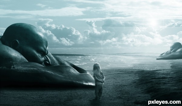
Unseen beach photo manipulation, thank to every stock provider.
Suggestions are most welcome. (5 years and 3081 days ago)

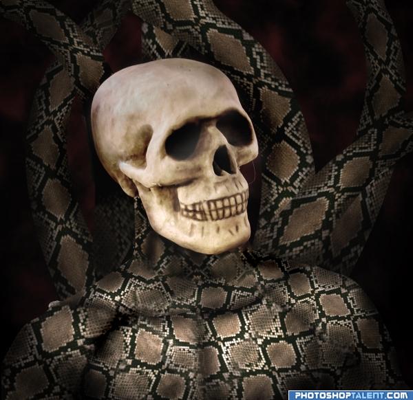
I am trying some new techniques to make complex objects using patterns. (5 years and 3967 days ago)
use the pattern on the skull to nice idea good luck!
I tried that but i think it is much more interesting with this skull..thank you for your comment
nice 
The skull looks kinda fake, see what would happen if you used the burn tool a bit eg:on the teeth, the creases on his chin etc etc  goodluck.
Good luck - keep experimenting.. 
good luck
The skull doesn't seem to fit in... you know what I mean? Maybe it's the angle and the fact that there's not really a neck... I'm not sure. Good luck. I like the idea...
I get what others are saying about the skull not really seeming to fit in, its still a great piece of work tho 
gl
beautiful body effect.. you might be able to blend the skull in better if you blurred the sharp edge all around.. just a suggestion.. experiment with high pass then laying the original image back over and blending with luminosity.. that sometimes works for me.. but good luck on a very inventive piece
Practice a little more.. still looks nice and original
Thank you all for the comments...I have made some changes to the god...
Nice pic, very creative! I'd darken the skull to match the color of the entire picture Imho. Got 1 question what pattern you used? Was a carpet or smth?))) GL
Howdie stranger!
If you want to rate this picture or participate in this contest, just:
LOGIN HERE or REGISTER FOR FREE
Very beautiful scene, great mood and colors.
Great lighting and shadow consistency. Well done.
Thank you and good to know that you like it.
Great use of my countryman Ramon Conde's sculpture, good luck!
I'm in love with it o.O mesmerizing
It's fantastic. I like it a lot.
spooky - excellently done - nice tonal range - good color
Howdie stranger!
If you want to rate this picture or participate in this contest, just:
LOGIN HERE or REGISTER FOR FREE