(5 years and 2839 days ago)
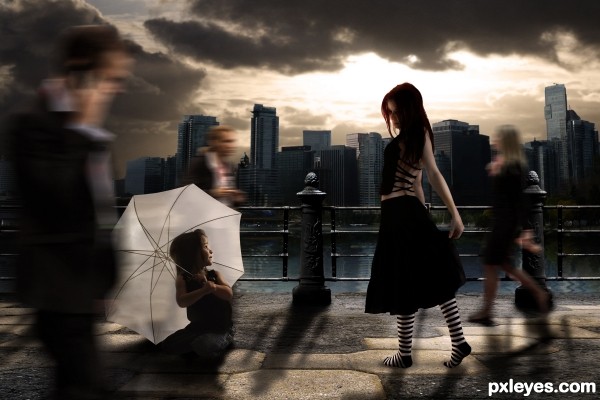
A concern on modern times, where business and personal interests steer us far away from helping and supporting necessitous people.
On regard to the entry, criticism on my entry is appreciated, it's always time to learn from others' suggestions!
An image including all the sources I used is within the SBS, in order to shorten the time to check them! (5 years and 2944 days ago)
for me. the beautiful goddess and is well made​​. a nice contrast. I also do not like the girl on her knees, just my opinion
Thanx Nator and lincemiope for your opinions. Unfortunately the kneeling kid had been the main concept of my creation, so everything turns around her (also all the masks and the light effects I used to create the atmosphere), I have no time to change the whole image again, but I admit that the kid fills too much space in the image, and decreases the sensation of movement of the people; but, on the other hand, I considered the importance of the glance between the characters, which is the title of the picture.
Congrats!!
Howdie stranger!
If you want to rate this picture or participate in this contest, just:
LOGIN HERE or REGISTER FOR FREE
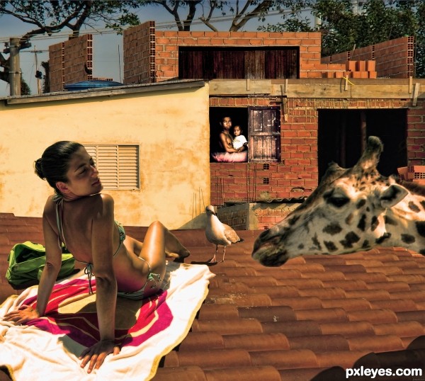
thanks to:
rubenshito: girl
kapsa: building
johnatan n: man with boy
garwee: seagull
somadjinn: giraffe (5 years and 3158 days ago)
Howdie stranger!
If you want to rate this picture or participate in this contest, just:
LOGIN HERE or REGISTER FOR FREE
other source:
http://www.flickr.com/photos/xeeliz/1256722/ (5 years and 3214 days ago)
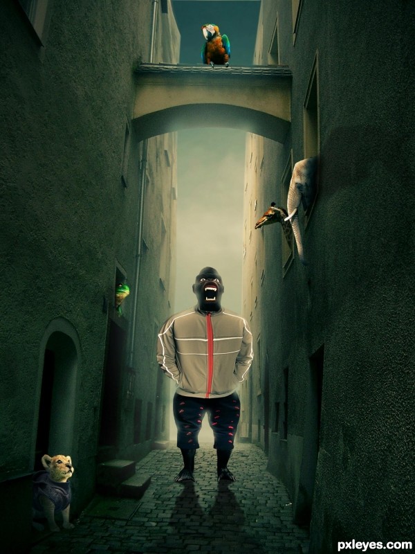
Interesting idea!  Try to get the elephant shadow right, and maybe reduce the saturation on the other animals. They look very bright to be in that dim alley.
great work..!!
Interesting idea, but the execution needs a lot of work...
The whites are too bright for a dim alley, those teeth almost glow.
The alley itself is crooked, leaning down to the right.
The proportion of all the animals is terribly inconsistent. The parrot is huge, with the frog even larger, while the elephant is tiny, and the giraffe is either too short, or is standing between floors of the building - the angle of it's neck doesn't provide for it possibly being lying down...And why doesn't the miniature elephant have any ears???
The lighting of everything is jumbled, with nothing corresponding to the back lighting. Lit on top, lit from the front, and the oversized lion cub is lit from some non-existent spotlight that doesn't seem to illuminate anything else that low to the ground, not even its feet...
Fantasy is one thing, but this almost crosses the line to nonsensical. You've done better work, this just looks hurried with no attention to detail.
thanks cmyk46, Neo and thanks a lot MossyB...
@MossyB
some things was intended to look like as it is in dis and some things are nt.bt thats true dt i was in hurry.
thanks newayz

thanks Razor...
Howdie stranger!
If you want to rate this picture or participate in this contest, just:
LOGIN HERE or REGISTER FOR FREE
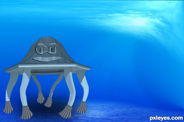
thanks to spekulator for the underwater pic (5 years and 3305 days ago)
Howdie stranger!
If you want to rate this picture or participate in this contest, just:
LOGIN HERE or REGISTER FOR FREE
Nice work!
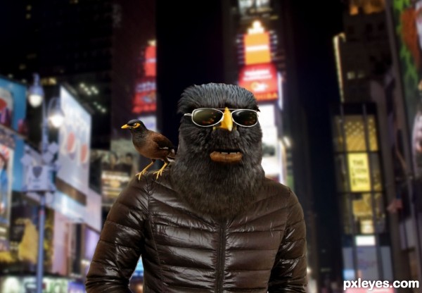
This is funny. Perched on a rooftop, this guy could be some new vigilante protecting his city.
Good luck!
Howdie stranger!
If you want to rate this picture or participate in this contest, just:
LOGIN HERE or REGISTER FOR FREE