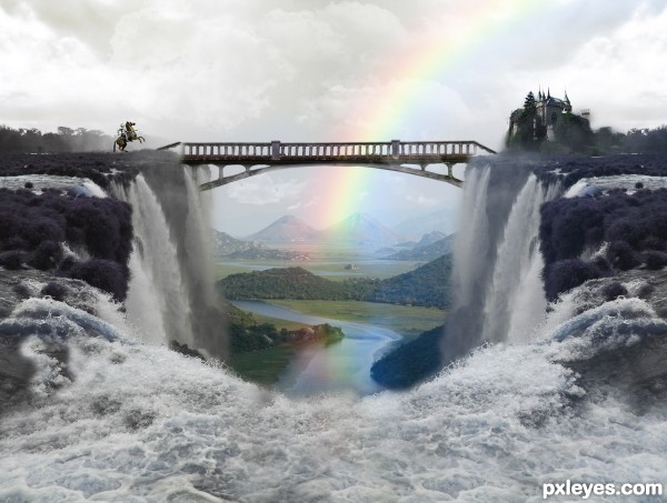
thanks to:
leftfield1 for the RIVER image
jana koll for CHATEAU image
enqe 6560 for MULTNOMAH FALLS image.
kamila t for KNIGHT ON A HORSE image (5 years and 3598 days ago)
- 1: RIVER
- 2: CHATEAU 2
- 3: MULTNOMAH FALLS
- 4: KNIGHT ON A HORSE

thanks to:
leftfield1 for the RIVER image
jana koll for CHATEAU image
enqe 6560 for MULTNOMAH FALLS image.
kamila t for KNIGHT ON A HORSE image (5 years and 3598 days ago)
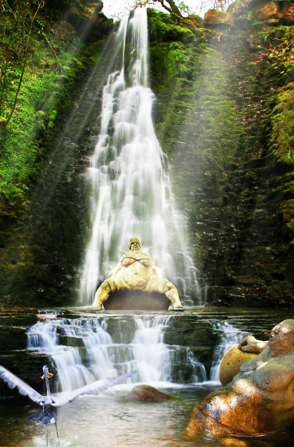
Thanks to Ali Taylor, Jean Scheijen, Coen Deurloo and Konrad Mostert for the nice source photo's.
Took me a while to figure out what i would do with these two funny characters. (5 years and 3752 days ago)
As with a previous entry, IMHO would be better if her feet were on the ground. There would also be splashes coming off her. On second look, she'd be smaller due to perspective. (PS: It's good you got rid of the dog.  )
)
Thx for the advice CMYK46, i will try to fix it 
Howdie stranger!
If you want to rate this picture or participate in this contest, just:
LOGIN HERE or REGISTER FOR FREE
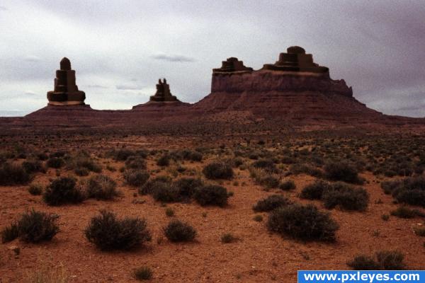
Famous monument valley a little bit different this time. (5 years and 3792 days ago)
nice idea 
Howdie stranger!
If you want to rate this picture or participate in this contest, just:
LOGIN HERE or REGISTER FOR FREE
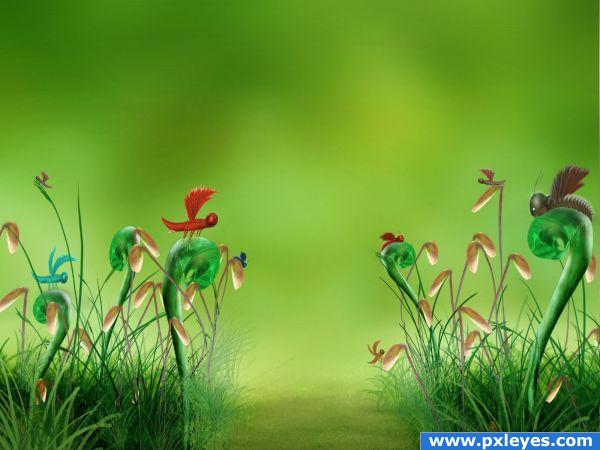
Thanks Grass brushes 2 by *Katikut (5 years and 3855 days ago)
huge marks.. but make sure you create some difference in each creature you have created (they look just a tad to repetitive... but other then that.. this image kicks butt LOL (do some shear/twirl/liquify... gently.. it will make the entry that much powerful)
do wish I would of thought of this.. it's wonderful
just love the dimensional effect as the grass goes blurry 
Very well done! Composition is flawless, nice colors. I like the insects (esp. the rightmost one). Only the legs of the red insect are a little off (the are all on one side of the body).
dustfinger- I see what you mean- but when I look at the image in PS- the legs are to the back, when I view in pxl I see the legs infront. I will try again..Thx GolemAura for the lovely comment.
Great image, good luck!
too cute..but it looks sumwhere a lil empty.add some centre peice ...buts far too cute and so neatly done .
Very nice drawing, great job.
lovely
great colours
great use of colours
Great pic!
This is worthy of an illustration for a child 's book. Very well executed.
makes me courious what´s behind the mist 
 good job
awesome!
Congrats for your third place!
Congrats too you Shellie 

congrats!
congrats shellie!!!!
Howdie stranger!
If you want to rate this picture or participate in this contest, just:
LOGIN HERE or REGISTER FOR FREE
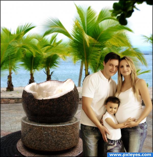
Best known for it's Stone Coconut Monument, the Coconut Island attracts thousands of tourists every year who seek the perfect vacation destination. (5 years and 3887 days ago)
cool looks real nice job Good luck Ps the people look a little placed they dont blend
errmm.. right. i did some tweaking and i think they look better now  thanks!
Nice image, but I never heard of a valley that was located on the beach.
because it's an ISLAND, duh!  fixed
fixed 
Very nice use of source, good job!
Oh makes me wanna go-- I love coconut.
Mmm. Tastey.
i was inspired by the first (and probably last) coconut i tried to open not too long ago. it's no picnic 
great thinking out of the box for source usage.
haahahah cool image! i love it author looks like a nice family photo!
I like the softness of the picture
gl
Oh author, I feel with you  Opening the one and only coconut in my life causes me a lot of cursing, sweat and a bleeding finger
  Very good blending and a really nice composition
  Good luck!
o.o looks like and advertisement for happyt family show the only comment i like to make is that the light falling on the ppl has a diff color then the light on the background from the source and the palmtrees
thanks! fixed  i hope they don't look to "pale" now..
Howdie stranger!
If you want to rate this picture or participate in this contest, just:
LOGIN HERE or REGISTER FOR FREE
very nice!
Not sure about the desaturated foreground, but pretty good image.
thanks CMYK46. the foreground its not desaturated. it has litlle bit of blue, because in turbulent waters you are not suposed to see any color.
I like how you have decided to use the source image..IMO you need to pick a focal point and work around that...too many fuzzy areas and then areas that are in focus...kinda makes it a bit confusing as to where to look...Good Luck
Christy...I dont get it.
You are showing different things at different viewpoints in the image...they shouldn't all be clear...if you want the castle and the horse in focus and the focal point then blend and blur your image to direct the eye to those points...Hope this explains better and it's just my opinion good luck
Nice result, the rainbow adds a lot to the mood of the image. You might fix the blurry parts though. Good luck!
Beautiful entry, author! GL...
GL
nice
good mood... congrats....
Howdie stranger!
If you want to rate this picture or participate in this contest, just:
LOGIN HERE or REGISTER FOR FREE