She was bitten... now she wants to bite too.
Thanks to MAXFX @ Photoxpress. (5 years and 3558 days ago)
- 1: girl

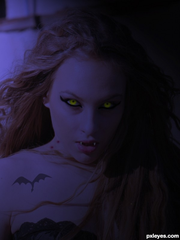
liquified the source image to change facial features slightly, colorized to change skintone, illustrated teeth and eyes and turned down the opacity to soften the layers....added the other 3 sources for final effect. Unfortunatly the full moon is not the lightsource couldn't quite work it.
(5 years and 3695 days ago)
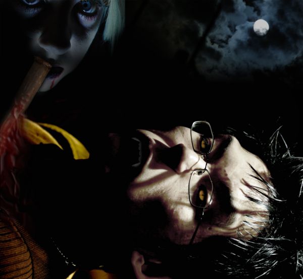
The blood looks quite unnrealistic and it looks like the woman is eating the stake...also, I'd agree to try what Nator suggests.
nice idea but i think the man should be vertically placed 
it does look like the stake is being eaten.
Howdie stranger!
If you want to rate this picture or participate in this contest, just:
LOGIN HERE or REGISTER FOR FREE

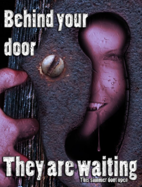
thnaks to alfi007 for old door image
thanks to coolza for Who's there? image
thanks to scottsnyde for Amy Lee image
thanks to binababy12 for green eyes image
thanks to andybenny for wood door 4image
thanks to spekulator for red drip image
(5 years and 3726 days ago)


very cool work
thanks SHIPLEYGIRL
Nice try....
Howdie stranger!
If you want to rate this picture or participate in this contest, just:
LOGIN HERE or REGISTER FOR FREE

(5 years and 3726 days ago)
Eeeeeek 

i like the idea although being a horror movie fan this idea has been used many times over .. Gothika is the first movie that comes to mind .. it is very good work though good luck 
looks good 
Great work,i like to mood very much...gl
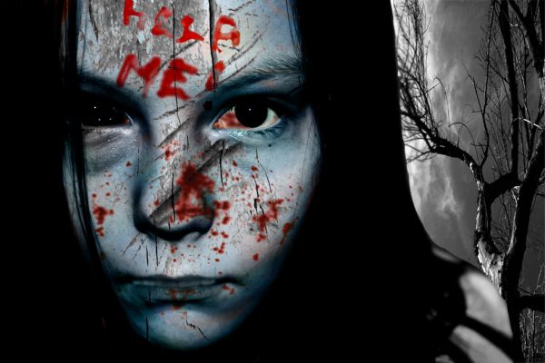
Inside of the right eye looks a little flat with the added red. Overall though very creepy pic and nice effect
Right eye doesnt add to the effect....Other than that beautiful work.....Scary...
thanks all
Howdie stranger!
If you want to rate this picture or participate in this contest, just:
LOGIN HERE or REGISTER FOR FREE
Nice idea great outside source, but the end result is a little too dark,
Damn,when man see woman like this...better to stop and to say only this "bite me,bite me please"... ...very nice work author,details are great.eyes especially...good luck
the photo is too dark
nice idea, the image is too dark
The image is dark because she is supposed to be in a moonlit night; the original image is sunny...
ok i get it ... cool job!
Nice image and clever title!
Excellent source for this contest with some great ideas about how to use it (coupled with a creative title). But the final result lacks drama because the lighting is so uniform. The shadow on the right (face and then onto hair) suggests moonlight could be coming from the left, thereby providing a cold light to illuminate the left while emphasizing the darkness of the right. Maybe the eyes could even glow a bit. I would be tempted to cheat and darken the back wall even if it is in the moonlight in order to focus attention on the face. Additionally, I think the bite marks on the neck are too big (go for subtle pinpricks noticeable only to those among us in the know about vampires) and the tatoo looks fake (a little more blue, a tad less opacity, slightly softer edges, a Google search—I don't know what the solution is).
PERFECT WORK ! G L
Howdie stranger!
If you want to rate this picture or participate in this contest, just:
LOGIN HERE or REGISTER FOR FREE