(5 years and 692 days ago)
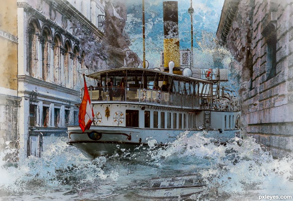
- 1: ship
- 2: water texture
- 3: wave 1
- 4: wave 2
- 5: ruins
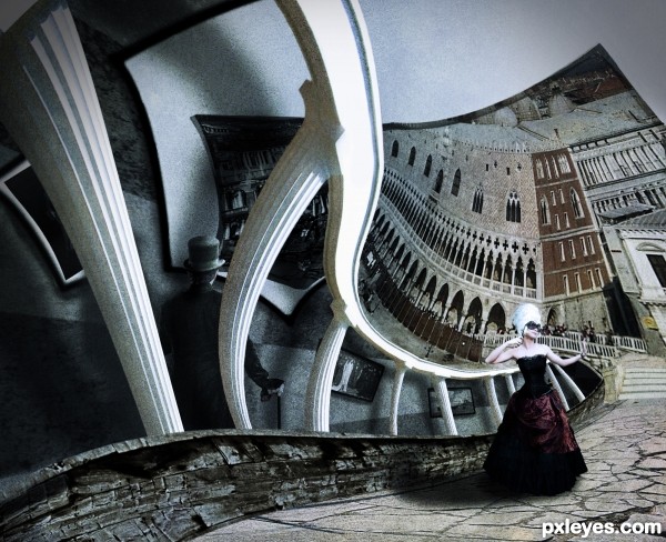
A reference to the amazing "Print Gallery" of M.C.Escher. A mix of distortion, alteration, puppet warping, and much more...
I had to change the chess board (the inner gallery wall) The photo I took is within the SBS. (5 years and 2960 days ago)
Very nice tribute to that style, good work, author. 
Thank you Pearlie
Nice effects....great take on Escher.
Thank you photogirl723 i'm glad you like it
a very good work, bravo
Thanx lincemiope
Thank you all for support and votes!
Congrats!!
Good Job! Congrats 
Howdie stranger!
If you want to rate this picture or participate in this contest, just:
LOGIN HERE or REGISTER FOR FREE
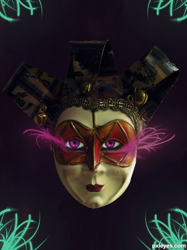
The Mask is form :
http://www.pxleyes.com/photoshop-contest/5305/venice-mask.html
[Venice Mask - Photoshop Contest]
I Really like to comment my entry because i want to know what you think... =)
(5 years and 3726 days ago)
Nice!  Really good! =)
Very beautiful! 
beautiful..... ...............
very nice work.... looks beautiful, but you can improve the eyes more, take a reference, good luck 
Good.
Nicely Done.....GL
great entry, author...and very nice idea... good luck 
cooll job
Howdie stranger!
If you want to rate this picture or participate in this contest, just:
LOGIN HERE or REGISTER FOR FREE
(5 years and 3744 days ago)
Good Lord...this picture is disturbing beyond compare. O.O
Thanks, I aim to please 
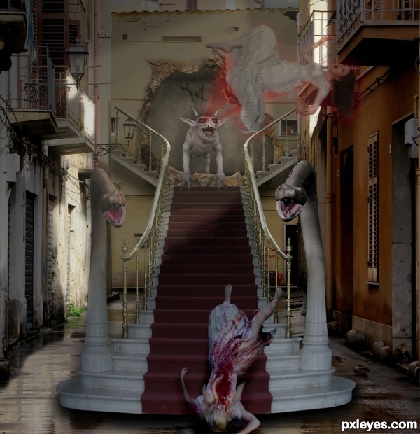
Lol, well I don't particularily like the image, but you've done a fair job. Two of my most imminent complains I suppose are that the staircase looks like it's hovering, rather than flat on the ground (the shadow is a bit thick at the front), and that the floating woman doesn't seem to match the lighting and sharpness as the rest of the image. Try playing around with curves a bit and see if it can be remidied. Good luck, author.
Okies, i'll see what I can do wiht the stair, but the girl has a motion blur on pupose 
Good idea, very dramatic. The snake in shadow is more distinct than the one that's lit...left one needs more contrast/saturation. To me it seems like less of the wall at left would be in shadow, judging from the light source. The left arm of the girl in foreground is distorted. You didn't show how you made the opening in the wall. There, is that enough nitpicking? I still like your basic concept, author, just give it a few tweaks.  (y0
(y0
I love details and this has many. I would have liked both snakes to have the same contrast though.
You should have thanked PKVstock source 5 and chamberstock source 1 at deviant Art for the use of their images. Make sure you credit authors when it's required. It's really best to always credit source authors, it's a nice gesture and you'll never miss a required credit. Also don't use the download URL for your links, use the link to the page with the image information and the image. That way we can see more of that authors work as well. The correct link for image 3 is: http://stocked-n-loaded.deviantart.com/art/Halloween-07-3-68700616
God , that's really creepy !
Thanks for the tip Spaceranger, If you look at my other entries you will see that I always thank.
Needs the blending work as already suggested, not a bad effort though 
Interesting entry......GL!
cool idea
No, it's not cool... it's freezing!!!
Now you can't edit the work anymore; but I think you forgot the reflection of the stairs (and nobody noticed it...) Don't forget it next time, my friend! 
Howdie stranger!
If you want to rate this picture or participate in this contest, just:
LOGIN HERE or REGISTER FOR FREE
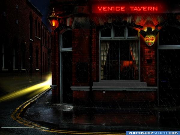
Took bright tavern image and used neon and neon mask to create scene. Please see source link and high res before voting. Thanks to Jackbox for tavern image. See high resolution. (5 years and 4025 days ago)
Great mood!
great job! usually changing the time of the day doesn't work out that good but this is pretty cool.
Nicely created mood...just needs a few edge cleanups and IMHO a bit less plastic wrap, but good job. 
EDIT: Now yer cookin'. 
Thanks CMYK...I have reduced the plastic wrap effect considerably...I also fixed the edges of light leaks from window masks. Looks better! Thanks for your help. 
Nicely done very atmospheric scene top job!
Nice work, very real, good one 
Heheh Good job author Like the mask light
Love this one! Hey, where did u get a neon light that thin for the lips? :-P
nice picture
great effects and the source pic is wonderful.. good luck on this author 
very nice 
like it
very good idea and good job 
night mood is good
nice. good luck!
Howdie stranger!
If you want to rate this picture or participate in this contest, just:
LOGIN HERE or REGISTER FOR FREE
Whole new take on a new Disney ride! hehehe
Not my kind of theme park ride.
I see waves that I can surf.
Another contest I forgot about. Was working on this, but yours is better. that's the fire Filter to make the Portal. https://image.ibb.co/ePd9np/boat.jpg
Nice portal effect. It's a shame you didn't finish it to enter it.
What photoshop version do you have? I don't have a fire filter in my filters. I only have photoshop CS6...the basic version, not the extended one. I use brushes or photos if I want to create any flames.
I use the latest version. It's just a silly Fire Filter. 1st time I used it. It's under Filter > Render > Flame. It may come in handy later though. I coulda downloaded something that looked like that portal stuff, but I wanted to keep it all source.
PS is only A$14.29/mo or $10 USD/mo. If you wanna research it and can't get that price, let me know. CS6 and you are able to do what you do... impressive.
Thank you but I am too stingy to pay monthly. It's only a hobby for me and I don't make money from it so I have no reason to pay monthly. I am happy to stick with my old version since it works just fine.
Good win Angel!!
Thanks BWR.
Congrats Skyangel, impressive!
Thanks Sylvie.
Howdie stranger!
If you want to rate this picture or participate in this contest, just:
LOGIN HERE or REGISTER FOR FREE