(5 years and 3732 days ago)

(5 years and 3752 days ago)
add some details to the background and the ground
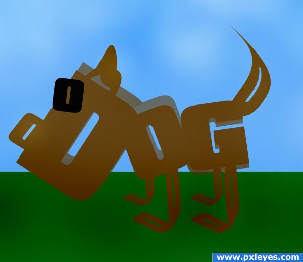
The other one wasn't made from fonts. This one may seem more boring to you but at least it's on theme now! 
I think you shoulda replaced your first entry with this one...
beg for deleting this double image...
It's a little too simple in my own opinion.
Very interesting yet simple idea. Sometimes simpler is the best way to go. I might have added shadows, but that is a personal preference. Nice Job. Good Luck!!
You know there is a cartoon character almost identical to one on a public television program called "word world" and may be considered copy-righted.
good job on the dog
Howdie stranger!
If you want to rate this picture or participate in this contest, just:
LOGIN HERE or REGISTER FOR FREE

Hi ! Can i play Bryce with you ?
Great tutorial. Vue seems very close to Bryce. Unfortunately have no more time for Vue. This amazing and irrational ZBrush kill me. (5 years and 3805 days ago)
Howdie stranger!
If you want to rate this picture or participate in this contest, just:
LOGIN HERE or REGISTER FOR FREE

(5 years and 3907 days ago)
gl
Quite a lot happens here, but hard to see the actual connection with the ste, especially when this will be in the final measures. Good luck!
Could not read it scaled down, sorry 
i think your design it's fine put the square attracts the eye more to them than to the anme and the colors are to expresive...you should trry and google some COLOR THEORY see how that can help you good l;uck
Good luck!  Nice!
Nice!
Looks like something from Windows '85 - sorry. I think it's the bright green and bright blue - a no no.
Howdie stranger!
If you want to rate this picture or participate in this contest, just:
LOGIN HERE or REGISTER FOR FREE
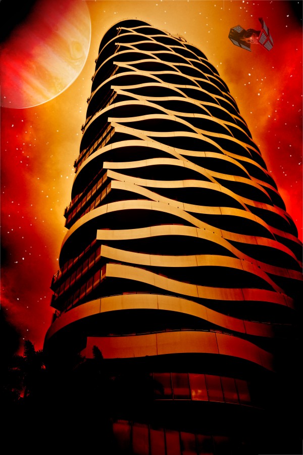
you still can't use the planet or the stars as these a re pre manipulated sources. We have all made that mistake with sxc... but unfortunately they can't be used and yes we all know that they are there for stock purposes, but you might need to find a tutorial on how to make the stars and get some brush sets to make the planets. The spaceship should be ok though
It happens to the best of us
Seems like only the Jupiter image might be in question, the others are fine. You can easily find a usable Jupiter pic from NASA if that's the case...good luck!
OH the struggles we face as artists.. this is a great image. like the thought behind it and the colour use. GL> Keep at it author once you get a handle on image stock use you will do just fine especially if this is the kind of work you produce.
Congrats for your third place, Calciu!
Congrats!
congrats
congrats!
Congrats!!
Howdie stranger!
If you want to rate this picture or participate in this contest, just:
LOGIN HERE or REGISTER FOR FREE