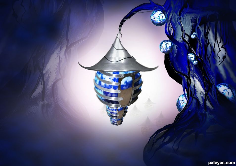
The enchanted blue village with their houses hanged by a blue true. (5 years and 1561 days ago)
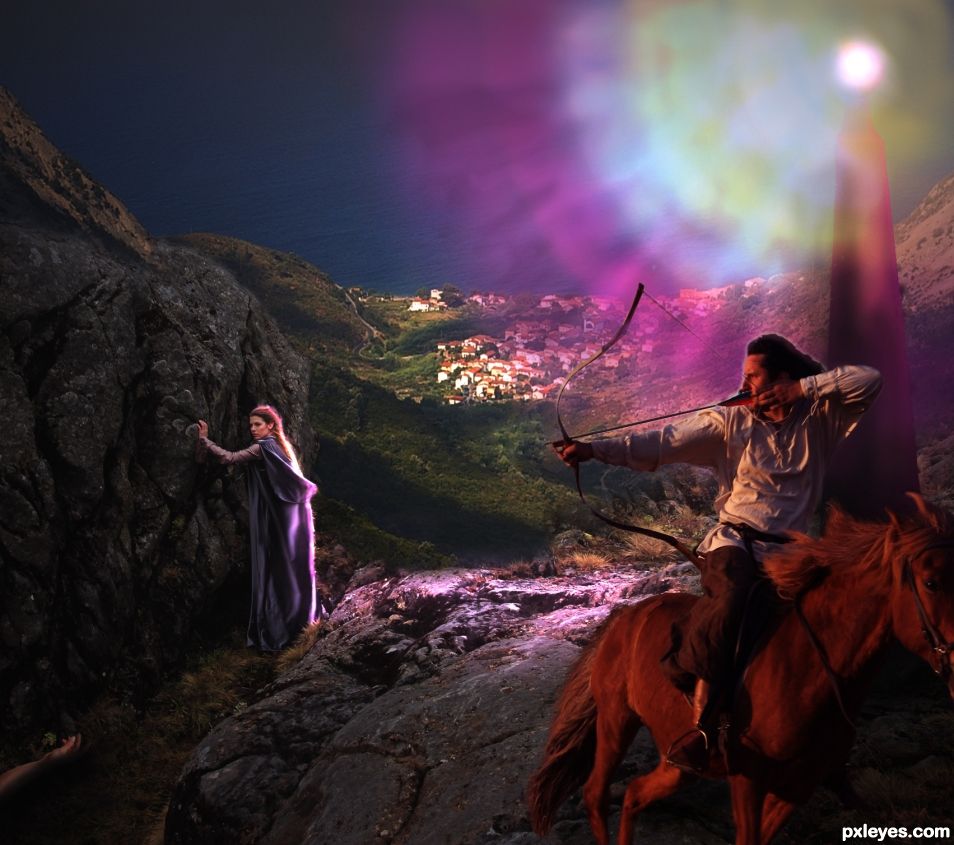
Your present circumstances don't determine where you can go; they merely determine where you start.
Nido Qubein
(5 years and 2347 days ago)
Nice. If the guy on the horse is supposed to be backlit, wouldn't the horse be backlit too?
Thank you! Indeed in high resolution you will see that there are a soft outline. The base of the beacon is dark so lower to the ground (as is the horse to the rider) not that much light.
The rider wouldn't be backlit in shadow areas. Try to blur the lit edges.
Thanks, it sure does look better now.
Howdie stranger!
If you want to rate this picture or participate in this contest, just:
LOGIN HERE or REGISTER FOR FREE
(5 years and 2510 days ago)
Howdie stranger!
If you want to rate this picture or participate in this contest, just:
LOGIN HERE or REGISTER FOR FREE
(5 years and 2622 days ago)
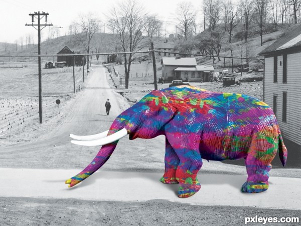
Well done...good effort....please focus on shadow....
Thank you Sir for guidance I will rework the shadow.
Far Out...Thought I was having 60's flashback... .. GL Author
Can not get u please explain 
Link 2 seems to be broken....
It has been fixed sir
I wonder if the shadow should be a little darker with a beast that size. Cool idea with the colouring. Good luck
Thank you I am learning shadow
Howdie stranger!
If you want to rate this picture or participate in this contest, just:
LOGIN HERE or REGISTER FOR FREE
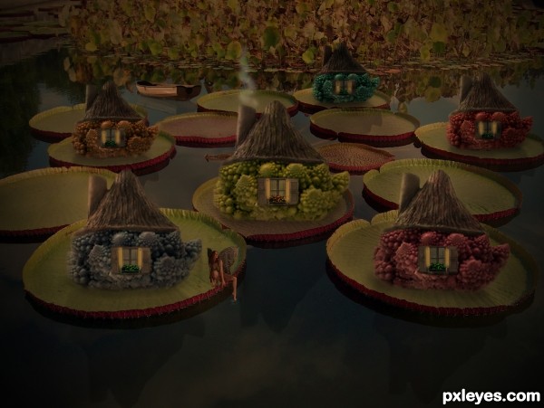
made the smoke with brushtool, rendering clouds, and lower opacity (5 years and 3063 days ago)
dark, darkity dark dark dark (I can see where you were going on this but still) dark
EDIT: Much easier to see now author 
must be my monitor settings i guess, doesnt look that dark over here lol, but i lightening it up a bit hope it looks better now 
Imaginative and cool...I like the muted color look of this!
the perspective is not consistent and that takes away from the beauty of the image unfortunately. The little fairy is lacking shadows and reflection. great idea, i like it.
good idea but could be easily improved just by brightening the whole image, unless it's dark for a reason ... in which case you could improve it by making each "house" a bit different from the others besides just changing the colours ... unless that was also done on purpose ...
Howdie stranger!
If you want to rate this picture or participate in this contest, just:
LOGIN HERE or REGISTER FOR FREE
Fantastic
Thanks.
Great use of source
TY!
Just beautiful work....
thanks.
Congrats!
Congrats!
Howdie stranger!
If you want to rate this picture or participate in this contest, just:
LOGIN HERE or REGISTER FOR FREE